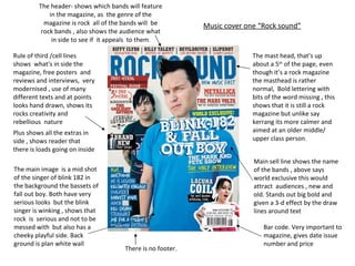
The header- shows which bands will feature in the magazine, as  the genre of the magazine is rock  all of the bands will  be rock bands , also shows the audience what in side to see if  it appeals  to them . The mast head, that’s up about a 5 th  of the page, even though it’s a rock magazine the masthead is rather normal,  Bold lettering with bits of the word missing , this shows that it is still a rock magazine but unlike say kerrang its more calmer and aimed at an older middle/ upper class person .  The main image  is a mid shot  of the singer of blink 182 in the background the bassets of fall out boy. Both have very serious looks  but the blink singer is winking , shows that rock  is  serious and not to be messed with  but also has a cheeky playful side. Back ground is plan white wall  Rule of third /cell lines  shows  what's in side the magazine, free posters  and reviews and interviews,  very modernised , use of many different texts and at points looks hand drawn, shows its  rocks creativity and rebellious  nature  Main sell line shows the name of the bands , above says world exclusive this would attract  audiences , new and old. Stands out big bold and given a 3-d effect by the draw lines around text  Plus shows all the extras in side , shows reader that there is loads going on inside  There is no footer.  Bar code. Very important to magazine, gives date issue number and price Music cover one “Rock sound”
The header, shows main articles in the magazine, I n this issue it’s a readers pole , be interesting to target audience to see what others think about there genre  The masthead. “KERRANG” takes up one fifth of the page , the font style is broken glass, shows the rebellion of rock , with an exclamation to show the loud  genre style rock has  The main image, it’s a mid close shot, of the lead singer of paramore  in this image she  looks like she is in a fight and punched the camera with a serious expression on her face , this shows rock can be angry and not to be mess with also shows that she is a powerful figure in rock. Simple black background so all focus goes on to her. The main sell  line is on the first of Hayley Williams ( the lead singer ) like  she’s punching the main sell line on to you, makes it stand out  “doing It her way” shows the  to the reader she’s powerful  her feast side The footer shows the extra bands articals and reviews in the magazine draws in the reader even more and makes the magazine seem to be more packed wild and crazy inside, like the genre.  Other sell lines are all over the page don’t really follow rule of third shows rocks rebellion, none of them cover her face , shows what else is in side magazine and freebes with magazine. Bar code. Very important to magazine, gives date issue number and price Music cover two “kerrang”
The header- shows main article to reader in this header it says reading Leeds “2011 line-up revealed” this would interest the reader as they would want to know to see if they should go,   Main sell line- sits under the masthead, catches the readers eye rafter they read the mast head, on a read back ground , this contrast makes it stat out even more, “this  will be the last chance” shows its an important as it’s the last time, this would get the aduence wanting to know more about why and when.  Masthead-unlike rock sound and kerrang, “NME” only takes up a small part of the page, but the audiences and potential buyers know what type of magazine and the type of people in it. White lettering, no editing to it like kerrang, to show its for all genre.   The main image shows the lead singer of Muse, looks very serious look on his face holding his knuckles looks as if he is about to be in a fight , shows that he is in a rock band in the back ground there is a blue glow , which seems to be coming out of the singer, makes him look powerful and highly important. sell lines/rule of third , follows normal rules , shows the mix of genres, “51 NEW acts unveiled” would excite the reader, key words are different colours , this is to draw the eye to that word and point , lots of sell lines on page  make it seem that there is loads to be unveiled inside magazine. Instead of using the word plus , they used the symbol, shows that NME is a symbol its self as well as shows extras in magazine.  The footer-in the footer it shows other articles and reviews this is to show the what else is in the magazine making them want to read it. Bar code. Very important to magazine, gives date issue number and price Magazine cover three “NME ”

Covers

  • 1.
    The header- showswhich bands will feature in the magazine, as the genre of the magazine is rock all of the bands will be rock bands , also shows the audience what in side to see if it appeals to them . The mast head, that’s up about a 5 th of the page, even though it’s a rock magazine the masthead is rather normal, Bold lettering with bits of the word missing , this shows that it is still a rock magazine but unlike say kerrang its more calmer and aimed at an older middle/ upper class person . The main image is a mid shot of the singer of blink 182 in the background the bassets of fall out boy. Both have very serious looks but the blink singer is winking , shows that rock is serious and not to be messed with but also has a cheeky playful side. Back ground is plan white wall Rule of third /cell lines shows what's in side the magazine, free posters and reviews and interviews, very modernised , use of many different texts and at points looks hand drawn, shows its rocks creativity and rebellious nature Main sell line shows the name of the bands , above says world exclusive this would attract audiences , new and old. Stands out big bold and given a 3-d effect by the draw lines around text Plus shows all the extras in side , shows reader that there is loads going on inside There is no footer. Bar code. Very important to magazine, gives date issue number and price Music cover one “Rock sound”
  • 2.
    The header, showsmain articles in the magazine, I n this issue it’s a readers pole , be interesting to target audience to see what others think about there genre The masthead. “KERRANG” takes up one fifth of the page , the font style is broken glass, shows the rebellion of rock , with an exclamation to show the loud genre style rock has The main image, it’s a mid close shot, of the lead singer of paramore in this image she looks like she is in a fight and punched the camera with a serious expression on her face , this shows rock can be angry and not to be mess with also shows that she is a powerful figure in rock. Simple black background so all focus goes on to her. The main sell line is on the first of Hayley Williams ( the lead singer ) like she’s punching the main sell line on to you, makes it stand out “doing It her way” shows the to the reader she’s powerful her feast side The footer shows the extra bands articals and reviews in the magazine draws in the reader even more and makes the magazine seem to be more packed wild and crazy inside, like the genre. Other sell lines are all over the page don’t really follow rule of third shows rocks rebellion, none of them cover her face , shows what else is in side magazine and freebes with magazine. Bar code. Very important to magazine, gives date issue number and price Music cover two “kerrang”
  • 3.
    The header- showsmain article to reader in this header it says reading Leeds “2011 line-up revealed” this would interest the reader as they would want to know to see if they should go, Main sell line- sits under the masthead, catches the readers eye rafter they read the mast head, on a read back ground , this contrast makes it stat out even more, “this will be the last chance” shows its an important as it’s the last time, this would get the aduence wanting to know more about why and when. Masthead-unlike rock sound and kerrang, “NME” only takes up a small part of the page, but the audiences and potential buyers know what type of magazine and the type of people in it. White lettering, no editing to it like kerrang, to show its for all genre. The main image shows the lead singer of Muse, looks very serious look on his face holding his knuckles looks as if he is about to be in a fight , shows that he is in a rock band in the back ground there is a blue glow , which seems to be coming out of the singer, makes him look powerful and highly important. sell lines/rule of third , follows normal rules , shows the mix of genres, “51 NEW acts unveiled” would excite the reader, key words are different colours , this is to draw the eye to that word and point , lots of sell lines on page make it seem that there is loads to be unveiled inside magazine. Instead of using the word plus , they used the symbol, shows that NME is a symbol its self as well as shows extras in magazine. The footer-in the footer it shows other articles and reviews this is to show the what else is in the magazine making them want to read it. Bar code. Very important to magazine, gives date issue number and price Magazine cover three “NME ”