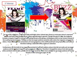
2. 1.In what ways does your media
product use, develop or
challenge forms and
conventions of real media
products?
3. For my music magazine, a mixture of dark and bright colour scheme was chosen as most pop culture’s represent
bubbly and lively vibes through music videos and the songs in general. Though the genre is pop, the magazine
includes a singular image of a young fresh looking female artist giving a striking pose with no eye contact instead of
the usual group band images. This was so that my target audience would be able notice the magazine amongst the
others. I have challenged the conventions of music magazine as the artist would look more mysterious and unusual
therefore making a statement to my audience’s attention.
Furthermore, my first draft of my magazine consisted of very dull soldiery colours that did not really suit my target
audience and the product image of a girly pop music magazine. Therefore I changed the colours from dark purple,
white and black into hot pink, yellow and red which would be much more suitable for my target audience of mostly
females in their early teens (ages 14-18)
1st Attempt
4. 3.What kind of media institution
might distribute your media
product and why?
5. Media institutions such as popular
and local DVD store such as HMV
and Blockbusters might distribute
my media product as they would
include music based products such
as albums and posters and may
also be interested in selling music
magazines for extra profit.
Furthermore, local store and private
businesses would also help distribute
my products since they are most likely
to have a section of newspaper and
magazine as their sources of income
and profit therefore would probably
want to sell music magazines as a way
to bring in younger consumers.
In addition online based institutions
such as ITunes would probably help in
distributing my product as a means of
advertisement and promotions to
create hype and attract more and wider
range of audiences online.
Larger well known supermarkets would
also be interested in distributing my
media product as their customers
would expect it to sell magazines of all
types from fashion, to music to cooking
to regular gossip in order to meet its
customer demands.
7. • In order to attract and address my audience I have used
techniques such as vibrant colours schemes throughout my
magazine pages for obvious reasons (to be noticed next to the
other magazines)
• Another technique would be through the use of colloquial
language such as “gig”, “epic” and “hot”. These everyday lexis
would convey the informal tone which my target audience of
mostly teenagers aged 14+ to young adults would be able to relate
to as they are more familiar with the usage of these terms.
• I have also used my own pictures such as images of young people
in groups and events related to music in order to convey the pop
theme of the magazine which would ultimately attract my
audiences that are interested in pop music.
8. 6.What have you learnt about
technologies from the process of
constructing this product?
9. Technology wise I have learnt that in Publisher, Word and
Microsoft PowerPoint I am able to adjust objects on the page in
order to place them more precisely considering the composition
of them on the page. I did this by clicking on the item and pressing
the arrows on the keyboard so that the page looks more clear and
professional.
I have also learnt that I am able to increase and decrease the
contrast of images on word to help modify and alter the pictures
to suit my magazine’s theme and the colour scheme.
I have also learnt that the use of camera lighting and altering the
model’s posture drastically changes the outcome of what an
image may portray, therefore I must be able to work with the
natural lighting along with the artificial lightings when taking
pictures for my product.
10. 7.Looking back at your preliminary
task, what do you feel you have
learnt in the progression from it to
full product?
11. • Looking back I have learnt that pre-planning is extremely necessary in order
to fully commit with the development of the final product. As I did not focus on
the preliminary task with detail, I lost some valuable time during the main
task trying to make up decisions about the colour scheme and the images that I
wanted to use.
• I have also learnt that I should be able to think realistically about the features
I use to make my media product as close to looking professional as possible, for
example using a good range of specific fonts instead of lots and lots of random
ones that may end up looking tacky and ineffective.
• Moreover, I learnt that whenever I feel as though I am done with a section I
should stop and see if I can criticize my own work in order to change and
develop it further for a better out come and final piece. For example, I could
always try different fonts and decide which one is most suitable.
• In addition I have learnt that I need to include more codes and conventions of
music magazines and incorporate it accurately with my chosen media product
so that it reaches its full potential to sell as a real pop music magazine instead
of just an A-level student project. For instance, footer bars and small images in
order to appeal to my audience’s interest.