+


    Music Video Evaluation
    Presentation
    Daisy Westlotorn
+
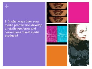
1. In what ways does your
media product use, develop
or challenge forms and
conventions of real media
products?
+
     Before we began planning the initial idea of our music video, we
    carried out research into the codes and conventions of a music video.
    This codes and conventions research was focused heavily of Andrew
    Goodwin's Theory of music videos. Goodwin’s theory primarily
    focuses on six elements which can be analysed in any music video.
    These elements include a demonstration of genre characteristics, a
    relationship between the lyrics and visuals, a relationship between the
    music and visuals, record label demands, reference to the notion of
    looking and finally Intertextual references.

     In the music video we tried to include each code and convention
    when it was relevant to the genre of music we had chosen to produce
    a video for. As we were attempting to address each individual code
    and convention of a music video; we had to spend time researching
    typical elements of a dance video-to ensure our video itself reflected
    this particular genre of music.
+
    1.Demonstrate genre
    characteristics
                  Through the research I had carried out, I had discovered that the most obvious
    characteristics of a ‘dance’ music video included a form of dancing performed during the video
    itself, cuts which followed the beat of the song-which were usually of a faster pace and an
    extensive use of bright colours.

                 Throughout our music video we included various short dance sequences including
    tap, ballet and freestyle (as shown in the images below). From our original planning we wanted to
    include some style of dance in the video, we slightly changed the traditional styles of dance
    featured within a dance video by opting to include tap and ballet. We merged all three styles of
    dance by adding the same editing style for each scene-which in turn worked better for the type
    of video we were aiming to create.


     The music video screenshots also show the use of bright colours sustained throughout our video-a
     key feature of the genre. We purposely chose to use these vibrant colours during the dance
     sequence to highlight their presence, as the dance sequences were a significant feature of our
     music video.
+
    2.Relationship between lyrics
    and visuals
    The obvious relationship between lyrics and visuals in a music video was the use of a narrative
    reflecting the lyrics. However, our narrative was portraying the slogan of our artist-which was
    ‘sleep all day, party all night’.

    We tried to link in a relationship between lyrics and visuals by placing the lyrics themselves
    visually throughout the video at various dance sequences. We used a particular design of
    typography which we felt portrayed the style of the song itself. Originally we wanted to have an
    effect on the text which made it seems as if the lyrics were jumping out, although after some
    research we found this was impossible to do and subsequently had to abandon the idea and
    instead leave the text as it was. Due to this issue we faced, we had to get each word written in
    perfect unison with the lyrics as they were being sung so that they followed the rhythm and
    timing of the song. Another way we thought was a good idea of making the lyrics stand out was to
    use brightly coloured font against a dance sequence background which resembled a black and
    white sketch (as shown in the images below).
+
    3.Relationship between music
    and visuals
                  The idea of the lips originally came from watching one of Rihanna’s music videos, where the
    lips were a recurring motif throughout the video. We did want to have the lips as a recurring motif
    throughout our music video which we seemed to have achieved in regard to the feedback we received
    about this particular part of the video. Although we did not want our video to resemble the music video
    we initially got the idea from, so we decided to use the lip footage by adding split screens which
    appeared on the screen at different points of entry when a new beat was introduced in the song.


                   One of the main sequences in our music video is a multiple split screen of the same pair of feet
    dancing. This small shot increases in numbers as it divides on the screen and then decrease in numbers as
    it begins to leave the screen. As this appears and fades the music reaches a climax and then slowly as
    larger beats enter more small screens are removed from the overall picture. The images below show the
    continuing sequence giving an idea of how this part of the music video works.
+
    4.Record label demands
    “Sony Music Entertainment is a global recorded music company with a roster that includes a
    broad array of both local artists and international superstars. The company boasts a vast
    catalog that comprises some of the most important recordings in history. It is home to
    premier record labels representing music from every genre. Sony Music Entertainment is a
    wholly owned subsidiary of Sony Corporation of America.”-sonymusic.com

    Straight after we had chosen the artist we wanted we then had to connect them with a
    record label, we believed Sony BMG would be the best suited to the artist we had in mind.
    Sony BMG is a global company comprising of some of the most well known artists of all
    time, some present artists including Chris Brown, Avril Lavinge, One Direction and Foo
    Fighters. We had distinguished that our artist was going to have to fit into this category
    with an exaggerated music video showing of the music rather than the music being
    hidden under a complicated narrative.

    Sony BMG represent music from all genres of music and therefore fit perfectly with our
    genre of music which was Dance. Dance tracks become some of the most recognisable
    tracks in society therefore having such a well known platform to present our artist on
    would let us be more flexible with how we wanted to portray DJ DES in the current music
    market.
+       We also used many close ups throughout the
         video to make our artist recognisable to the
         audience. Originally we wanted to keep the
         identity of our artist secret but found this
         would be very hard if we wanted to make
         our artist mainstream.


        We decided to feature a lip motif throughout the music video also, adding to the
        identity of the artist. By making this relationship between the lip motifs and the artist
        made it easier for the artist to be recognised for something different in comparison to
        just DJ DES’s face.
+
    5.Reference to notion of looking
                During the planning of the video never included a shot which gave reference
    to the notion of looking. As we gradually began editing our video and found that there
    were spaces which needed to be filled, we needed to film more footage.

                In our first filming session, we put together a shot of DJ DES writing on a mirror
    with lipstick, however the lighting we had used was of a low standard and in turn made the
    shot look weak. So when we discovered we needed more footage we filmed the scene of
    the writing on the mirror with the lipstick again. This time we made sure the setting was
    bright and also used a lipstick colour which would show up well on the mirror. The images
    below show the difference between the first shooting of the scene and the second
    shooting of the scene:


    The notion of looking is presented through the audience being able to see what DJ DES
    would be seeing in her reflection on the mirror. The red lipstick works well against the
    brighter background which links in with the bright colours use featured throughout the
    music video.
+
    6.Intertextual reference
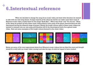
                  When we decided to change the song of our music video, we knew what direction we wanted
    to take with our new song choice. A large majority of the ideas we had for our video came from many of
    Rihanna’s music video, mostly those for the songs “Rude Boy”, “Who's that chick” and “You da one”. Many
    of the ideas we picked up from these music videos fitted in with many of the genre characteristics we had
    discovered during the research stage of project. Mainly the bright colours used in these music videos we
    wanted to interpret into our own song and therefore still fit the stereotypical look of an upbeat music
    video. Here are some examples of the bright colours featured in the music video:


    Below are some of the very inspirational shots from Rihanna's music videos that we liked the most and thought
    would fit in with both our music video concept and also the type of artist we hoped to have created:
+


2. How effective is the
combination of your main
product and ancillary texts?
+
    Digipak
    During the process of making my digipak, I changed my design around ten times. Each time I created a
    new digipak the colours often would not fit with my poster or the entire digipak itself would not reflect
    to type of artist we were looking to form. After a photo-shoot of DJ DES, I began editing some of the
    images and found that using the same editing technique for images used on both the digipak and poster
    would link them together.

    I opted for a simple colour scheme to use throughout my digipak, I believed this helped each side of the
    digipak work well together. I chose to use the same image twice on the inside of the digipak so that it
    did not look too confusing; although I chose to use an image of DJ DES between these two images to
    keep the artists identity present throughout the digipak. I thought it would be a good idea to add
    elements of the music video into my digipak also, the elements I used included the trainers DJ DES is
    wearing towards the end of the video. During our music video there are some dance sequences which
    had lyrics from the song over them, the typography used to write these lyrics is the same font which I
    used to write ‘DJ DES’ on the front cover of my digipak.

    After showing my digipak to the class for the
    first time, I received some feedback on areas
    of improvement. These included adding
    information about copyright on the back of the
    digipak cover and also, I found it difficult to
    find the copyright information I needed so I
    resulted to writing out copyright information I
    found on the back of a digipak cover, and
    changed some of the information to suit the
    record label we had chosen for DJ DES.
+
    Poster
    After looking and analysing some posters I found recurring elements throughout each of them.
    These included a major feature on the artist, some information about the record label, information
    about the release upon which the poster was based and also details on possible places where the
    single or album would be available to purchase or download.

                                              The poster was meant to go with the digi pak I designed so I used
                                              the same typography which was featured on my digi pak and I
                                              also used a similar editing technique on the image of DJ DES I
                                              used as the main focal point of my poster.

                                              After I had shown my poster to the class, I was able to gain
                                              feedback on what could possibly we added to my poster in order
                                              for it to seem more professional and for it to present all the
                                              correct information.

                                              Therefore, I took this feedback on board and added information
                                              about the album being available for download from iTunes. Also I
                                              added a box in the bottom right corner which gave information
                                              about how to follow DJ DES on Twitter and also to like the
                                              Facebook page of our artist also. These small changes added
                                              more to the poster which would be required information when
                                              publicising an artist or musician in this way.
+


3. What have you learned
from your audience
feedback?
+
    First Screening
    For our first screening our aim was to not have any gaps during
    the music video, we were able to achieve this and receive
    feedback on the majority of footage we had shot.
    Elements that need developing:
    •Bit too short
    •Clearer cuts
    •Some shots are too long
    •Writing on the mirror
    •More split screens
    •Clothing on bed sequence repeated once too many

    The elements that work:
    •Good editing
    •Good effects - could add more!
    •The dancing
    •Nice shoes and props
    •Lips
    •Animations
    •Split screens
    •Split screens when getting ready
    •Costume
    •The ballet dancing
+
    Second Screening
Our second screening of the music video, was of our final edit. After taking on board all of the feedback
we had received from the first screening of the video we changed parts of the video which we had been
recommended to change in order for the video to work better.

We had added more footage to the music video after we had to remove previous sequences which did
not work with the good footage that we already had. One of the main areas for improvement was the
‘mirror scene’ and ‘the clothes on the bed scene’. In our first filming session, we put together a shot of
DJ DES writing on a mirror with lipstick, however the lighting we had used was of a low standard and in
turn made the shot look weak. So when we discovered we needed more footage we filmed the scene of
the writing on the mirror with the lipstick again. This time we made sure the setting was bright and also
used a lipstick colour which would show up well on the mirror. As for ‘the clothes on the bed scene’ we
cut down how many time we used the sequence throughout and replaced it with either new footage or
more dance sequences.
These were the positive comments we received from the final cut of our music video:

Better/clearer    narrative

Multi   Split Screen

Works    with song

Recognisable     artist
Lip   motif throughout

Photo   animation
+
4. How did you use new
media technologies in the
construction and research,
planning and evaluation
stages?
+

Final a2 evaluation

  • 1.
    + Music Video Evaluation Presentation Daisy Westlotorn
  • 2.
    + 1. In whatways does your media product use, develop or challenge forms and conventions of real media products?
  • 3.
    + Before we began planning the initial idea of our music video, we carried out research into the codes and conventions of a music video. This codes and conventions research was focused heavily of Andrew Goodwin's Theory of music videos. Goodwin’s theory primarily focuses on six elements which can be analysed in any music video. These elements include a demonstration of genre characteristics, a relationship between the lyrics and visuals, a relationship between the music and visuals, record label demands, reference to the notion of looking and finally Intertextual references. In the music video we tried to include each code and convention when it was relevant to the genre of music we had chosen to produce a video for. As we were attempting to address each individual code and convention of a music video; we had to spend time researching typical elements of a dance video-to ensure our video itself reflected this particular genre of music.
  • 4.
    + 1.Demonstrate genre characteristics Through the research I had carried out, I had discovered that the most obvious characteristics of a ‘dance’ music video included a form of dancing performed during the video itself, cuts which followed the beat of the song-which were usually of a faster pace and an extensive use of bright colours. Throughout our music video we included various short dance sequences including tap, ballet and freestyle (as shown in the images below). From our original planning we wanted to include some style of dance in the video, we slightly changed the traditional styles of dance featured within a dance video by opting to include tap and ballet. We merged all three styles of dance by adding the same editing style for each scene-which in turn worked better for the type of video we were aiming to create. The music video screenshots also show the use of bright colours sustained throughout our video-a key feature of the genre. We purposely chose to use these vibrant colours during the dance sequence to highlight their presence, as the dance sequences were a significant feature of our music video.
  • 5.
    + 2.Relationship between lyrics and visuals The obvious relationship between lyrics and visuals in a music video was the use of a narrative reflecting the lyrics. However, our narrative was portraying the slogan of our artist-which was ‘sleep all day, party all night’. We tried to link in a relationship between lyrics and visuals by placing the lyrics themselves visually throughout the video at various dance sequences. We used a particular design of typography which we felt portrayed the style of the song itself. Originally we wanted to have an effect on the text which made it seems as if the lyrics were jumping out, although after some research we found this was impossible to do and subsequently had to abandon the idea and instead leave the text as it was. Due to this issue we faced, we had to get each word written in perfect unison with the lyrics as they were being sung so that they followed the rhythm and timing of the song. Another way we thought was a good idea of making the lyrics stand out was to use brightly coloured font against a dance sequence background which resembled a black and white sketch (as shown in the images below).
  • 6.
    + 3.Relationship between music and visuals The idea of the lips originally came from watching one of Rihanna’s music videos, where the lips were a recurring motif throughout the video. We did want to have the lips as a recurring motif throughout our music video which we seemed to have achieved in regard to the feedback we received about this particular part of the video. Although we did not want our video to resemble the music video we initially got the idea from, so we decided to use the lip footage by adding split screens which appeared on the screen at different points of entry when a new beat was introduced in the song. One of the main sequences in our music video is a multiple split screen of the same pair of feet dancing. This small shot increases in numbers as it divides on the screen and then decrease in numbers as it begins to leave the screen. As this appears and fades the music reaches a climax and then slowly as larger beats enter more small screens are removed from the overall picture. The images below show the continuing sequence giving an idea of how this part of the music video works.
  • 7.
    + 4.Record label demands “Sony Music Entertainment is a global recorded music company with a roster that includes a broad array of both local artists and international superstars. The company boasts a vast catalog that comprises some of the most important recordings in history. It is home to premier record labels representing music from every genre. Sony Music Entertainment is a wholly owned subsidiary of Sony Corporation of America.”-sonymusic.com Straight after we had chosen the artist we wanted we then had to connect them with a record label, we believed Sony BMG would be the best suited to the artist we had in mind. Sony BMG is a global company comprising of some of the most well known artists of all time, some present artists including Chris Brown, Avril Lavinge, One Direction and Foo Fighters. We had distinguished that our artist was going to have to fit into this category with an exaggerated music video showing of the music rather than the music being hidden under a complicated narrative. Sony BMG represent music from all genres of music and therefore fit perfectly with our genre of music which was Dance. Dance tracks become some of the most recognisable tracks in society therefore having such a well known platform to present our artist on would let us be more flexible with how we wanted to portray DJ DES in the current music market.
  • 8.
    +  We also used many close ups throughout the video to make our artist recognisable to the audience. Originally we wanted to keep the identity of our artist secret but found this would be very hard if we wanted to make our artist mainstream. We decided to feature a lip motif throughout the music video also, adding to the identity of the artist. By making this relationship between the lip motifs and the artist made it easier for the artist to be recognised for something different in comparison to just DJ DES’s face.
  • 9.
    + 5.Reference to notion of looking During the planning of the video never included a shot which gave reference to the notion of looking. As we gradually began editing our video and found that there were spaces which needed to be filled, we needed to film more footage. In our first filming session, we put together a shot of DJ DES writing on a mirror with lipstick, however the lighting we had used was of a low standard and in turn made the shot look weak. So when we discovered we needed more footage we filmed the scene of the writing on the mirror with the lipstick again. This time we made sure the setting was bright and also used a lipstick colour which would show up well on the mirror. The images below show the difference between the first shooting of the scene and the second shooting of the scene: The notion of looking is presented through the audience being able to see what DJ DES would be seeing in her reflection on the mirror. The red lipstick works well against the brighter background which links in with the bright colours use featured throughout the music video.
  • 10.
    + 6.Intertextual reference When we decided to change the song of our music video, we knew what direction we wanted to take with our new song choice. A large majority of the ideas we had for our video came from many of Rihanna’s music video, mostly those for the songs “Rude Boy”, “Who's that chick” and “You da one”. Many of the ideas we picked up from these music videos fitted in with many of the genre characteristics we had discovered during the research stage of project. Mainly the bright colours used in these music videos we wanted to interpret into our own song and therefore still fit the stereotypical look of an upbeat music video. Here are some examples of the bright colours featured in the music video: Below are some of the very inspirational shots from Rihanna's music videos that we liked the most and thought would fit in with both our music video concept and also the type of artist we hoped to have created:
  • 11.
    + 2. How effectiveis the combination of your main product and ancillary texts?
  • 12.
    + Digipak During the process of making my digipak, I changed my design around ten times. Each time I created a new digipak the colours often would not fit with my poster or the entire digipak itself would not reflect to type of artist we were looking to form. After a photo-shoot of DJ DES, I began editing some of the images and found that using the same editing technique for images used on both the digipak and poster would link them together. I opted for a simple colour scheme to use throughout my digipak, I believed this helped each side of the digipak work well together. I chose to use the same image twice on the inside of the digipak so that it did not look too confusing; although I chose to use an image of DJ DES between these two images to keep the artists identity present throughout the digipak. I thought it would be a good idea to add elements of the music video into my digipak also, the elements I used included the trainers DJ DES is wearing towards the end of the video. During our music video there are some dance sequences which had lyrics from the song over them, the typography used to write these lyrics is the same font which I used to write ‘DJ DES’ on the front cover of my digipak. After showing my digipak to the class for the first time, I received some feedback on areas of improvement. These included adding information about copyright on the back of the digipak cover and also, I found it difficult to find the copyright information I needed so I resulted to writing out copyright information I found on the back of a digipak cover, and changed some of the information to suit the record label we had chosen for DJ DES.
  • 13.
    + Poster After looking and analysing some posters I found recurring elements throughout each of them. These included a major feature on the artist, some information about the record label, information about the release upon which the poster was based and also details on possible places where the single or album would be available to purchase or download. The poster was meant to go with the digi pak I designed so I used the same typography which was featured on my digi pak and I also used a similar editing technique on the image of DJ DES I used as the main focal point of my poster. After I had shown my poster to the class, I was able to gain feedback on what could possibly we added to my poster in order for it to seem more professional and for it to present all the correct information. Therefore, I took this feedback on board and added information about the album being available for download from iTunes. Also I added a box in the bottom right corner which gave information about how to follow DJ DES on Twitter and also to like the Facebook page of our artist also. These small changes added more to the poster which would be required information when publicising an artist or musician in this way.
  • 14.
    + 3. What haveyou learned from your audience feedback?
  • 15.
    + First Screening For our first screening our aim was to not have any gaps during the music video, we were able to achieve this and receive feedback on the majority of footage we had shot. Elements that need developing: •Bit too short •Clearer cuts •Some shots are too long •Writing on the mirror •More split screens •Clothing on bed sequence repeated once too many The elements that work: •Good editing •Good effects - could add more! •The dancing •Nice shoes and props •Lips •Animations •Split screens •Split screens when getting ready •Costume •The ballet dancing
  • 16.
    + Second Screening Our second screening of the music video, was of our final edit. After taking on board all of the feedback we had received from the first screening of the video we changed parts of the video which we had been recommended to change in order for the video to work better. We had added more footage to the music video after we had to remove previous sequences which did not work with the good footage that we already had. One of the main areas for improvement was the ‘mirror scene’ and ‘the clothes on the bed scene’. In our first filming session, we put together a shot of DJ DES writing on a mirror with lipstick, however the lighting we had used was of a low standard and in turn made the shot look weak. So when we discovered we needed more footage we filmed the scene of the writing on the mirror with the lipstick again. This time we made sure the setting was bright and also used a lipstick colour which would show up well on the mirror. As for ‘the clothes on the bed scene’ we cut down how many time we used the sequence throughout and replaced it with either new footage or more dance sequences. These were the positive comments we received from the final cut of our music video: Better/clearer narrative Multi Split Screen Works with song Recognisable artist Lip motif throughout Photo animation
  • 17.
    + 4. How didyou use new media technologies in the construction and research, planning and evaluation stages?
  • 18.

Editor's Notes

  • #3 1. In what ways does your media product use, develop or challenge forms and conventions of real media products?
  • #4 Before we began planning the initial idea of our music video, we carried out research into the codes and conventions of a music video. This codes and conventions research was focused heavily of Andrew Goodwin's Theory of music videos. Goodwin’s theory primarily focuses on six elements which can be analysed in any music video. These elements include a demonstration of genre characteristics, a relationship between the lyrics and visuals, a relationship between the music and visuals, record label demands, reference to the notion of looking and finally Intertextual references. In the music video we tried to include each code and convention when it was relevant to the genre of music we had chosen to produce a video for. As we were attempting to address each individual code and convention of a music video; we had to spend time researching typical elements of a dance video-to ensure our video itself reflected this particular genre of music.
  • #5 Through the research I had carried out, I had discovered that the most obvious characteristics of a ‘dance’ music video included a form of dancing performed during the video itself, cuts which followed the beat of the song-which were usually of a faster pace and an extensive use of bright colours. Throughout our music video we included various short dance sequences including tap, ballet and freestyle (as shown in the images below). From our original planning we wanted to include some style of dance in the video, we slightly changed the traditional styles of dance featured within a dance video by opting to include tap and ballet. We merged all three styles of dance by adding the same editing style for each scene-which in turn worked better for the type of video we were aiming to create. The music video screenshots also show the use of bright colours sustained throughout our video-a key feature of the genre. We purposely chose to use these vibrant colours during the dance sequence to highlight their presence, as the dance sequences were a significant feature of our music video.
  • #6 The obvious relationship between lyrics and visuals in a music video was the use of a narrative reflecting the lyrics. However, our narrative was portraying the slogan of our artist-which was ‘sleep all day, party all night’. We tried to link in a relationship between lyrics and visuals by placing the lyrics themselves visually throughout the video at various dance sequences. We used a particular design of typography which we felt portrayed the style of the song itself. Originally we wanted to have an effect on the text which made it seems as if the lyrics were jumping out, although after some research we found this was impossible to do and subsequently had to abandon the idea and instead leave the text as it was. Due to this issue we faced, we had to get each word written in perfect unison with the lyrics as they were being sung so that they followed the rhythm and timing of the song. Another way we thought was a good idea of making the lyrics stand out was to use brightly coloured font against a dance sequence background which resembled a black and white sketch (as shown in the images below).
  • #7 The idea of the lips originally came from watching one of Rihanna’s music videos, where the lips were a recurring motif throughout the video. We did want to have the lips as a recurring motif throughout our music video which we seemed to have achieved in regard to the feedback we received about this particular part of the video. Although we did not want our video to resemble the music video we initially got the idea from, so we decided to use the lip footage by adding split screens which appeared on the screen at different points of entry when a new beat was introduced in the song. One of the main sequences in our music video is a multiple split screen of the same pair of feet dancing. This small shot increases in numbers as it divides on the screen and then decrease in numbers as it begins to leave the screen. As this appears and fades the music reaches a climax and then slowly as larger beats enter more small screens are removed from the overall picture. The images below show the continuing sequence giving an idea of how this part of the music video works.
  • #8 “ Sony Music Entertainment is a global recorded music company with a roster that includes a broad array of both local artists and international superstars. The company boasts a vast catalog that comprises some of the most important recordings in history. It is home to premier record labels representing music from every genre. Sony Music Entertainment is a wholly owned subsidiary of Sony Corporation of America.”-sonymusic.com Straight after we had chosen the artist we wanted we then had to connect them with a record label, we believed Sony BMG would be the best suited to the artist we had in mind. Sony BMG is a global company comprising of some of the most well known artists of all time, some present artists including Chris Brown, Avril Lavinge, One Direction and Foo Fighters. We had distinguished that our artist was going to have to fit into this category with an exaggerated music video showing of the music rather than the music being hidden under a complicated narrative. Sony BMG represent music from all genres of music and therefore fit perfectly with our genre of music which was Dance. Dance tracks become some of the most recognisable tracks in society therefore having such a well known platform to present our artist on would let us be more flexible with how we wanted to portray DJ DES in the current music market.
  • #10 During the planning of the video never included a shot which gave reference to the notion of looking. As we gradually began editing our video and found that there were spaces which needed to be filled, we needed to film more footage. In our first filming session, we put together a shot of DJ DES writing on a mirror with lipstick, however the lighting we had used was of a low standard and in turn made the shot look weak. So when we discovered we needed more footage we filmed the scene of the writing on the mirror with the lipstick again. This time we made sure the setting was bright and also used a lipstick colour which would show up well on the mirror. The images below show the difference between the first shooting of the scene and the second shooting of the scene: The notion of looking is presented through the audience being able to see what DJ DES would be seeing in her reflection on the mirror. The red lipstick works well against the brighter background which links in with the bright colours use featured throughout the music video.
  • #11 When we decided to change the song of our music video, we knew what direction we wanted to take with our new song choice. A large majority of the ideas we had for our video came from many of Rihanna’s music video, mostly those for the songs “Rude Boy”, “Who's that chick” and “You da one”. Many of the ideas we picked up from these music videos fitted in with many of the genre characteristics we had discovered during the research stage of project. Mainly the bright colours used in these music videos we wanted to interpret into our own song and therefore still fit the stereotypical look of an upbeat music video. Here are some examples of the bright colours featured in the music video: Below are some of the very inspirational shots from Rihanna's music videos that we liked the most and thought would fit in with both our music video concept and also the type of artist we hoped to have created:
  • #12 How effective is the combination of your main product and ancillary texts?
  • #13 During the process of making my digipak, I changed my design around ten times. Each time I created a new digipak the colours often would not fit with my poster or the entire digipak itself would not reflect to type of artist we were looking to form. After a photo-shoot of DJ DES, I began editing some of the images and found that using the same editing technique for images used on both the digipak and poster would link them together. I opted for a simple colour scheme to use throughout my digipak, I believed this helped each side of the digipak work well together. I chose to use the same image twice on the inside of the digipak so that it did not look too confusing; although I chose to use an image of DJ DES between these two images to keep the artists identity present throughout the digipak. I thought it would be a good idea to add elements of the music video into my digipak also, the elements I used included the trainers DJ DES is wearing towards the end of the video. During our music video there are some dance sequences which had lyrics from the song over them, the typography used to write these lyrics is the same font which I used to write ‘DJ DES’ on the front cover of my digipak. After showing my digipak to the class for the first time, I received some feedback on areas of improvement. These included adding information about copyright on the back of the digipak cover and also, I found it difficult to find the copyright information I needed so I resulted to writing out copyright information I found on the back of a digipak cover, and changed some of the information to suit the record label we had chosen for DJ DES.
  • #14 After looking and analysing some posters I found recurring elements throughout each of them. These included a major feature on the artist, some information about the record label, information about the release upon which the poster was based and also details on possible places where the single or album would be available to purchase or download. The poster was meant to go with the digi pak I designed so I used the same typography which was featured on my digi pak and I also used a similar editing technique on the image of DJ DES I used as the main focal point of my poster. After I had shown my poster to the class, I was able to gain feedback on what could possibly we added to my poster in order for it to seem more professional and for it to present all the correct information. Therefore, I took this feedback on board and added information about the album being available for download from iTunes. Also I added a box in the bottom right corner which gave information about how to follow DJ DES on Twitter and also to like the Facebook page of our artist also. These small changes added more to the poster which would be required information when publicising an artist or musician in this way.
  • #16 For our first screening our aim was to not have any gaps during the music video, we were able to achieve this and receive feedback on the majority of footage we had shot. Elements that need developing: Bit too short Clearer cuts Some shots are too long Writing on the mirror More split screens Clothing on bed sequence repeated once too many The elements that work: Good editing Good effects - could add more! The dancing Nice shoes and props Lips Animations Split screens Split screens when getting ready Costume The ballet dancing
  • #17 Our second screening of the music video, was of our final edit. After taking on board all of the feedback we had received from the first screening of the video we changed parts of the video which we had been recommended to change in order for the video to work better. We had added more footage to the music video after we had to remove previous sequences which did not work with the good footage that we already had. One of the main areas for improvement was the ‘mirror scene’ and ‘the clothes on the bed scene’. In our first filming session, we put together a shot of DJ DES writing on a mirror with lipstick, however the lighting we had used was of a low standard and in turn made the shot look weak. So when we discovered we needed more footage we filmed the scene of the writing on the mirror with the lipstick again. This time we made sure the setting was bright and also used a lipstick colour which would show up well on the mirror. As for ‘the clothes on the bed scene’ we cut down how many time we used the sequence throughout and replaced it with either new footage or more dance sequences. These were the positive comments we received from the final cut of our music video: Better/clearer narrative Multi Split Screen Works with song Recognisable artist Lip motif throughout Photo animation
  • #18 . How did you use new media technologies in the construction and research, planning and evaluation stages?