What is BusinessAnalytics
Definition – study of business data using statistical techniques and
programming for creating decision support and insights for achieving
business goals
Predictive- To predict the future.
Descriptive- To describe the past.
4.
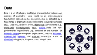
Data
Data is aset of values of qualitative or quantitative variables. An
example of qualitative data would be an anthropologist's
handwritten notes about her interviews. data is collected by a
huge range of organizations and institutions, including businesses
(e.g., sales data, revenue, profits, stock price), governments (e.g.,
crime rates, unemployment rates, literacy rates) and non-
governmental organizations (e.g., censuses of the number of
homeless people by non-profit organizations). Data is measured,
collected and reported, and analyzed, whereupon it can be
visualized using graphs, images or other analysis tools.
5.
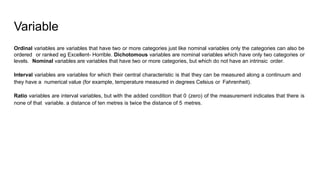
Variable
Ordinal variables arevariables that have two or more categories just like nominal variables only the categories can also be
ordered or ranked eg Excellent- Horrible. Dichotomous variables are nominal variables which have only two categories or
levels. Nominal variables are variables that have two or more categories, but which do not have an intrinsic order.
Interval variables are variables for which their central characteristic is that they can be measured along a continuum and
they have a numerical value (for example, temperature measured in degrees Celsius or Fahrenheit).
Ratio variables are interval variables, but with the added condition that 0 (zero) of the measurement indicates that there is
none of that variable. a distance of ten metres is twice the distance of 5 metres.
6.
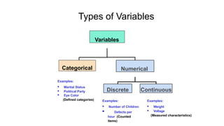
Types of Variables
Variables
CategoricalNumerical
Discrete Continuous
Examples:
Marital Status
Political Party
Eye Color
(Defined categories) Examples:
Number of Children
Defects per
hour (Counted
items)
Examples:
Weight
Voltage
(Measured characteristics)
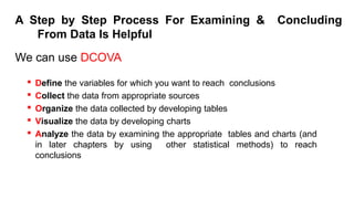
A Step byStep Process For Examining & Concluding
From Data Is Helpful
We can use DCOVA
Define the variables for which you want to reach conclusions
Collect the data from appropriate sources
Organize the data collected by developing tables
Visualize the data by developing charts
Analyze the data by examining the appropriate tables and charts (and
in later chapters by using other statistical methods) to reach
conclusions
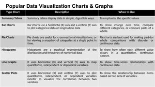
9.
Popular Data VisualizationCharts & Graphs
Type Chart Description When to Use
Summary Tables Summary tables display data in simple, digestible ways. To emphasize the specific values
Bar Charts Bar charts use a horizontal (X) axis and a vertical (Y) axis
to plot categorical data or longitudinal data
To show change over time, compare
different categories, or compare parts of a
whole.
Pie Charts Pie charts are useful for cross-sectional visualizations, or
for viewing a snapshot of categories at a single point in
time.
Pie charts are best used for making part-to-
whole comparisons with discrete or
continuous data.
Histograms Histograms are a graphical representation of the
distribution and frequency of numerical data
To show how often each different value
occurs in a quantitative, continuous
dataset.
Line Graphs It uses horizontal (X) and vertical (Y) axes to map
quantitative, independent or dependent variables.
To show time-series relationships with
continuous data.
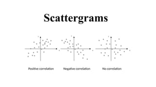
Scatter Plots It uses horizontal (X) and vertical (Y) axes to plot
quantitative, independent, or dependent variables
inorder to visualize the correlation between two
variables
To show the relationship between items
based on two sets of variables.
10.
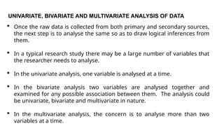
UNIVARIATE, BIVARIATE ANDMULTIVARIATE ANALYSIS OF DATA
Once the raw data is collected from both primary and secondary sources,
the next step is to analyse the same so as to draw logical inferences from
them.
In a typical research study there may be a large number of variables that
the researcher needs to analyse.
In the univariate analysis, one variable is analysed at a time.
In the bivariate analysis two variables are analysed together and
examined for any possible association between them. The analysis could
be univariate, bivariate and multivariate in nature.
In the multivariate analysis, the concern is to analyse more than two
variables at a time.
11.
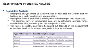
DESCRIPTIVE VS INFERENTIALANALYSIS
Descriptive Analysis
Descriptive analysis refers to transformation of raw data into a form that will
facilitate easy understanding and interpretation.
Descriptive analysis deals with summary measures relating to the sample data.
The common ways of summarizing data are by calculating average, range,
standard deviation, frequency and percentage distribution.
The type of descriptive analysis to be carried out depends on the measurement
of variables into four forms—nominal, ordinal, interval and ratio.
12.
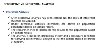
DESCRIPTIVE VS INFERENTIALANALYSIS
Inferential Analysis
After descriptive analysis has been carried out, the tools of inferential
statistics are applied.
Under inferential statistics, inferences are drawn on population
parameters based on sample results.
The researcher tries to generalize the results to the population based
on sample results.
The analysis is based on probability theory and a necessary condition
for carrying out inferential analysis is that the sample should be drawn
at random.
13.
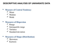
DESCRIPTIVE ANALYSIS OFUNIVARIATE DATA
Measure of Central Tendency
Mean
Median
Mode
Measures of Dispersion
Range
Interquartile range
Variance
Standard deviation
Measures of Shape (Distribution)
Skewness
Kurtosis
14.
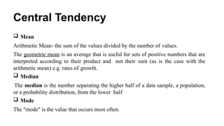
Central Tendency
Mean
ArithmeticMean- the sum of the values divided by the number of values.
The geometric mean is an average that is useful for sets of positive numbers that are
interpreted according to their product and not their sum (as is the case with the
arithmetic mean) e.g. rates of growth.
Median
The median is the number separating the higher half of a data sample, a population,
or a probability distribution, from the lower half
Mode
The "mode" is the value that occurs most often.
15.
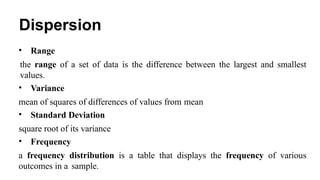
Dispersion
• Range
the rangeof a set of data is the difference between the largest and smallest
values.
• Variance
mean of squares of differences of values from mean
• Standard Deviation
square root of its variance
• Frequency
a frequency distribution is a table that displays the frequency of various
outcomes in a sample.
16.
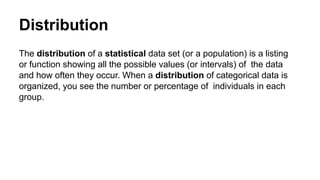
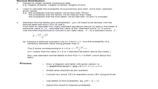
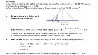
Distribution
The distribution ofa statistical data set (or a population) is a listing
or function showing all the possible values (or intervals) of the data
and how often they occur. When a distribution of categorical data is
organized, you see the number or percentage of individuals in each
group.
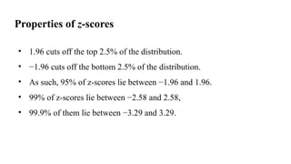
Properties of z-scores
•1.96 cuts off the top 2.5% of the distribution.
• −1.96 cuts off the bottom 2.5% of the distribution.
• As such, 95% of z-scores lie between −1.96 and 1.96.
• 99% of z-scores lie between −2.58 and 2.58,
• 99.9% of them lie between −3.29 and 3.29.
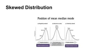
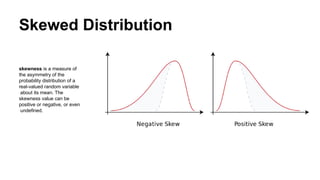
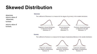
Skewed Distribution
skewness isa measure of
the asymmetry of the
probability distribution of a
real-valued random variable
about its mean. The
skewness value can be
positive or negative, or even
undefined.
23.
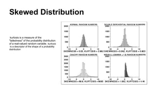
Skewed Distribution
kurtosis isa measure of the
"tailedness" of the probability distribution
of a real-valued random variable. kurtosis
is a descriptor of the shape of a probability
distribution
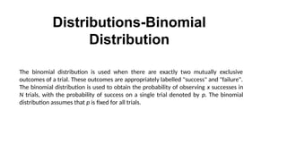
Distributions-Binomial
Distribution
The binomial distributionis used when there are exactly two mutually exclusive
outcomes of a trial. These outcomes are appropriately labelled "success" and "failure".
The binomial distribution is used to obtain the probability of observing x successes in
N trials, with the probability of success on a single trial denoted by p. The binomial
distribution assumes that p is fixed for all trials.
28.
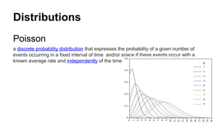
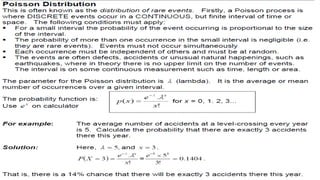
Distributions
Poisson
a discrete probabilitydistribution that expresses the probability of a given number of
events occurring in a fixed interval of time and/or space if these events occur with a
known average rate and independently of the time since the last event
30.
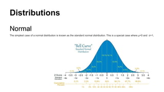
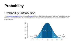
Probability
Probability Distribution
The probabilitydensity function (pdf) of the normal distribution, also called Gaussian or "bell curve", the most important
continuous random distribution. As notated on the figure, the probabilities of intervals of values correspond to the area
under the curve.
31.
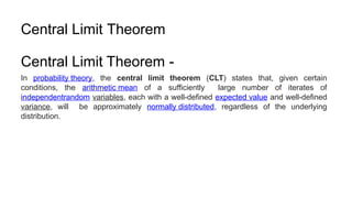
Central Limit Theorem
CentralLimit Theorem -
In probability theory, the central limit theorem (CLT) states that, given certain
conditions, the arithmetic mean of a sufficiently large number of iterates of
independentrandom variables, each with a well-defined expected value and well-defined
variance, will be approximately normally distributed, regardless of the underlying
distribution.
32.
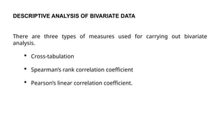
DESCRIPTIVE ANALYSIS OFBIVARIATE DATA
There are three types of measures used for carrying out bivariate
analysis.
Cross-tabulation
Spearman’s rank correlation coefficient
Pearson’s linear correlation coefficient.
33.
Cross-Tabulation
While a frequencydistribution describes one variable at a time, a cross-
tabulation describes two or more variables simultaneously.
Cross-tabulation results in tables that reflect the joint distribution of two or
more variables with a limited number of categories or distinct values
34.
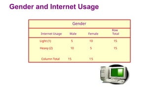
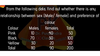
Gender and InternetUsage
Gender
Row
Internet Usage Male Female Total
Light (1) 5 10 15
Heavy (2) 10 5 15
Column Total 15 15
35.
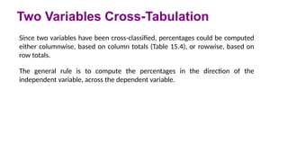
Two Variables Cross-Tabulation
Sincetwo variables have been cross-classified, percentages could be computed
either columnwise, based on column totals (Table 15.4), or rowwise, based on
row totals.
The general rule is to compute the percentages in the direction of the
independent variable, across the dependent variable.
36.
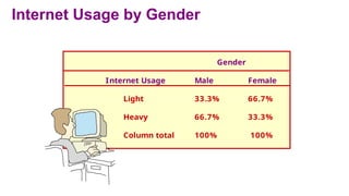
Internet Usage byGender
Gender
Internet Usage Male Female
Light 33.3% 66.7%
Heavy 66.7% 33.3%
Column total 100% 100%
37.
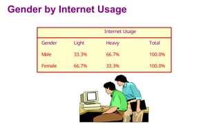
Gender by InternetUsage
Internet Usage
Gender Light Heavy Total
Male 33.3% 66.7% 100.0%
Female 66.7% 33.3% 100.0%
38.
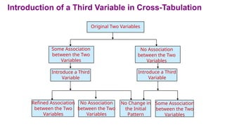
Introduction of aThird Variable in Cross-Tabulation
Refined Association
between the Two
Variables
No Association
between the Two
Variables
No Change in
the Initial
Pattern
Some Association
between the Two
Variables
Some Association
between the Two
Variables
No Association
between the Two
Variables
Introduce a Third
Variable
Introduce a Third
Variable
Original Two Variables
39.
As shown inFigure , the introduction of a third variable can result in four possibilities:
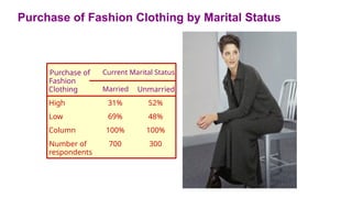
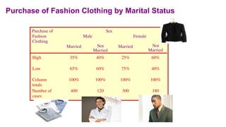
As can be seen from Table 52% of unmarried respondents fell in the high-purchase category, as opposed
to 31% of the married respondents.
Before concluding that unmarried respondents purchase more fashion clothing than those who are
married, a third variable, the buyer's sex, was introduced into the analysis.
As shown in Table, in the case of females, 60% of the unmarried fall in the high-purchase category, as
compared to 25% of those who are married. On the other hand, the percentages are much closer for
males, with 40% of the unmarried and 35% of the married falling in the high purchase category.
Hence, the introduction of sex (third variable) has refined the relationship between marital status and
purchase of fashion clothing (original variables). Unmarried respondents are more likely to fall in the
high purchase category than married ones, and this effect is much more pronounced for females than
for males.
Three Variables Cross-Tabulation
Refine an Initial Relationship
40.
Purchase of FashionClothing by Marital Status
Purchase of
Fashion
Current Marital Status
Clothing Married Unmarried
High 31% 52%
Low 69% 48%
Column 100% 100%
Number of
respondents
700 300
41.
Purchase of FashionClothing by Marital Status
Purchase of
Fashion
Clothing
Sex
Male Female
Married Not
Married
Married Not
Married
High 35% 40% 25% 60%
Low 65% 60% 75% 40%
Column
totals
100% 100% 100% 100%
Number of
cases
400 120 300 180
42.
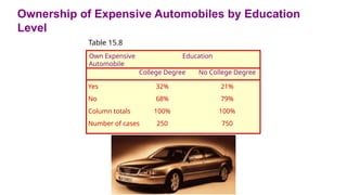
Table 15.8shows that 32% of those with college degrees own an expensive automobile, as
compared to 21% of those without college degrees. Realizing that income may also be a
factor, the researcher decided to reexamine the relationship between education and
ownership of expensive automobiles in light of income level.
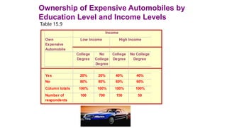
In Table 15.9, the percentages of those with and without college degrees who own
expensive automobiles are the same for each of the income groups. When the data for
the high income and low income groups are examined separately, the association between
education and ownership of expensive automobiles disappears, indicating that the initial
relationship observed between these two variables was spurious.
Three Variables Cross-Tabulation
Initial Relationship was Spurious
43.
Ownership of ExpensiveAutomobiles by Education
Level
Table 15.8
Own Expensive
Automobile
Education
College Degree No College Degree
Yes
No
Column totals
Number of cases
32%
68%
100%
250
21%
79%
100%
750
44.
Ownership of ExpensiveAutomobiles by
Education Level and Income Levels
Table 15.9
Own
Expensive
Automobile
College
Degree
No
College
Degree
College
Degree
No College
Degree
Yes 20% 20% 40% 40%
No 80% 80% 60% 60%
Column totals 100% 100% 100% 100%
Number of
respondents
100 700 150 50
Low Income High Income
Income
45.
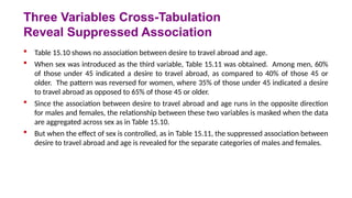
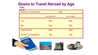
Table 15.10shows no association between desire to travel abroad and age.
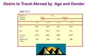
When sex was introduced as the third variable, Table 15.11 was obtained. Among men, 60%
of those under 45 indicated a desire to travel abroad, as compared to 40% of those 45 or
older. The pattern was reversed for women, where 35% of those under 45 indicated a desire
to travel abroad as opposed to 65% of those 45 or older.
Since the association between desire to travel abroad and age runs in the opposite direction
for males and females, the relationship between these two variables is masked when the data
are aggregated across sex as in Table 15.10.
But when the effect of sex is controlled, as in Table 15.11, the suppressed association between
desire to travel abroad and age is revealed for the separate categories of males and females.
Three Variables Cross-Tabulation
Reveal Suppressed Association
46.
Desire to TravelAbroad by Age
Table
15.10
Desire to Travel Abroad Age
Less than 45 45 or More
Yes 50% 50%
No 50% 50%
Column totals 100% 100%
Number of respondents 500 500
47.
Desire to TravelAbroad by Age and Gender
Table 15.11
Desire to
Travel
Abroad
Sex
Male
Age
Female
Age
< 45 >=45 <45 >=45
Yes 60% 40% 35% 65%
No 40% 60% 65% 35%
Column
totals
100% 100% 100% 100%
Number of
Cases
300 300 200 200
48.
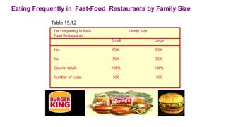
Consider the cross-tabulationof family size and the tendency to eat out frequently in
fast-food restaurants as shown in Table 15.12. No association is observed.
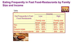
When income was introduced as a third variable in the analysis, Table 15.13 was
obtained. Again, no association was observed.
Three Variables Cross-Tabulations
No Change in Initial Relationship
49.
Eating Frequently inFast-Food Restaurants by Family Size
Table 15.12
Eat Frequently in Fast-
Food Restaurants
Family Size
Small Large
Yes 65% 65%
No 35% 35%
Column totals 100% 100%
Number of cases 500 500
50.
Eating Frequently inFast Food-Restaurants by Family
Size and Income
Table
15.13
Small Large Small Large
Yes 65% 65% 65% 65%
No 35% 35% 35% 35%
Column totals 100% 100% 100% 100%
Number of respondents 250 250 250 250
Income
Eat Frequently in Fast-
Food Restaurants
Family size Family size
Low High
51.
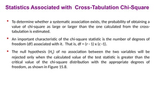
To determinewhether a systematic association exists, the probability of obtaining a
value of chi-square as large or larger than the one calculated from the cross-
tabulation is estimated.
An important characteristic of the chi-square statistic is the number of degrees of
freedom (df) associated with it. That is, df = (r - 1) x (c -1).
The null hypothesis (H0) of no association between the two variables will be
rejected only when the calculated value of the test statistic is greater than the
critical value of the chi-square distribution with the appropriate degrees of
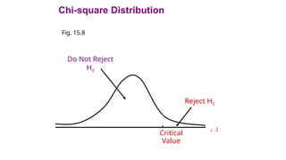
freedom, as shown in Figure 15.8.
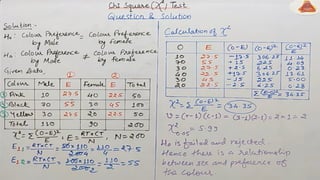
Statistics Associated with Cross-Tabulation Chi-Square
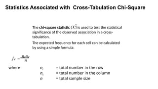
Statistics Associated withCross-Tabulation Chi-Square
The chi-square statistic ( ) is used to test the statistical
significance of the observed association in a cross-
tabulation.
The expected frequency for each cell can be calculated
by using a simple formula:
c2
fe =
nrnc
n
where nr = total number in the row
nc = total number in the column
n = total sample size
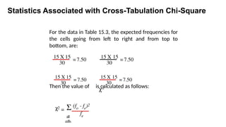
54.
For the datain Table 15.3, the expected frequencies for
the cells going from left to right and from top to
bottom, are:
Then the value of is calculated as follows:
Statistics Associated with Cross-Tabulation Chi-Square
15 X 15
30
=7.50 15 X 15
30
= 7.50
15 X 15
30
= 7.50
15 X 15
30
= 7.50
c2
=
(fo - fe)2
fe
S
all
cells
c2
55.
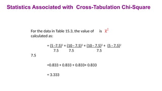
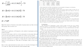
For the datain Table 15.3, the value of is
calculated as:
= (5 -7.5)2
+ (10 - 7.5)2
+ (10 - 7.5)2
+ (5 - 7.5)2
7.5 7.5 7.5
7.5
=0.833 + 0.833 + 0.833+ 0.833
= 3.333
c2
Statistics Associated with Cross-Tabulation Chi-Square
56.
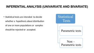
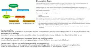
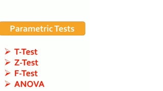
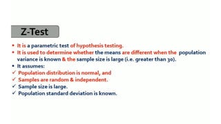
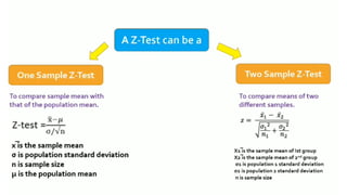
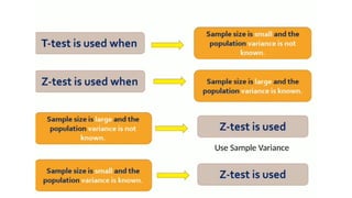
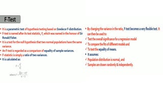
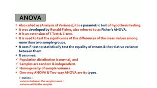
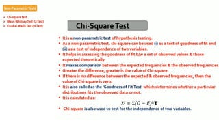
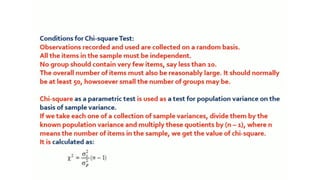
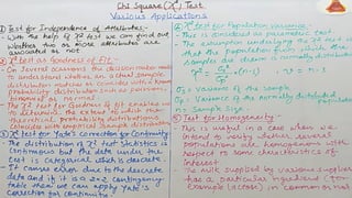
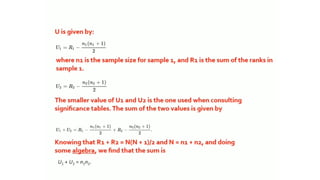
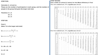
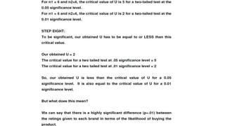
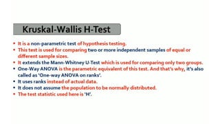
INFERENTIAL ANALYSIS (UNIVARIATEAND BIVARIATE)
• Statistical tests are intended to decide
whether a hypothesis about distribution
of one or more populations or samples
should be rejected or accepted.
Statistical
Tests
Parametric tests
Non –
Parametric tests
57.
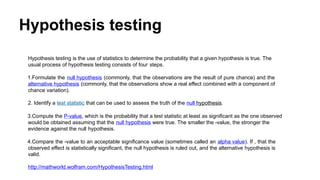
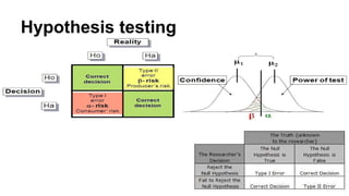
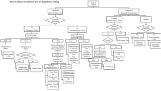
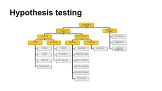
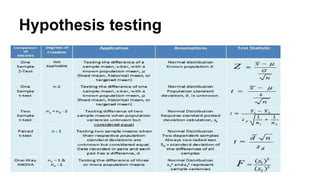
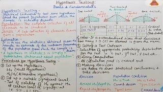
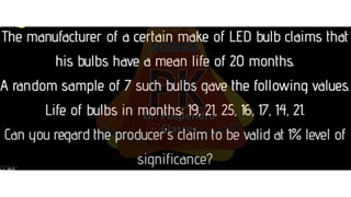
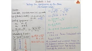
Hypothesis testing
Hypothesis testingis the use of statistics to determine the probability that a given hypothesis is true. The
usual process of hypothesis testing consists of four steps.
1.Formulate the null hypothesis (commonly, that the observations are the result of pure chance) and the
alternative hypothesis (commonly, that the observations show a real effect combined with a component of
chance variation).
2. Identify a test statistic that can be used to assess the truth of the null hypothesis.
3.Compute the P-value, which is the probability that a test statistic at least as significant as the one observed
would be obtained assuming that the null hypothesis were true. The smaller the -value, the stronger the
evidence against the null hypothesis.
4.Compare the -value to an acceptable significance value (sometimes called an alpha value). If , that the
observed effect is statistically significant, the null hypothesis is ruled out, and the alternative hypothesis is
valid.
http://mathworld.wolfram.com/HypothesisTesting.html
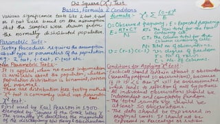
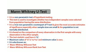
Non-parametric Tests
In Non-Parametrictests, we don’t make any assumption about the parameters for the given population or the population we are studying. In fact, these tests
don’t depend on the population.
Hence, there is no fixed set of parameters is available, and also there is no distribution (normal distribution, etc.) of any kind is available for use.
This is also the reason that nonparametric tests are also referred to as distribution-free tests.
In modern days, Non-parametric tests are gaining popularity and an impact of influence some reasons behind this fame is –
The main reason is that there is no need to be mannered while using parametric tests.
The second reason is that we do not require to make assumptions about the population given (or taken) on which we are doing the analysis.
Most of the nonparametric tests available are very easy to apply and to understand also i.e. the complexity is very low.
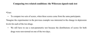
Comparing two relatedconditions: the Wilcoxon signed-rank test
•Uses:
– To compare two sets of scores, when these scores come from the same participants.
•Imagine the experimenter in the previous example was interested in the change in depression
levels for each of the two drugs.
– We still have to use a non-parametric test because the distributions of scores for both
drugs were non-normal on one of the two days.
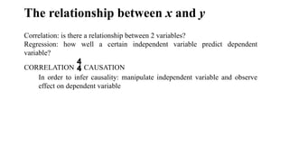
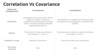
The relationship betweenx and y
Correlation: is there a relationship between 2 variables?
Regression: how well a certain independent variable predict dependent
variable?
CORRELATION CAUSATION
In order to infer causality: manipulate independent variable and observe
effect on dependent variable
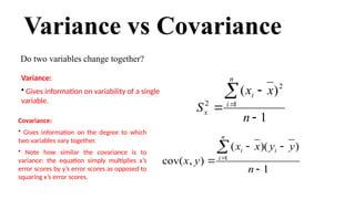
Variance vs Covariance
Dotwo variables change together?
1
)
)(
(
)
,
cov( 1
n
y
y
x
x
y
x
i
n
i
i
Covariance:
• Gives information on the degree to which
two variables vary together.
• Note how similar the covariance is to
variance: the equation simply multiplies x’s
error scores by y’s error scores as opposed to
squaring x’s error scores.
1
)
( 2
1
2
n
x
x
S
n
i
i
x
Variance:
• Gives information on variability of a single
variable.
115.
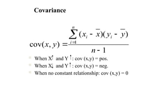
Covariance
When Xand Y : cov (x,y) = pos.
When X and Y : cov (x,y) = neg.
When no constant relationship: cov (x,y) = 0
1
)
)(
(
)
,
cov( 1
n
y
y
x
x
y
x
i
n
i
i
116.
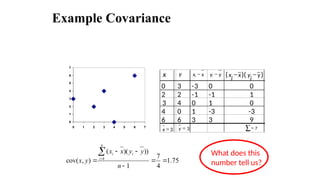
Example Covariance
x yx
xi - y
yi - ( x
i
x - )( y
i
y - )
0 3 -3 0 0
2 2 -1 -1 1
3 4 0 1 0
4 0 1 -3 -3
6 6 3 3 9
3
=
x 3
=
y å= 7
75
.
1
4
7
1
))
)(
(
)
,
cov( 1
n
y
y
x
x
y
x
i
n
i
i What does this
number tell us?
0
1
2
3
4
5
6
7
0 1 2 3 4 5 6 7
117.
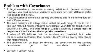
Problem with Covariance:
A large covariance can mean a strong relationship between variables.
However, you can’t compare variances over data sets with different scales
(like pounds and inches).
A weak covariance in one data set may be a strong one in a different data set
with different scales.
The main problem with interpretation is that the wide range of results that it
takes on makes it hard to interpret. For example, your data set could return a
value of 3, or 3,000. This wide range of values is cause by a simple fact; The
larger the X and Y values, the larger the covariance.
A value of 300 tells us that the variables are correlated, but unlike
the correlation coefficient, that number doesn’t tell us exactly how strong
that relationship is.
The problem can be fixed by dividing the covariance by the standard
deviation to get the correlation coefficient.
Corr(X,Y) = Cov(X,Y) / σ σ
118.
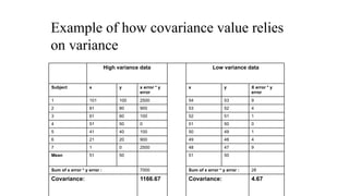
Example of howcovariance value relies
on variance
High variance data Low variance data
Subject x y x error * y
error
x y X error * y
error
1 101 100 2500 54 53 9
2 81 80 900 53 52 4
3 61 60 100 52 51 1
4 51 50 0 51 50 0
5 41 40 100 50 49 1
6 21 20 900 49 48 4
7 1 0 2500 48 47 9
Mean 51 50 51 50
Sum of x error * y error : 7000 Sum of x error * y error : 28
Covariance: 1166.67 Covariance: 4.67
119.
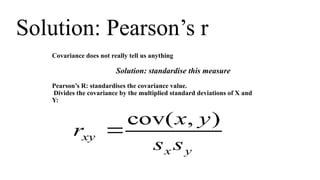
Solution: Pearson’s r
Covariancedoes not really tell us anything
Solution: standardise this measure
Pearson’s R: standardises the covariance value.
Divides the covariance by the multiplied standard deviations of X and
Y:
y
x
xy
s
s
y
x
r
)
,
cov(
120.
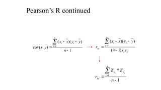
Pearson’s R continued
1
)
)(
(
)
,
cov(1
n
y
y
x
x
y
x
i
n
i
i
y
x
i
n
i
i
xy
s
s
n
y
y
x
x
r
)
1
(
)
)(
(
1
1
*
1
n
Z
Z
r
n
i
y
x
xy
i
i
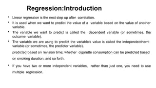
Regression:Introduction
• Linear regressionis the next step up after correlation.
• It is used when we want to predict the value of a variable based on the value of another
variable.
• The variable we want to predict is called the dependent variable (or sometimes, the
outcome variable).
• The variable we are using to predict the variable's value is called the independeothernt
variable (or sometimes, the predictor variable).
predicted based on revision time; whether cigarette consumption can be predicted based
on smoking duration; and so forth.
• If you have two or more independent variables, rather than just one, you need to use
multiple regression.
123.
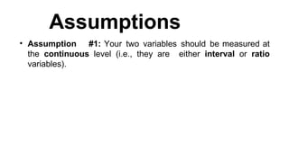
Assumptions
• Assumption #1:Your two variables should be measured at
the continuous level (i.e., they are either interval or ratio
variables).
124.
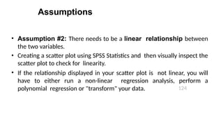
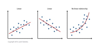
Assumptions
124
• Assumption #2:There needs to be a linear relationship between
the two variables.
• Creating a scatter plot using SPSS Statistics and then visually inspect the
scatter plot to check for linearity.
• If the relationship displayed in your scatter plot is not linear, you will
have to either run a non-linear regression analysis, perform a
polynomial regression or "transform" your data.
126.
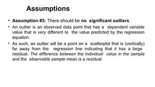
Assumptions
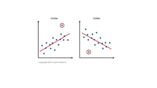
• Assumption #3:There should be no significant outliers.
• An outlier is an observed data point that has a dependent variable
value that is very different to the value predicted by the regression
equation.
• As such, an outlier will be a point on a scatterplot that is (vertically)
far away from the regression line indicating that it has a large
residual. The difference between the individual value in the sample
and the observable sample mean is a residual.
127.
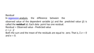
Residual
In regression analysis,the difference between the
observed value of the dependent variable (y) and the predicted value (ŷ) is
called the residual (e). Each data point has one residual.
Residual = Observed value - Predicted value
e = y - ŷ
Both the sum and the mean of the residuals are equal to zero. That is, Σ e = 0
and e = 0.
129.
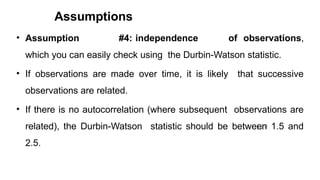
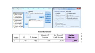
Assumptions
129
• Assumption #4:independence of observations,
which you can easily check using the Durbin-Watson statistic.
• If observations are made over time, it is likely that successive
observations are related.
• If there is no autocorrelation (where subsequent observations are
related), the Durbin-Watson statistic should be between 1.5 and
2.5.
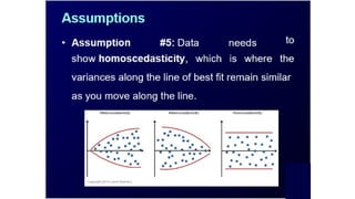
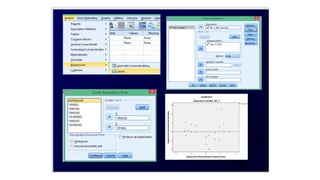
Assumptions
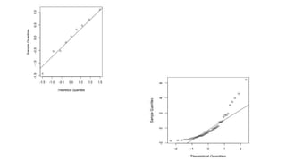
133
• Assumption #6:Finally, residuals (errors) of
the regression line are approximately normally
distributed
• Two common methods to check this assumption
include using either a histogram (with a
superimposed normal curve) or a Normal P-P
Plot.
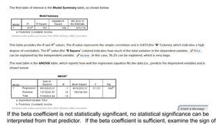
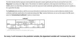
If the betacoefficient is not statistically significant, no statistical significance can be
interpreted from that predictor. If the beta coefficient is sufficient, examine the sign of
If the beta coefficient is not statistically significant, no statistical significance can be
interpreted from that predictor. If the beta coefficient is sufficient, examine the sign of
138.
19
for every 1-unitincrease in the predictor variable, the dependent variable will increase by the unst


![[DSC Europe 25] Gordana Milutinovic Dumbelovic - From Insight to Oversight: A...](https://cdn.slidesharecdn.com/ss_thumbnails/t7dkjsfxqwwzceropjv4-gordana-milutinovicdumbelovic-from-insight-to-oversight-ai-driven-power-bi-moni-260119121559-9e0bf11b-thumbnail.jpg?width=640&height=640&fit=bounds)


![[DSC Europe 25] Milovan Jovicic - Beyond AI's Reach: The Enduring Value of Ev...](https://cdn.slidesharecdn.com/ss_thumbnails/pyeij0hurgwq5jugmtnv-2-milovan-jovicic-beyond-ais-reach-the-enduring-value-of-evergreen-design-v2-260120105856-d6ee57e5-thumbnail.jpg?width=640&height=640&fit=bounds)
![[DSC Europe 25] Harshvardhan Jain - From Pre-Trained to Purpose-Built: Fine-T...](https://cdn.slidesharecdn.com/ss_thumbnails/zru4zmiseku5tgvu2dgw-harshvardhan-jain-from-pre-trained-to-purpose-built-fine-tuning-llms-for-high-i-260119101520-8335585f-thumbnail.jpg?width=640&height=640&fit=bounds)

![[DSC Europe 25] Laila Kakar - Leveraging AI for Strategic Excellence: Enhanci...](https://cdn.slidesharecdn.com/ss_thumbnails/eykmhrtsqmaaftwkexh7-dsc-lailakakar-1-260119101520-5f3b5616-thumbnail.jpg?width=640&height=640&fit=bounds)
![[DSC Europe 25] Jovan Sumarac - Real-World Applications of Computer Vision in...](https://cdn.slidesharecdn.com/ss_thumbnails/fiksms22smcpopvvld03-jovan-sumarac-real-life-applications-of-computer-vision-in-automotive-systems-260120105855-de622abb-thumbnail.jpg?width=640&height=640&fit=bounds)

![[DSC Europe 25] Josip Saban - Career building for data professionals.pptx](https://cdn.slidesharecdn.com/ss_thumbnails/zroflcttkm1vmli0txea-josip-saban-career-building-for-data-professionals-260123083019-587cdb8c-thumbnail.jpg?width=640&height=640&fit=bounds)


![[DSC Europe 25] Milos Belcevic - Product Professional's Journey to Full-Stack...](https://cdn.slidesharecdn.com/ss_thumbnails/1zovd6fgsycdg4wvgvls-milos-belcevic-product-professionals-journey-to-full-stack-product-developer-260123083019-d993120d-thumbnail.jpg?width=640&height=640&fit=bounds)