1. Feedback on my first draft of my
contents page!
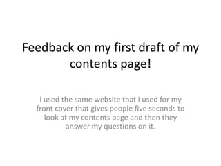
I used the same website that I used for my
front cover that gives people five seconds to
look at my contents page and then they
answer my questions on it.
2. This is the image
they were
Given five seconds
to look at
Before answering
my questions
3. Do you like the colour scheme?
• Yes, I like that it is consistent
• Yes
• Too much white space, the middle picture on the bottom three does not match the rest
• Yes
• Not Really
• Yes
• Yes I did
• I like the colors you have chosen but maybe add a wider variety of colors, this will make it a bit more interesting.
• It’s alright, bit dull
• Yes
• Yes
• Yes
• It’s OK
• Yeah!
• Yes
• Yes
• Sure
• Yeah I did
• Boring
• The colors are fine when they are used right
• No, it’s hard to distinguish whats important
4. Does the layout look good? Should
anything be changed/ moved?
• I like the the boxy, organised feel to it
• I think the layout is very clear and readable. I really like it.
• Less white space!
• I like the layout, it’s all colour coordinated and matches the girls shirt.
• Maybe make it slightly less formal, more messy and fun
• Maybe make the photo a tad bigger
• I like the layout – the only think I would say is put some boarders around the
pictures
• It’s too block-y and plain
• I like it how it is
• It’s a lot of info at once
• It looks good how it is
• I think it was too much text
• Yes, couldn’t find anything wrong with the design and layout.
• It’s dense
• Yes, I like the whole design
5. Does the font look good?
• Yes, I think it suits Indie well
• Yes, definitely shows an indie folk genre
• Looks good
• Yes
• It’s okay
• Simple, yet effective
• Yes
• I really like the font
• Bit too small
• Yes
• Yes, I love it
• Yes
• I didn’t like it. Too childish
• Sure, I haven’t seen it before so it would be eye catching
• Yes
• I like it for the topic
• I’m not a bit fan
• It’s a bit difficult to read
• No
• It’s alright
• Yes, for the main body, but I would change the headers to stand out more.
6. Any feedback? How can I improve?
• I don’t think so
• Nope
• Less white space
• Maybe bold out some important parts
• Make it more interesting, different colours, not too playful but more
messy
• It looks great
• More colours
• Spread the info out. Place pictures between blocks of writing to split it up
• Less text
• Trim down the text
• Cleaner, less sloppy and more readable
• Put the most important info at the top