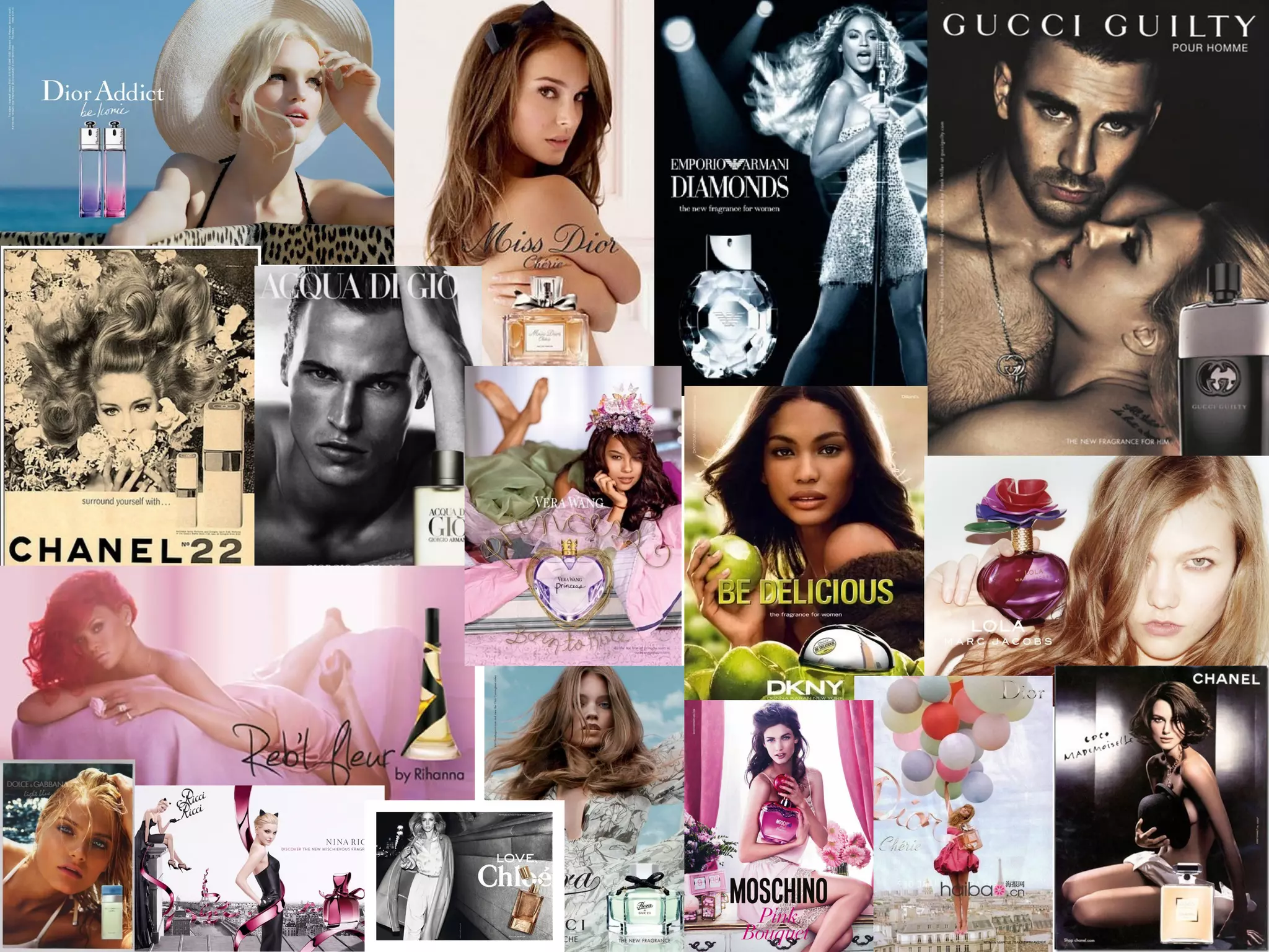
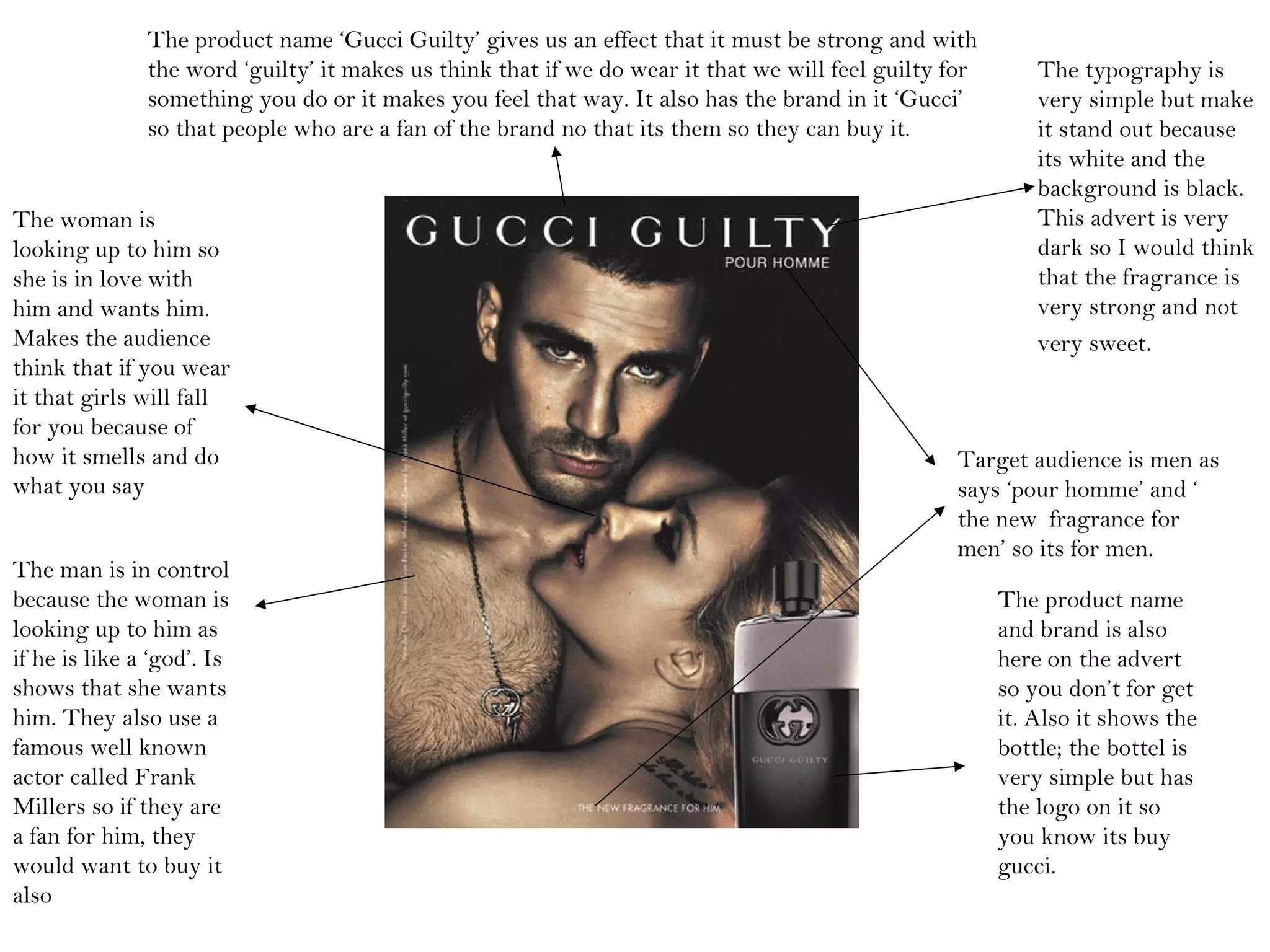
• I have chosen these adverts because the
majority of them contain strong beautiful
women; some of which are celebrities. Also I feel
they promote a glamorous lifestyle because they
are all pictured doing exceptional and exciting
activities i.e. performing on stage, lying on a
chaise lounge or walking on roof tops.
• The three image that really stick out are the
ones in black and white and also sepia; I feel it
really gives them a film noir allure and an old
time glamour.
This bottle looks like a diamond
or some kind of expensive
jewellery so it makes us think if it
looks expensive it would have to
smell expensive and rich and want
us to fell like it.
This bottle is in the shape as
Nicki Minaj so this is manly
for her fans but if you didn’t
know her you would think it
is very unique and different
and for girls because of the
pink.
This bottle is a normal bottle but
with flowers on the top to tell us
that the smell would be sweet and
smell of flowers. Also fits the name
of ‘daisy’ so its very girls but the
bottle is very simple but with a
different lid to make it stand out.
The typography is very simple
and stylish but at the same time
it stands out. I think this
typography is very girly and
classic so it wouldn’t be for
young girls more of the younger
adults.
You cant really see what she
is wearing but you assume its
something very summery
because of the summer hat
and the sea in the
background so you think that
the perfume is not very
strong and would be very
summery.
Daphne Groeneveld looks
very chilled and relaxed
like she don’t care about
anything so it makes you
think that if you wear this
fragrance that you will
forget about everything
and just make you feel
beautiful and wouldn’t
care about anything.
The target audience must be for
girls/woman because of the
colours of the bottles and also its
very bright and not very manly
so you wouldn’t think it was doe
men.
Product name and brand is ‘Dior Addict’
so it make us want to smell it if it would
make us addicted to it or it could make us
think that if we wear this fragrance people
will be addicted to them and love them.
The colours shows
that its very bright
and out standing
and the smell would
be very light and
not so strong and
rich.
The typography is
very simple but make
it stand out because
its white and the
background is black.
This advert is very
dark so I would think
that the fragrance is
very strong and not
very sweet.
Target audience is men as
says ‘pour homme’ and ‘
the new fragrance for
men’ so its for men.
The product name
and brand is also
here on the advert
so you don’t for get
it. Also it shows the
bottle; the bottel is
very simple but has
the logo on it so
you know its buy
gucci.
The product name ‘Gucci Guilty’ gives us an effect that it must be strong and with
the word ‘guilty’ it makes us think that if we do wear it that we will feel guilty for
something you do or it makes you feel that way. It also has the brand in it ‘Gucci’
so that people who are a fan of the brand no that its them so they can buy it.
The man is in control
because the woman is
looking up to him as
if he is like a ‘god’. Is
shows that she wants
him. They also use a
famous well known
actor called Frank
Millers so if they are
a fan for him, they
would want to buy it
also
The woman is
looking up to him so
she is in love with
him and wants him.
Makes the audience
think that if you wear
it that girls will fall
for you because of
how it smells and do
what you say
The slogan ‘surround
yourself with the
perfume of romance’
that makes you think of
the 60’s and love then
because its very
romantic and retro. It
makes you want to wear
it to find love and so
then if you wear it you
might because your
‘surrounding yourself
with the perfume of
romance.
Looks like she is in love in the 60’s and she cant stop thinking about him or
looking for it, looks very retro. Also she looks like she's covering her self with
flowers so that’s what it must be like when you put this fragrance on. It has very
60’s theme to it so it targeted at every kind of age.
Target audience is young
woman who are a fan of the
60’s. it must girls because of
all the colours and the flowers.
The product name is
‘Chanel no.22’ co its
got the brand in it
also so if you’re a fan
of the brand people
will buy it. The
‘no22’ says there
must have been more
before this or the 22
must represent
something
She is smelling the flowers
so the sent must be very
flowery and sweet but
because of the sepia so it
must smell like very old
and the 60’s.
The bottle is very
retro and something
they would have in the
60’s, its very simple
and normal so it don’t
stand out. It has the
logo on the top of the
bottle so fans of the
brand will buy it.

18 b task 3 and task 4

  • 2.
    • I havechosen these adverts because the majority of them contain strong beautiful women; some of which are celebrities. Also I feel they promote a glamorous lifestyle because they are all pictured doing exceptional and exciting activities i.e. performing on stage, lying on a chaise lounge or walking on roof tops. • The three image that really stick out are the ones in black and white and also sepia; I feel it really gives them a film noir allure and an old time glamour.
  • 3.
    This bottle lookslike a diamond or some kind of expensive jewellery so it makes us think if it looks expensive it would have to smell expensive and rich and want us to fell like it. This bottle is in the shape as Nicki Minaj so this is manly for her fans but if you didn’t know her you would think it is very unique and different and for girls because of the pink. This bottle is a normal bottle but with flowers on the top to tell us that the smell would be sweet and smell of flowers. Also fits the name of ‘daisy’ so its very girls but the bottle is very simple but with a different lid to make it stand out.
  • 4.
    The typography isvery simple and stylish but at the same time it stands out. I think this typography is very girly and classic so it wouldn’t be for young girls more of the younger adults. You cant really see what she is wearing but you assume its something very summery because of the summer hat and the sea in the background so you think that the perfume is not very strong and would be very summery. Daphne Groeneveld looks very chilled and relaxed like she don’t care about anything so it makes you think that if you wear this fragrance that you will forget about everything and just make you feel beautiful and wouldn’t care about anything. The target audience must be for girls/woman because of the colours of the bottles and also its very bright and not very manly so you wouldn’t think it was doe men. Product name and brand is ‘Dior Addict’ so it make us want to smell it if it would make us addicted to it or it could make us think that if we wear this fragrance people will be addicted to them and love them. The colours shows that its very bright and out standing and the smell would be very light and not so strong and rich.
  • 5.
    The typography is verysimple but make it stand out because its white and the background is black. This advert is very dark so I would think that the fragrance is very strong and not very sweet. Target audience is men as says ‘pour homme’ and ‘ the new fragrance for men’ so its for men. The product name and brand is also here on the advert so you don’t for get it. Also it shows the bottle; the bottel is very simple but has the logo on it so you know its buy gucci. The product name ‘Gucci Guilty’ gives us an effect that it must be strong and with the word ‘guilty’ it makes us think that if we do wear it that we will feel guilty for something you do or it makes you feel that way. It also has the brand in it ‘Gucci’ so that people who are a fan of the brand no that its them so they can buy it. The man is in control because the woman is looking up to him as if he is like a ‘god’. Is shows that she wants him. They also use a famous well known actor called Frank Millers so if they are a fan for him, they would want to buy it also The woman is looking up to him so she is in love with him and wants him. Makes the audience think that if you wear it that girls will fall for you because of how it smells and do what you say
  • 6.
    The slogan ‘surround yourselfwith the perfume of romance’ that makes you think of the 60’s and love then because its very romantic and retro. It makes you want to wear it to find love and so then if you wear it you might because your ‘surrounding yourself with the perfume of romance. Looks like she is in love in the 60’s and she cant stop thinking about him or looking for it, looks very retro. Also she looks like she's covering her self with flowers so that’s what it must be like when you put this fragrance on. It has very 60’s theme to it so it targeted at every kind of age. Target audience is young woman who are a fan of the 60’s. it must girls because of all the colours and the flowers. The product name is ‘Chanel no.22’ co its got the brand in it also so if you’re a fan of the brand people will buy it. The ‘no22’ says there must have been more before this or the 22 must represent something She is smelling the flowers so the sent must be very flowery and sweet but because of the sepia so it must smell like very old and the 60’s. The bottle is very retro and something they would have in the 60’s, its very simple and normal so it don’t stand out. It has the logo on the top of the bottle so fans of the brand will buy it.
  • 7.
    The slogan ‘surround yourselfwith the perfume of romance’ that makes you think of the 60’s and love then because its very romantic and retro. It makes you want to wear it to find love and so then if you wear it you might because your ‘surrounding yourself with the perfume of romance. Looks like she is in love in the 60’s and she cant stop thinking about him or looking for it, looks very retro. Also she looks like she's covering her self with flowers so that’s what it must be like when you put this fragrance on. It has very 60’s theme to it so it targeted at every kind of age. Target audience is young woman who are a fan of the 60’s. it must girls because of all the colours and the flowers. The product name is ‘Chanel no.22’ co its got the brand in it also so if you’re a fan of the brand people will buy it. The ‘no22’ says there must have been more before this or the 22 must represent something She is smelling the flowers so the sent must be very flowery and sweet but because of the sepia so it must smell like very old and the 60’s. The bottle is very retro and something they would have in the 60’s, its very simple and normal so it don’t stand out. It has the logo on the top of the bottle so fans of the brand will buy it.