
Recommended
More Related Content
What's hot
What's hot (20)
Viewers also liked
Viewers also liked (13)
Similar to Digipack and album cover design analysis
Similar to Digipack and album cover design analysis (20)
Recently uploaded
Recently uploaded (20)
Digipack and album cover design analysis
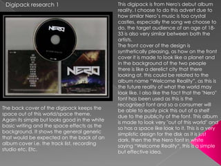
- 1. Digipack research 1 This digipack is from Nero's debut album reality. I choose to do this advert due to how similar Nero‟s music is too crystal castles, especially the song we choose to do, the target audience of an age of 18- 33 is also very similar between both the artists. The front cover of the design is synthetically pleasing, as how on the front cover it is made to look like a planet and in the background of the two people there is like a derelict city that there looking at, this could be related to the album name “Welcome Reality”, as this is the future reality of what the world may look like. I also like the fact that the "Nero" font has been used as this is the recognised font and so a consumer will The back cover of the digipack keeps the be able to easily pick this out of a shelf space out of this world/space theme, due to the publicity of the font. This album Again its simple but looks good in the white is made to look very "out of this world" and basic writing and the space effects as the so has a space like look to it. This is a very background. It shows the general generic simplistic design for the disk as it is just that would be expected on the back of an dark, then the the Nero font in white album cover i.e. the track list, recording saying “Welcome Reality“, this is a simple studio etc. Etc. but effective idea.
- 2. Advert 1 This is advert to coincide with Nero‟s “Welcome Reality” digipack, there wasn't really a full on advert, just this banner to promote the album, the banner really is trying to link back to the digipack to hard and is practically taken straight from the front cover which is a bit boring. It shows not much thought has gone into using the same cover although at the same time this could help to create an enigma around the artist and to help them sell tracks, mainly due to the fact the CD would be easily recognised on a shelf after looking at this banner.
- 3. Digipak research 2 Once again I choose this artist‟s digipak due to the similar music, in fact he is the exact same genre and type of music as Crystal Castles only he is much larger. Again the target ago is around 16-33 the target audience that my music video is aimed at. The album cover is very well constructed, although not very related to the type of music, the music being club music and the flowers and patterns on the front don't really relate. Despite this it is a good effect and is once again synthetically pleasing. There is a simple picture of just Tiesto that has been colour corrected and the patterns around him have been fitted to match the colour scheme gibing a nice stylish effect. It also features Tiesto's logo in the background, and the well know Tiesto logo with the „E‟ with the dots in it which is well known over the world. This combination of reusing past ideas will help the digipak to stand out on a shop shelf. On the back of the digipak all the tracks are listed. this is generic of all CD cases no matter what genre. The same logo is used again on the back as the front. This helps the front and the back to relate well. This helps the to album stand out so more people recognise that logo and brand image. Finally we can see the logo for the studio that produced the album, this is commonly seen on the back of album's, in this case the studio is 'Ultra'.
- 4. Advert research 2 This advert is for Tiestos album release party, this advert works really well and is well applied to the target market and the type of music being played, therefore it is very different to the digipak in which I feel it is not very relevant to the audience or the music market that he is in, therefore this is sticking well to Andrew Goodwin‟s theory of the music relating to the artwork giving a good visual relationship to the music itself. This advert works well for the music as it a picture of a club with Tiesto playing music from the front, which is enjoyable for the audience that Tiesto is aiming for. At the same time Ken Robinsons theory of creativity is also produced in this advert with the lights shining from Tiesto this again a really authentic effect. How the same logo and album text is used also helps to relate the music back to the album as after looking at this advert you would recognise the CD on a shop shelf.