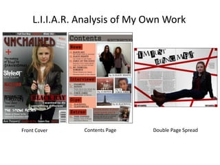
SlideShare a Scribd company logo
1 of 16
L.I.I.A.R. Analysis of My Own Work
Front Cover Contents Page Double Page Spread
Language
The language used for the front cover of my
magazine is quite direct towards the
audience as it includes words such as
“WIN!!!” which shows that the magazine is
trying to draw the reader in to buy the
magazine due to what they could win.
Plus, this text, and other text, is in capitals
to show the importance of the text. Also I
think that having the text in capitals
contrasts well with the rock genre as it
makes the text look bold and outgoing, like
rock music.
The main image is of Black Ray who is the
main feature story in my magazine and is
featured on my double page spread. From
this image you can easily identify the
genre of my magazine because she is
wearing a black leather jacket which is a
convention of the rock genre.
The page layout follows the conventions of
music magazines as the mast head is at the
top; the main image is in the centre; the
barcode, issue number, date and price are
in a corner at the bottom and the feature
stories and text are spread out around the
page. The mast head is at the top of the
page to clearly show to the reader what
magazine it is and so that when it is on a
shelf in a shop you will be able to see the
name of the magazine without having to
search for the magazine you want to
buy, making it more convenient for the
users.
The mast head has been placed
over the main image to show
dominance in the company as it
shows that UNCHAINED are in
charge of this magazine and the
people who go in it.
The articles have been spread out
along the length of my magazine
to try and avoid any free space on
my front cover, as this makes my
magazine look more full and
makes the reader think that there
is going to be a lot of content
inside this magazine, making
them more persuaded to
purchase the magazine.
The main colours of my magazine are red,
black, grey and white and I think that
these colours are iconographic of the
rock genre. This is because they are quite
dark to contrast with the rock genre but
the bright red makes it not seem dull and
boring. Black connotes mystery which I
think links with rock music as it is very
different to other music styles. Red
connotes danger which again links to rock
music however white connotes hope and
purity which shows a softer side to the
magazine to make it look not as dark.
This will make the magazine appeal to
more people as it is more friendly and
welcoming.
IdeologyThe ideology of this magazine
is to appeal to people aged 16-
21 as this is my target audience
for my magazine because of
the image and colour scheme
that I have used. I think that
my magazine isn’t just trying to
appeal to lovers of rock music
but to a wider audience of
different music tastes as the
image I have used could also
be associated with R’n’B as
nowadays leather jackets are in
fashion and many members of
the public wear them.
Therefore targeting more
people, hence becoming more
popular and successful and
gaining more money.
The ideology of this magazine could also be to make more people confident as Black
Ray is stood looking very strong and powerful on the front cover of my magazine. She
is also staring directly at the audience making it more personal and direct towards the
audience and making it seem as if Black Ray is talking to the reader.
The ideology of my magazine
could also be to make the
public more aware of rock
music and the artists
contained within this genre as
on the front cover there are a
lot of different artists/bands
advertised which shows to
the whole public that there is
a lot to offer in the rock genre
and this may cause more
people to enjoy rock music
and purchase this magazine.
InstitutionI think that Bauer Media might
distribute my media product
because this institution
doesn’t just focus on one
particular genre of music; they
work with any genre of music.
Plus they already work with
Kerrang and Mojo which
shows that they are happy to
work with rock music.
Also, Bauer Media work with
loads of different magazines
such as Heat, Q and Grazia
therefore it seems like a good
institution to work with as
they work with a lot of big-
named magazines meaning
that they will have a lot of
experience in distribution and
according to their website
(http://magazines.bauermedia
advertising.com/magazines)
they are happy to help people
advertise their own
magazines.
I think that it would be good for Bauer
Media to distribute my media product
because there aren’t that many rock
magazines in stores to buy, meaning that
there is a space for a magazine like mine.
Plus, I think that rock music
is getting more popular
nowadays so more people
will be interested in
purchasing rock magazines.
Bauer Media distributes
Kerrang magazine which is
what I have mainly based
my magazine on so I think
that it would be a good
institution to distribute my
magazine as they distribute
a magazine similar to mine.
AudienceThe target audience for this
magazine is of people aged 16-
21 and of both genders. I think
that my front cover targets this
age group because I have
included a prize that I think this
age group would appreciate
and would like to win. Plus, on
my footer I have mentioned
free posters available inside the
magazine which I think targets
my target audience as, in my
opinion, people in this age
group like to stick posters on
their walls so would be more
tempted to purchase this
magazine if it had free posters
in it.
I think that my magazine targets both genders because of the
types of bands and artists that I have included such as Linkin
Park and Fall Out Boy as these bands already appeal to both
genders so I have included them in my magazine in order to try
and get my magazine to appeal to both men and women.
I think that my magazine
targets this target audience
because of the colour scheme
and the fonts used as the
colour scheme is quite fun
but not childish and the fonts
are very adventurous as I
have experimented with
many different fonts.
It also appeals to my target
audience because the price if
£1.50 so is affordable for my
age group because most of the
people in this age group will be
at school, college or university
so will not have a lot of money
to spend on magazines. But
£1.50 is a reasonable price
which my target audience can
easily afford.
RepresentationThe representation of this magazine
is what you would expect for any
magazine because it has the same
conventions such as the mast head
at the top in a bold font and in
capital letters to make it stand out
and so that the reader knows which
magazine it is as soon as you first
look at it.
It also has the model in the centre of
the page to show that she is the
main feature of that issue of the
magazine and this could persuade
people to buy this magazine if they
like the person on the front of the
magazine as they would want to find
out more about them inside the
magazine. The model on my
magazine has got bright red lipstick
and nail varnish on and is wearing a
black leather jacket which represents
a rock star, therefore you wouldn’t
get upper-class people reading the
magazine as they would be wearing
elegant and classy clothes but this is
not the case so it is targeting
working-class people instead.
Most of the text is placed on the far left of the page or at the bottom of the page
to keep all of the attention on the image which makes the reader immediately
know whether they would be interested in this magazine or not because their
eyes will go to the image straight away so they can decide whether the artists on
the front is someone they would want to read about or not.
The barcode, issue number, date
and price are placed in the bottom
right hand corner so that little
attention is drawn towards this as it
is only there for sales purposes, it is
not an important feature of the
magazine.
The mast head has also been placed
over the image to show that
UNCHAINED are in control of the
magazine which shows
dominance, making the magazine
look powerful and successful.
Black Ray is wearing a black leather
jacket which is iconographic of the
rock genre as it is quite punk-like.
However it could also show that she
is quite mysterious as the
connotation of black is mystery.
Language
The language used for my contents page
is quite direct towards the reader as it
uses words such as ‘Subscribe’ which are
direct words to the audience as it is
telling them to do something. This word
is also in capital letters to make it stand
out more against the rest of the text in
that grey box. It has also been placed in
capitals to show the importance of the
text and to draw slightly more attention
to it. I also think that having the text in
capital letters contrasts well with the
rock genre as it makes the text look bold
and outgoing like the rock music.
The images easily identify the genre of
my magazine because the Black Hearts
are wearing black and red clothes which
contrast with the rock genre and my
colour scheme also they are holding a
guitar which shows that they are
musicians. There is also an image of
Katsuo at a gig which links to the rock
life as gigs are seen as a place to let
loose and be free with your music which
is what I think rock music is all about.
The page layout follows the conventions of music magazines as the mast
head is at the top; the images and contents are scattered around the centre
part of the page and a subscription box is at the bottom of the page. The
mast head is at the top of the page to clearly show to the reader what page
it is and this is the first place that the reader looks when reading a page so
it needs to be in the same place to avoid confusion for the reader.
The contents and images have been
spread out along the length of the page
to try and avoid any free space on my
front cover, as this makes my magazine
look more full and makes the reader
think that there is going to be a lot of
content inside this magazine, making
them more persuaded to purchase the
magazine.
The main colours of my magazine are
red, black, grey and white which I think
are iconographic of the rock genre. This is
because they are quite dark to contrast
with the rock genre but the bright red
makes it not seem dull and boring and
brightens up the page slightly. Black
connotes mystery which I think links with
rock music as it is very different to other
music styles. Red connotes danger which
again links to rock music however white
connotes hope and purity which shows a
softer side to the magazine to make it
look not as dark. This will make the
magazine appeal to more people as it is
more friendly and welcoming.
Ideology
The ideology of this magazine is
to appeal to people aged 16-21
as this is my target audience for
my magazine because of the
images and colour scheme that
I have used. I think that my
magazine isn’t just trying to
appeal to lovers of rock music
but to a wider audience of
different music tastes as the
images that I have used look
quite friendly and welcoming as
they are not. Therefore
targeting more people, hence
becoming more popular and
successful and gaining more
money.
The ideology of this magazine could also be to make more people confident as all of the models are stood
looking very strong and powerful. They are also staring directly at the reader making it more personal and
direct towards the audience and making it seem as if they are talking to the reader.
The ideology of my magazine
could also be to make the
public more aware of rock
music and the artists contained
within this genre as there are a
lot of different artists/bands
listed in the contents which
shows to the whole public that
there is a lot to offer in the rock
genre and this may cause more
people to enjoy rock music and
purchase this magazine as
there is a wide range of
different artists on the contents
page.
InstitutionI think that Bauer Media
might distribute my media
product because this
institution doesn’t just focus
on one particular genre of
music; they work with any
genre of music. Plus they
already work with Kerrang
and Mojo which shows that
they are happy to work with
rock music. Also, Bauer Media
work with loads of different
magazines such as Heat, Q
and Grazia therefore it seems
like a good institution to work
with as they work with a lot
of big-named magazines
meaning that they will have a
lot of experience in
distribution and according to
their website
(http://magazines.bauermedi
aadvertising.com/magazines)
they are happy to help people
advertise their own
magazines.
I think that it would be good for Bauer
Media to distribute my media product
because there aren’t that many rock
magazines in stores to buy, meaning that
there is a space for a magazine like mine.
Plus, I think that rock music is
getting more popular
nowadays so more people will
be interested in purchasing
rock magazines. Bauer Media
distributes Kerrang magazine
which is what I have mainly
based my magazine on so I
think that it would be a good
institution to distribute my
magazine as they distribute a
magazine similar to mine.
Audience
The target audience for this
magazine is of people aged 16-
21 and of both genders. I think
that my contents page targets
this age group because of the
bands and artists that I have
included such as Black Hearts
and Vince Jones as these artists
are of different genders
therefore will more likely appeal
to both genders as it isn’t just
targeted at one gender it is
targeted at both of them
I think that my magazine targets this target audience because of the
colours scheme used as the colour scheme is quite fun due to the
bright red but it isn’t childish as the black makes it more grown up as
it is a more serious colour.
It also appeals to my target
audience because the price if
£1.50 so is affordable for my
age group because most of the
people in this age group will be
at school, college or university
so will not have a lot of money
to spend on magazines. But
£1.50 is a reasonable price
which my target audience can
easily afford.
RepresentationThe representation of this
magazine is what you would
expect for any magazine because it
has the same conventions such as
the mast head at the top in a bold
font to make it stand out.
It also has the images and
contents in the centre of the
page as this what this page is
about, it is telling the reader
what and who is going to be
featured in this magazine. The
models from Black Hearts have
got bright red lipstick and nail
varnish on and are wearing a
black and red clothes which
contrasts with my colour scheme
and links with the rock genre.
She is also holding a guitar in her
hand which again reinforces the
idea that she is a rock star.
Plus, in the image of Katsuo they
are performing at a gig and one
of them is playing a guitar which
links with the rock genre.
Most of the text is placed on the far left of the page or at the bottom of
the page to keep all of the attention on the images which makes the
reader immediately know whether they would be interested in this
magazine or not because their eyes will go to the images straight away
so they can decide whether the artists are ones that they would want
to read about or not.
From this page my magazine
is represented as quite fun
and playful due to the colours
that I have used and how I
have used them, although it is
also represented as
professional because I have
followed the conventions of
contents pages’ and it looks
like there is a lot available
inside the magazine due to
the multiple images that I
have used.
Language
The language used for the
article on my double page
spread of my magazine is
quite formal as I wanted it to
sound very professional and
make it seem more like an
existing magazine.
However, I didn’t want it to
be too formal as this doesn’t
reflect the rock genre so I
avoided using posh
vocabulary to try and appeal
more to my target audience. I
also used a fun font style for
my mast head/pull quote to
make it seem less formal as
the boxes and different
coloured letters makes it
more fun and
interesting, which I think
entices more readers in as
the article looks like it is
going to be fun because the
title is.
The image is of Black Ray who
is the main feature story in
my magazine and is also
featured on my front cover.
From this image you can
easily identify the genre of my
magazine because she is
wearing a black leather jacket
which is iconographic of the
rock genre and she also has
bright red lipstick and nail
varnish which again links with
the rock genre and
corresponds with my colour
scheme
The page layout follows the conventions of music magazines as the mast head
is at the top; the main image is on one of the pages and the article is on the
other page and the page numbers and the name of the magazine are in the
corners at the bottom of the page. The mast head is at the top of the page to
clearly show to the reader what the article is going to be about without having
to read it, this way the reader can decide whether they want to read it or not.
It is very important to keep the page numbers on each page so that the reader
knows where they are in the magazine and also so that you can find the pages
that correspond with the page numbers on the contents page, making it more
convenient for the reader as the contents will be able to find.
The article has been placed
on one page and the image
on another page because
this is a convention of double
page spreads. Although the
main reason why this is done
is so that when the reader
open the pages all of the
attention is on the image and
this way all of the text is
contained in one area,
making it much easier for the
reader to read.
The main colours of my
magazine are red, black, grey
and white which I think are
iconographic of the rock genre.
This is because they are quite
dark to contrast with the rock
genre but the bright red makes
it not seem dull and boring.
Black connotes mystery which I
think links with rock music as it
is very different to other music
styles. Red connotes danger
which again links to rock music
however white connotes hope
and purity which shows a softer
side to the magazine to make it
look not as dark. This will make
the magazine appeal to more
people as it is more friendly
and welcoming.
Ideology
The ideology of this
magazine is to appeal to
people aged 16-21 as
this is my target
audience for my
magazine because of the
image and colour
scheme that I have used.
I think that my magazine
isn’t just trying to appeal
to lovers of rock music
but to a wider audience
of different music tastes
as the image I have used
could also be associated
with R’n’B as nowadays
leather jackets are in
fashion and many
members of the public
wear them. Therefore
targeting more
people, hence becoming
more popular and
successful and gaining
more money.
The ideology of this magazine could also be to make more
people confident as Black Ray is looking very strong and
powerful on my double page spread. She is also looking
directly at the audience making it more personal and direct
towards the audience and making it seem as if Black Ray is
talking to the reader. This means that the reader is able to
connect with her story and feel more involved with the
article.
Institution
I think that Bauer Media
might distribute my media
product because this
institution doesn’t just
focus on one particular
genre of music; they work
with any genre of music.
Plus they already work
with Kerrang and Mojo
which shows that they are
happy to work with rock
music. Also, Bauer Media
work with loads of
different magazines such
as Heat, Q and Grazia
therefore it seems like a
good institution to work
with as they work with a
lot of big-named
magazines meaning that
they will have a lot of
experience in distribution
and according to their
website
(http://magazines.bauerm
ediaadvertising.com/maga
zines) they are happy to
help people advertise
their own magazines.
I think that it would be good for
Bauer Media to distribute my
media product because there
aren’t that many rock magazines in
stores to buy, meaning that there
is a space for a magazine like mine.
Plus, I think that rock
music is getting more
popular nowadays so
more people will be
interested in
purchasing rock
magazines. Bauer
Media distributes
Kerrang magazine
which is what I have
mainly based my
magazine on so I
think that it would be
a good institution to
distribute my
magazine as they
distribute a magazine
similar to mine.
AudienceThe target audience for
this magazine is of
people aged 16-21 and
of both genders. I think
that my double page
spread targets this age
group because of the
types of bands and
artists that I have
included however my
main feature story is of
a woman, Black Ray, so
could slightly be
targeted towards
women than men. To
avoid this my main
feature story could have
been of a band
including both genders
to make my magazine
not sexist and to ensure
that it appeals to both
genders. I think that my magazine appeals to this target audience
because of the colour scheme and the fonts used as the
colour scheme is quite fun but not childish and the fonts for
my title/pull quote is very adventurous due to the boxes
that I have used as it makes it more intriguing for the
audience.
It also appeals to my
target audience
because the price if
£1.50 so is
affordable for my
age group because
most of the people
in this age group will
be at school, college
or university so will
not have a lot of
money to spend on
magazines. But
£1.50 is a reasonable
price which my
target audience can
easily afford.
RepresentationThe representation of
this magazine is what
you would expect for
any magazine because it
has the same
conventions such as the
mast head at the top in
a bold font and in
capital letters to make it
stand out and so that
the reader knows which
magazine it is as soon as
you first look at it.
It also has the model on one page and the text on the other page to
keep them both apart as this makes it easier for the reader to read
the article. It also make the pages look a lot neater as the pages are
laid out better. The model on my magazine has got bright red lipstick
on and is wearing a black leather jacket which represents a rock
star, therefore you wouldn’t get upper-class people reading the
magazine as they would be wearing elegant and classy clothes but
this is not the case so it is targeting working-class people instead.
Black Ray is wearing a black
leather jacket which is
iconographic of the rock genre
as it is quite punk-like. However
it could also show that she is
quite mysterious as the
connotation of black is mystery.
From this page my
magazine is represented
as quite fun and playful
due to the colours that I
have used and the red
lines running across
both of the pages as
these make my page not
look boring as it gives it
more detail, making it
more interesting and
enticing for the reader.

More Related Content

What's hot (19)

Media evaluation powerpoint
Media evaluation powerpointMedia evaluation powerpoint
Media evaluation powerpoint
 
Survey analysis
Survey analysisSurvey analysis
Survey analysis
 
Media evauation
Media evauationMedia evauation
Media evauation
 
Music Magazine Evaluation
Music Magazine EvaluationMusic Magazine Evaluation
Music Magazine Evaluation
 
My eveluation
My eveluationMy eveluation
My eveluation
 
Proposal of the magazine2
Proposal of the magazine2Proposal of the magazine2
Proposal of the magazine2
 
Evaluation
EvaluationEvaluation
Evaluation
 
Music Magazine analysis
Music Magazine analysisMusic Magazine analysis
Music Magazine analysis
 
Music magazine – the evaluation final
Music magazine – the evaluation finalMusic magazine – the evaluation final
Music magazine – the evaluation final
 
Evaluation
EvaluationEvaluation
Evaluation
 
Music magazine Evaluation
Music magazine Evaluation Music magazine Evaluation
Music magazine Evaluation
 
Evaluation Presentation
Evaluation PresentationEvaluation Presentation
Evaluation Presentation
 
Evaluationmol
EvaluationmolEvaluationmol
Evaluationmol
 
Evaluation
EvaluationEvaluation
Evaluation
 
Media Studies Magazine Evaluation
Media Studies Magazine EvaluationMedia Studies Magazine Evaluation
Media Studies Magazine Evaluation
 
Evaluation
EvaluationEvaluation
Evaluation
 
Evaluation
EvaluationEvaluation
Evaluation
 
Evaluation of music magazine
Evaluation of music magazineEvaluation of music magazine
Evaluation of music magazine
 
Cover analysis
Cover analysisCover analysis
Cover analysis
 

Viewers also liked

Textual analysis of my music video
Textual analysis of my music videoTextual analysis of my music video
Textual analysis of my music video
shannoncammish
 
Zarah Scene 2 Frame by Frame
Zarah Scene 2 Frame by FrameZarah Scene 2 Frame by Frame
Zarah Scene 2 Frame by Frame
shannoncammish
 
Making the 5th draft of my front cover
Making the 5th draft of my front coverMaking the 5th draft of my front cover
Making the 5th draft of my front cover
shannoncammish
 
Makin the 3rd draft of my double page spread
Makin the 3rd draft of my double page spreadMakin the 3rd draft of my double page spread
Makin the 3rd draft of my double page spread
shannoncammish
 
Zarah Scene 3 Frame by Frame
Zarah Scene 3 Frame by FrameZarah Scene 3 Frame by Frame
Zarah Scene 3 Frame by Frame
shannoncammish
 
Zarah Scene 4 Frame by Frame
Zarah Scene 4 Frame by FrameZarah Scene 4 Frame by Frame
Zarah Scene 4 Frame by Frame
shannoncammish
 
Buku pegangan-guru-matematika-sma-kelas-10-kurikulum-2013-edisi-revisi-2014
Buku pegangan-guru-matematika-sma-kelas-10-kurikulum-2013-edisi-revisi-2014Buku pegangan-guru-matematika-sma-kelas-10-kurikulum-2013-edisi-revisi-2014
Buku pegangan-guru-matematika-sma-kelas-10-kurikulum-2013-edisi-revisi-2014
Dwi Suciati Isdiansyah
 

Viewers also liked (18)

Question 1
Question 1Question 1
Question 1
 
Textual analysis of my music video
Textual analysis of my music videoTextual analysis of my music video
Textual analysis of my music video
 
Interactions between teaching assistants and students boost engagement in phy...
Interactions between teaching assistants and students boost engagement in phy...Interactions between teaching assistants and students boost engagement in phy...
Interactions between teaching assistants and students boost engagement in phy...
 
Zarah Scene 2 Frame by Frame
Zarah Scene 2 Frame by FrameZarah Scene 2 Frame by Frame
Zarah Scene 2 Frame by Frame
 
Question 1
Question 1Question 1
Question 1
 
Puertas logicas
Puertas  logicasPuertas  logicas
Puertas logicas
 
Making the 5th draft of my front cover
Making the 5th draft of my front coverMaking the 5th draft of my front cover
Making the 5th draft of my front cover
 
Makin the 3rd draft of my double page spread
Makin the 3rd draft of my double page spreadMakin the 3rd draft of my double page spread
Makin the 3rd draft of my double page spread
 
Zarah Scene 3 Frame by Frame
Zarah Scene 3 Frame by FrameZarah Scene 3 Frame by Frame
Zarah Scene 3 Frame by Frame
 
Flexlunch groene hart acf presentatie 20150421
Flexlunch groene hart acf presentatie 20150421Flexlunch groene hart acf presentatie 20150421
Flexlunch groene hart acf presentatie 20150421
 
Zarah Scene 4 Frame by Frame
Zarah Scene 4 Frame by FrameZarah Scene 4 Frame by Frame
Zarah Scene 4 Frame by Frame
 
Film
FilmFilm
Film
 
Storyboard
StoryboardStoryboard
Storyboard
 
Buku pegangan-guru-matematika-sma-kelas-10-kurikulum-2013-edisi-revisi-2014
Buku pegangan-guru-matematika-sma-kelas-10-kurikulum-2013-edisi-revisi-2014Buku pegangan-guru-matematika-sma-kelas-10-kurikulum-2013-edisi-revisi-2014
Buku pegangan-guru-matematika-sma-kelas-10-kurikulum-2013-edisi-revisi-2014
 
Familias Logicas
Familias LogicasFamilias Logicas
Familias Logicas
 
Buku pegangan-guru-matematika-sma-kelas-10-kurikulum-2013-edisi-revisi-2014
Buku pegangan-guru-matematika-sma-kelas-10-kurikulum-2013-edisi-revisi-2014Buku pegangan-guru-matematika-sma-kelas-10-kurikulum-2013-edisi-revisi-2014
Buku pegangan-guru-matematika-sma-kelas-10-kurikulum-2013-edisi-revisi-2014
 
Evaluation question 3
Evaluation question 3Evaluation question 3
Evaluation question 3
 
Chindogu
ChindoguChindogu
Chindogu
 

Similar to Liiar analysis own work (20)

Magazine Pitch
Magazine PitchMagazine Pitch
Magazine Pitch
 
Evaluation
EvaluationEvaluation
Evaluation
 
Evaluation
EvaluationEvaluation
Evaluation
 
Evaluation
EvaluationEvaluation
Evaluation
 
Eval1
Eval1Eval1
Eval1
 
Evaluation
EvaluationEvaluation
Evaluation
 
AS Media Magazine Evaluation
AS Media Magazine EvaluationAS Media Magazine Evaluation
AS Media Magazine Evaluation
 
Questions 2 - 5
Questions 2 - 5Questions 2 - 5
Questions 2 - 5
 
Evaluation
EvaluationEvaluation
Evaluation
 
Media evaluation 2
Media evaluation 2Media evaluation 2
Media evaluation 2
 
Media evaluation 2
Media evaluation 2Media evaluation 2
Media evaluation 2
 
Media evaluation 2
Media evaluation 2Media evaluation 2
Media evaluation 2
 
Written evaluation
Written evaluationWritten evaluation
Written evaluation
 
Media evaluation
Media evaluationMedia evaluation
Media evaluation
 
Task 5
Task 5Task 5
Task 5
 
Task 5
Task 5Task 5
Task 5
 
Evaluation
EvaluationEvaluation
Evaluation
 
Proposal
ProposalProposal
Proposal
 
My evaluation
My evaluationMy evaluation
My evaluation
 
My evaluation
My evaluationMy evaluation
My evaluation
 

More from shannoncammish (20)

IEE
IEEIEE
IEE
 
IEE
IEE IEE
IEE
 
IEE Presentation
IEE PresentationIEE Presentation
IEE Presentation
 
Textual analysis of my music video
Textual analysis of my music videoTextual analysis of my music video
Textual analysis of my music video
 
Zarah Final Scene (Scene 5) Frame by Frame
Zarah Final Scene (Scene 5) Frame by FrameZarah Final Scene (Scene 5) Frame by Frame
Zarah Final Scene (Scene 5) Frame by Frame
 
Film
FilmFilm
Film
 
Presentation to show
Presentation to showPresentation to show
Presentation to show
 
Animation film survey
Animation film surveyAnimation film survey
Animation film survey
 
Storyboard
StoryboardStoryboard
Storyboard
 
Storyboard
StoryboardStoryboard
Storyboard
 
Storyboard
StoryboardStoryboard
Storyboard
 
Storyboard
StoryboardStoryboard
Storyboard
 
Beyonce love on top textual analysis
Beyonce   love on top textual analysisBeyonce   love on top textual analysis
Beyonce love on top textual analysis
 
Taylor swift you belong with me textual analysis
Taylor swift   you belong with me textual analysisTaylor swift   you belong with me textual analysis
Taylor swift you belong with me textual analysis
 
Taylor swift you belong with me textual analysis
Taylor swift   you belong with me textual analysisTaylor swift   you belong with me textual analysis
Taylor swift you belong with me textual analysis
 
About my film
About my filmAbout my film
About my film
 
Lyrics analysis
Lyrics analysisLyrics analysis
Lyrics analysis
 
Storyboard
StoryboardStoryboard
Storyboard
 
Storyboard
StoryboardStoryboard
Storyboard
 
Print screen storyboard
Print screen storyboardPrint screen storyboard
Print screen storyboard
 

Liiar analysis own work

  • 1. L.I.I.A.R. Analysis of My Own Work Front Cover Contents Page Double Page Spread
  • 2. Language The language used for the front cover of my magazine is quite direct towards the audience as it includes words such as “WIN!!!” which shows that the magazine is trying to draw the reader in to buy the magazine due to what they could win. Plus, this text, and other text, is in capitals to show the importance of the text. Also I think that having the text in capitals contrasts well with the rock genre as it makes the text look bold and outgoing, like rock music. The main image is of Black Ray who is the main feature story in my magazine and is featured on my double page spread. From this image you can easily identify the genre of my magazine because she is wearing a black leather jacket which is a convention of the rock genre. The page layout follows the conventions of music magazines as the mast head is at the top; the main image is in the centre; the barcode, issue number, date and price are in a corner at the bottom and the feature stories and text are spread out around the page. The mast head is at the top of the page to clearly show to the reader what magazine it is and so that when it is on a shelf in a shop you will be able to see the name of the magazine without having to search for the magazine you want to buy, making it more convenient for the users. The mast head has been placed over the main image to show dominance in the company as it shows that UNCHAINED are in charge of this magazine and the people who go in it. The articles have been spread out along the length of my magazine to try and avoid any free space on my front cover, as this makes my magazine look more full and makes the reader think that there is going to be a lot of content inside this magazine, making them more persuaded to purchase the magazine. The main colours of my magazine are red, black, grey and white and I think that these colours are iconographic of the rock genre. This is because they are quite dark to contrast with the rock genre but the bright red makes it not seem dull and boring. Black connotes mystery which I think links with rock music as it is very different to other music styles. Red connotes danger which again links to rock music however white connotes hope and purity which shows a softer side to the magazine to make it look not as dark. This will make the magazine appeal to more people as it is more friendly and welcoming.
  • 3. IdeologyThe ideology of this magazine is to appeal to people aged 16- 21 as this is my target audience for my magazine because of the image and colour scheme that I have used. I think that my magazine isn’t just trying to appeal to lovers of rock music but to a wider audience of different music tastes as the image I have used could also be associated with R’n’B as nowadays leather jackets are in fashion and many members of the public wear them. Therefore targeting more people, hence becoming more popular and successful and gaining more money. The ideology of this magazine could also be to make more people confident as Black Ray is stood looking very strong and powerful on the front cover of my magazine. She is also staring directly at the audience making it more personal and direct towards the audience and making it seem as if Black Ray is talking to the reader. The ideology of my magazine could also be to make the public more aware of rock music and the artists contained within this genre as on the front cover there are a lot of different artists/bands advertised which shows to the whole public that there is a lot to offer in the rock genre and this may cause more people to enjoy rock music and purchase this magazine.
  • 4. InstitutionI think that Bauer Media might distribute my media product because this institution doesn’t just focus on one particular genre of music; they work with any genre of music. Plus they already work with Kerrang and Mojo which shows that they are happy to work with rock music. Also, Bauer Media work with loads of different magazines such as Heat, Q and Grazia therefore it seems like a good institution to work with as they work with a lot of big- named magazines meaning that they will have a lot of experience in distribution and according to their website (http://magazines.bauermedia advertising.com/magazines) they are happy to help people advertise their own magazines. I think that it would be good for Bauer Media to distribute my media product because there aren’t that many rock magazines in stores to buy, meaning that there is a space for a magazine like mine. Plus, I think that rock music is getting more popular nowadays so more people will be interested in purchasing rock magazines. Bauer Media distributes Kerrang magazine which is what I have mainly based my magazine on so I think that it would be a good institution to distribute my magazine as they distribute a magazine similar to mine.
  • 5. AudienceThe target audience for this magazine is of people aged 16- 21 and of both genders. I think that my front cover targets this age group because I have included a prize that I think this age group would appreciate and would like to win. Plus, on my footer I have mentioned free posters available inside the magazine which I think targets my target audience as, in my opinion, people in this age group like to stick posters on their walls so would be more tempted to purchase this magazine if it had free posters in it. I think that my magazine targets both genders because of the types of bands and artists that I have included such as Linkin Park and Fall Out Boy as these bands already appeal to both genders so I have included them in my magazine in order to try and get my magazine to appeal to both men and women. I think that my magazine targets this target audience because of the colour scheme and the fonts used as the colour scheme is quite fun but not childish and the fonts are very adventurous as I have experimented with many different fonts. It also appeals to my target audience because the price if £1.50 so is affordable for my age group because most of the people in this age group will be at school, college or university so will not have a lot of money to spend on magazines. But £1.50 is a reasonable price which my target audience can easily afford.
  • 6. RepresentationThe representation of this magazine is what you would expect for any magazine because it has the same conventions such as the mast head at the top in a bold font and in capital letters to make it stand out and so that the reader knows which magazine it is as soon as you first look at it. It also has the model in the centre of the page to show that she is the main feature of that issue of the magazine and this could persuade people to buy this magazine if they like the person on the front of the magazine as they would want to find out more about them inside the magazine. The model on my magazine has got bright red lipstick and nail varnish on and is wearing a black leather jacket which represents a rock star, therefore you wouldn’t get upper-class people reading the magazine as they would be wearing elegant and classy clothes but this is not the case so it is targeting working-class people instead. Most of the text is placed on the far left of the page or at the bottom of the page to keep all of the attention on the image which makes the reader immediately know whether they would be interested in this magazine or not because their eyes will go to the image straight away so they can decide whether the artists on the front is someone they would want to read about or not. The barcode, issue number, date and price are placed in the bottom right hand corner so that little attention is drawn towards this as it is only there for sales purposes, it is not an important feature of the magazine. The mast head has also been placed over the image to show that UNCHAINED are in control of the magazine which shows dominance, making the magazine look powerful and successful. Black Ray is wearing a black leather jacket which is iconographic of the rock genre as it is quite punk-like. However it could also show that she is quite mysterious as the connotation of black is mystery.
  • 7. Language The language used for my contents page is quite direct towards the reader as it uses words such as ‘Subscribe’ which are direct words to the audience as it is telling them to do something. This word is also in capital letters to make it stand out more against the rest of the text in that grey box. It has also been placed in capitals to show the importance of the text and to draw slightly more attention to it. I also think that having the text in capital letters contrasts well with the rock genre as it makes the text look bold and outgoing like the rock music. The images easily identify the genre of my magazine because the Black Hearts are wearing black and red clothes which contrast with the rock genre and my colour scheme also they are holding a guitar which shows that they are musicians. There is also an image of Katsuo at a gig which links to the rock life as gigs are seen as a place to let loose and be free with your music which is what I think rock music is all about. The page layout follows the conventions of music magazines as the mast head is at the top; the images and contents are scattered around the centre part of the page and a subscription box is at the bottom of the page. The mast head is at the top of the page to clearly show to the reader what page it is and this is the first place that the reader looks when reading a page so it needs to be in the same place to avoid confusion for the reader. The contents and images have been spread out along the length of the page to try and avoid any free space on my front cover, as this makes my magazine look more full and makes the reader think that there is going to be a lot of content inside this magazine, making them more persuaded to purchase the magazine. The main colours of my magazine are red, black, grey and white which I think are iconographic of the rock genre. This is because they are quite dark to contrast with the rock genre but the bright red makes it not seem dull and boring and brightens up the page slightly. Black connotes mystery which I think links with rock music as it is very different to other music styles. Red connotes danger which again links to rock music however white connotes hope and purity which shows a softer side to the magazine to make it look not as dark. This will make the magazine appeal to more people as it is more friendly and welcoming.
  • 8. Ideology The ideology of this magazine is to appeal to people aged 16-21 as this is my target audience for my magazine because of the images and colour scheme that I have used. I think that my magazine isn’t just trying to appeal to lovers of rock music but to a wider audience of different music tastes as the images that I have used look quite friendly and welcoming as they are not. Therefore targeting more people, hence becoming more popular and successful and gaining more money. The ideology of this magazine could also be to make more people confident as all of the models are stood looking very strong and powerful. They are also staring directly at the reader making it more personal and direct towards the audience and making it seem as if they are talking to the reader. The ideology of my magazine could also be to make the public more aware of rock music and the artists contained within this genre as there are a lot of different artists/bands listed in the contents which shows to the whole public that there is a lot to offer in the rock genre and this may cause more people to enjoy rock music and purchase this magazine as there is a wide range of different artists on the contents page.
  • 9. InstitutionI think that Bauer Media might distribute my media product because this institution doesn’t just focus on one particular genre of music; they work with any genre of music. Plus they already work with Kerrang and Mojo which shows that they are happy to work with rock music. Also, Bauer Media work with loads of different magazines such as Heat, Q and Grazia therefore it seems like a good institution to work with as they work with a lot of big-named magazines meaning that they will have a lot of experience in distribution and according to their website (http://magazines.bauermedi aadvertising.com/magazines) they are happy to help people advertise their own magazines. I think that it would be good for Bauer Media to distribute my media product because there aren’t that many rock magazines in stores to buy, meaning that there is a space for a magazine like mine. Plus, I think that rock music is getting more popular nowadays so more people will be interested in purchasing rock magazines. Bauer Media distributes Kerrang magazine which is what I have mainly based my magazine on so I think that it would be a good institution to distribute my magazine as they distribute a magazine similar to mine.
  • 10. Audience The target audience for this magazine is of people aged 16- 21 and of both genders. I think that my contents page targets this age group because of the bands and artists that I have included such as Black Hearts and Vince Jones as these artists are of different genders therefore will more likely appeal to both genders as it isn’t just targeted at one gender it is targeted at both of them I think that my magazine targets this target audience because of the colours scheme used as the colour scheme is quite fun due to the bright red but it isn’t childish as the black makes it more grown up as it is a more serious colour. It also appeals to my target audience because the price if £1.50 so is affordable for my age group because most of the people in this age group will be at school, college or university so will not have a lot of money to spend on magazines. But £1.50 is a reasonable price which my target audience can easily afford.
  • 11. RepresentationThe representation of this magazine is what you would expect for any magazine because it has the same conventions such as the mast head at the top in a bold font to make it stand out. It also has the images and contents in the centre of the page as this what this page is about, it is telling the reader what and who is going to be featured in this magazine. The models from Black Hearts have got bright red lipstick and nail varnish on and are wearing a black and red clothes which contrasts with my colour scheme and links with the rock genre. She is also holding a guitar in her hand which again reinforces the idea that she is a rock star. Plus, in the image of Katsuo they are performing at a gig and one of them is playing a guitar which links with the rock genre. Most of the text is placed on the far left of the page or at the bottom of the page to keep all of the attention on the images which makes the reader immediately know whether they would be interested in this magazine or not because their eyes will go to the images straight away so they can decide whether the artists are ones that they would want to read about or not. From this page my magazine is represented as quite fun and playful due to the colours that I have used and how I have used them, although it is also represented as professional because I have followed the conventions of contents pages’ and it looks like there is a lot available inside the magazine due to the multiple images that I have used.
  • 12. Language The language used for the article on my double page spread of my magazine is quite formal as I wanted it to sound very professional and make it seem more like an existing magazine. However, I didn’t want it to be too formal as this doesn’t reflect the rock genre so I avoided using posh vocabulary to try and appeal more to my target audience. I also used a fun font style for my mast head/pull quote to make it seem less formal as the boxes and different coloured letters makes it more fun and interesting, which I think entices more readers in as the article looks like it is going to be fun because the title is. The image is of Black Ray who is the main feature story in my magazine and is also featured on my front cover. From this image you can easily identify the genre of my magazine because she is wearing a black leather jacket which is iconographic of the rock genre and she also has bright red lipstick and nail varnish which again links with the rock genre and corresponds with my colour scheme The page layout follows the conventions of music magazines as the mast head is at the top; the main image is on one of the pages and the article is on the other page and the page numbers and the name of the magazine are in the corners at the bottom of the page. The mast head is at the top of the page to clearly show to the reader what the article is going to be about without having to read it, this way the reader can decide whether they want to read it or not. It is very important to keep the page numbers on each page so that the reader knows where they are in the magazine and also so that you can find the pages that correspond with the page numbers on the contents page, making it more convenient for the reader as the contents will be able to find. The article has been placed on one page and the image on another page because this is a convention of double page spreads. Although the main reason why this is done is so that when the reader open the pages all of the attention is on the image and this way all of the text is contained in one area, making it much easier for the reader to read. The main colours of my magazine are red, black, grey and white which I think are iconographic of the rock genre. This is because they are quite dark to contrast with the rock genre but the bright red makes it not seem dull and boring. Black connotes mystery which I think links with rock music as it is very different to other music styles. Red connotes danger which again links to rock music however white connotes hope and purity which shows a softer side to the magazine to make it look not as dark. This will make the magazine appeal to more people as it is more friendly and welcoming.
  • 13. Ideology The ideology of this magazine is to appeal to people aged 16-21 as this is my target audience for my magazine because of the image and colour scheme that I have used. I think that my magazine isn’t just trying to appeal to lovers of rock music but to a wider audience of different music tastes as the image I have used could also be associated with R’n’B as nowadays leather jackets are in fashion and many members of the public wear them. Therefore targeting more people, hence becoming more popular and successful and gaining more money. The ideology of this magazine could also be to make more people confident as Black Ray is looking very strong and powerful on my double page spread. She is also looking directly at the audience making it more personal and direct towards the audience and making it seem as if Black Ray is talking to the reader. This means that the reader is able to connect with her story and feel more involved with the article.
  • 14. Institution I think that Bauer Media might distribute my media product because this institution doesn’t just focus on one particular genre of music; they work with any genre of music. Plus they already work with Kerrang and Mojo which shows that they are happy to work with rock music. Also, Bauer Media work with loads of different magazines such as Heat, Q and Grazia therefore it seems like a good institution to work with as they work with a lot of big-named magazines meaning that they will have a lot of experience in distribution and according to their website (http://magazines.bauerm ediaadvertising.com/maga zines) they are happy to help people advertise their own magazines. I think that it would be good for Bauer Media to distribute my media product because there aren’t that many rock magazines in stores to buy, meaning that there is a space for a magazine like mine. Plus, I think that rock music is getting more popular nowadays so more people will be interested in purchasing rock magazines. Bauer Media distributes Kerrang magazine which is what I have mainly based my magazine on so I think that it would be a good institution to distribute my magazine as they distribute a magazine similar to mine.
  • 15. AudienceThe target audience for this magazine is of people aged 16-21 and of both genders. I think that my double page spread targets this age group because of the types of bands and artists that I have included however my main feature story is of a woman, Black Ray, so could slightly be targeted towards women than men. To avoid this my main feature story could have been of a band including both genders to make my magazine not sexist and to ensure that it appeals to both genders. I think that my magazine appeals to this target audience because of the colour scheme and the fonts used as the colour scheme is quite fun but not childish and the fonts for my title/pull quote is very adventurous due to the boxes that I have used as it makes it more intriguing for the audience. It also appeals to my target audience because the price if £1.50 so is affordable for my age group because most of the people in this age group will be at school, college or university so will not have a lot of money to spend on magazines. But £1.50 is a reasonable price which my target audience can easily afford.
  • 16. RepresentationThe representation of this magazine is what you would expect for any magazine because it has the same conventions such as the mast head at the top in a bold font and in capital letters to make it stand out and so that the reader knows which magazine it is as soon as you first look at it. It also has the model on one page and the text on the other page to keep them both apart as this makes it easier for the reader to read the article. It also make the pages look a lot neater as the pages are laid out better. The model on my magazine has got bright red lipstick on and is wearing a black leather jacket which represents a rock star, therefore you wouldn’t get upper-class people reading the magazine as they would be wearing elegant and classy clothes but this is not the case so it is targeting working-class people instead. Black Ray is wearing a black leather jacket which is iconographic of the rock genre as it is quite punk-like. However it could also show that she is quite mysterious as the connotation of black is mystery. From this page my magazine is represented as quite fun and playful due to the colours that I have used and the red lines running across both of the pages as these make my page not look boring as it gives it more detail, making it more interesting and enticing for the reader.