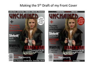
2. I made my features stories smaller as I think that my magazine looked more like a poster
than a magazine due to the large fonts used so I made the fonts smaller and added
another story. I experimented using different colours for all of my features stories and
decided that I like the one in the middle best because I think that the other two have used
too much of the same colour in them.
3. Next I experimented with changing the colours of the text on the header and footer. I think
doing this creates more continuity throughout my front cover. However I think that having
the different colours on the footer as well as the header may be a bit too much but I am
going to use this design as it creates more continuity in my front cover.
4. I then experimented with the colour of my plug. I changed the main colour to red and then
experimented with different text colours and coloured outlines. Out of all of my new designs I
think that I like the red plug with white text and a black outline (furthest to the right). The
reason why I think this is because the outline I have used makes my plug look slightly 3-D which I
think makes it stand out more.