The document discusses different film production logos that were researched to inspire ideas for a new film logo. The writer notes they particularly like the 'F' logo that also represents the number 4, and the "sketchy, chalkboard design" of the 'new school' logo. They also favor the simplicity of the 'ink' logo and the typewriter font of 'brutally honest productions'. The group ultimately decides the 'brutally honest productions' logo best fits their theme of social realism and desire for an urban, edgy feel due to its splatter effect, typewriter font, and name relating to realistic portrayals in society.
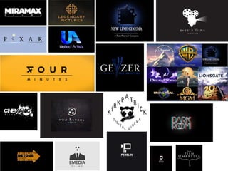
2. We have been researching film production logos to give us ideas for our own film logo and name.
These four are my favourite logos I have found. Firstly I like how the ‘F’ for four is also the number ‘4’ I think
this is a very clever idea and I also think that the bright yellow works very well to catch the viewers attention.
Secondly I like the sketchy, chalkboard design of the ‘new school’ logo, even though black on white is quite
plain I think its extremely effective, especially because our film opening will be quite dark.
The last two logos are my favourite I love the simplicity of the ‘ink’ logo but I also love the typewriter font of
the ‘brutally honest productions’.
3. Play on words with
social realism
simple
Black background
Black and white colour scheme
Splatter effect for a urban feel
One single bright colour
(eye catching)
Hand drawn chalk
board type font
Contrast between clean
and messy (see previous
page for example. Ink.)
Design including
a roll of film
4. Film fours current logo
When looking at other companies logos, we found
that companies that produce social realism films
use a variety and more interesting colours (eg. Red)
and intriguing designs.
Film4 is a British digital television channel available in the United Kingdom, owned and
operated by Channel Four Television Corporation.
Film4 was started in 1982 as Film4 Productions, a film production company owned by
Channel Four Television Corporation and has been responsible for backing a large number
of films made in the United Kingdom, and around the world.
Film fours first logo
Always been red and now this is how they are
recognized. This is why logos and colour schemes
are so important. Because the logo is so simple it
can be easily remembered and this is a important
thing to consider when designing our logo.
5. As a group we have decided that this our favorite logo
we have found, this is because we feel the logo is
effective and not only fits the theme of social realism
but gives the feel of a urban, edgy and exiting
production label. The name ‘Brutally Honest’ even fits
the social realism genre as the genres all about realistic
problems in society and the films show the honest
truth.
Splatter effect gives
edgy urban feel,
and links to the title
and to the genre
social realism
Conclusion
From looking at other production logos we realized we liked logos with dark
backgrounds, with recognizable images so we can relate to them and
understand them. Also we like clean and simple logos, and anything clever
with a play on words is always a bonus!
Type writer font
Simple white on
black colour
scheme
6. As a starting point we felt the name of our production
was simple but strong as was easily relatable to our
chosen genre (social realism), therefore we wanted to
create a simple but effective logo with a dark background
to go with it.