I have put the title of the interview at
the top of the screen. I have done          The title of the interview will go here
this so that the page is recognisable
and people know what they are
looking at straight away and who the
interview is with, which will be
important in the sale of the               The                                        The
magazine. I have put the interview on
both sides of the screen. I have done      interview                                  interview
this so that the magazine has had all      will go down          An image             will go down
of its space used. I have also done
this so that the magazine look good        the page              will go              the page
and that the magazine will look like it    here and              here of              here and
has a purpose. I have put the image
in the middle of the page. I have          maximise              the star             maximise
done this so that audience will have a     space.                who is               space.
focus on the image and know what
the magazine is about, and I have
                                                                 doing the
also done it so that the artist is                               interview
centre of attention.
I have put the title at the top of the
screen. I have done this so that the      The title will go here
interview is recognisable. I have also
put the interview only on one side of
the page. I have done this so that the
audience will be able to have a larger                             The image will go
image of the artist on the next page. I      The interview will    here
thought this may be good as the
reader would be able to use it as a
                                             go here
poster as well. The interview will
look larger as it will be all on one
page. This is good as it will look like
there will be more of a an interview
on the page when there will be the
same amount as before. I will not use
this design in my final magazine, as I
think that it looks more
unprofessional and I feel that it
would not fit the genre of the
magazine as well.

Layouts for double page spread

  • 1.
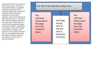
    I have putthe title of the interview at the top of the screen. I have done The title of the interview will go here this so that the page is recognisable and people know what they are looking at straight away and who the interview is with, which will be important in the sale of the The The magazine. I have put the interview on both sides of the screen. I have done interview interview this so that the magazine has had all will go down An image will go down of its space used. I have also done this so that the magazine look good the page will go the page and that the magazine will look like it here and here of here and has a purpose. I have put the image in the middle of the page. I have maximise the star maximise done this so that audience will have a space. who is space. focus on the image and know what the magazine is about, and I have doing the also done it so that the artist is interview centre of attention.
  • 2.
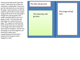
    I have putthe title at the top of the screen. I have done this so that the The title will go here interview is recognisable. I have also put the interview only on one side of the page. I have done this so that the audience will be able to have a larger The image will go image of the artist on the next page. I The interview will here thought this may be good as the reader would be able to use it as a go here poster as well. The interview will look larger as it will be all on one page. This is good as it will look like there will be more of a an interview on the page when there will be the same amount as before. I will not use this design in my final magazine, as I think that it looks more unprofessional and I feel that it would not fit the genre of the magazine as well.