Private Call Girls Bally - 8250192130 | 24x7 Service Available Near Me
Evaluation
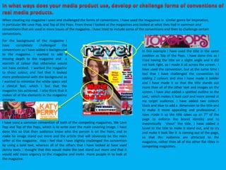
1. When creating my magazine I used and challenged the forms of conventions. I have used the magazines in similar genre for inspiration,
in particular We Love Pop, and Top of the Pops. From these I looked at the magazines and looked at what they had in common and
conventions that are used in more issues of the magazine. I have tried to include some of the conventions and then to challenge certain
conventions.
In this example I have used the title in the same
position as Top of the Pops. I have done this as I
tried having the title on a slight angle and it did
not look right, so I made it all across the screen. I
have used the convention, but at the same time I
feel that I have challenged the convention by
adding 2 colours and also I have made it bolder
and I have made it so that the title stands out
more than all of the other text and images on the
screen. I have also added a spotted outline to the
text, which makes it look cool and more aimed at
my target audience. I have added two colours
black and blue to add a dimension to the title and
to make it more appealing and professional. I
have made it so the title takes up an 7th of the
page to enforce the brand identity and to
theoretically ‘shout’ the title. I have added a
bevel to the title to make it stand out, and to try
and make it look like it is coming out of the page,
so that the audience are attracted to the
magazine, rather then all of the other flat titles in
competing magazines.
I have used a common convention of both of the competing magazines, We Love
Pop and Top of the Pops, which is to write over the main covering image. I have
done this so that then audience know who the person is on the front, and to
make he image stand out more and the article that will obviously be the main
seller of the magazine. Also I feel that I have slightly challenged the convention
by using a bold text, whereas all of the others that I have looked at have used
skinny texts. I thought that this would make the text stand out more and that it
would add more urgency to the magazine and invite more people in to look at
the magazine.
For the background of the magazine I
have completely challenged the
conventions as I have added a background
to the magazine. I wanted to add a
missing depth to the magazine and a
warmth of colour that otherwise would
not have existed. I wanted the magazine
to shout colour, and feel that it looked
more professional with the background as
I wanted to minimise the white space and
a clinical feel, which I feel that the
magazine has achieved. I also think that it
makes all of the elements in the magazine
stronger.
2. I have used a yellow circle to be able
to make a point more visible and
stand out more to the audience. And
make that part of the magazine look
better. I have also looked at the other
magazines that have used a similar
convention, however they do not hold
as much information as I have used.
However, I still feel like the convention
has worked and gives the same effect
as it has done on the professional
media products.
I have used a medium longshot of
the artist that I have chosen to
use. I have don’t this as most of
the magazines I have looked at
use this as a convention. Also it
focuses the reader onto the artist
and to look at the artist, so that it
is emphasised that this is the
artist and it is in this magazine. It
needs to be big to make the
reader respond, and buy the
magazine, as it is the main focus
of the magazine. I have not
challenged any of the
conventions here.
I have used a strip at the bottom of
the magazine to promote the
freebie that is in the magazine.
Some of the magazines that I have
looked at have just used the
bottom to promote posters in the
magazine and others have not used
any as a solid convention. I think
therefore that I have challenged
the convention.
I have added a fashion
section to make it look very
realistic and to capture the
audience. Most magazines
had this section o the front so
I thought it would be the best
thing to also have the section.
3. I have used this from the magazine We
Love Pop. I have used this as I thought
that it was a really good and visual way
for the target audience to know what
was where.
I have used the background again and I
feel that I have still challenged the
conversion as all the other magazines
that I have studied have actually left the
background as white space, whereas, I
tried to leave as little white space as
possible, making the magazine more
interactive.
Because I have got a versatile name, I
was able to use the title in all of the
subject areas on the contents page.
This was good as it reinforced the
brand of the magazine, as well as it
being a little silly and fun. I feel that
this challenges the conventions to a
certain extent as some magazines
have done this, but not as a stable
convention.
I feel that I have challenged the conventions in a way. I feel this as I have added
one photo to the contents page. I feel that this challenged the conventions and I
felt that the writing needed more emphasis than the images that were on the
screen and I think that it would help younger people to concentrate on the
reading element of the magazine and not just the images.
I feel that I have challenged the
conventions of the magazine by
using alternate colours as the
colour of the text in the boxes. I feel
like this would help the reader to be
able to concentrate on the writing
and for the writing to have a fun
element to them. This makes the
text more fun and easy to look at
for a period of time. I also thought
it would be a little quirky to have
the text colour change in all of the
boxes, but for the same colour to
also be a background in one f the
boxes.
I feel that I have followed the
conventions of a professional
magazine by putting the text into
boxes to separate it and make I easier
to read and interpret. I found that this
would be valuable to the magazine as
if people can’t navigate it then they
will not buy the product again and
therefore the magazine will not be of
a professional standard.
4. I have made the title of
the double page spread,
on a slight angle. This did
challenge a convention as
most magazines did not
do this. I feel that this
made the magazine look
good and I made the
words almost come out of
Marie's mouth, to make
the article more
believable. It also could
suggest, taking a different
angle about things, and
enticing the audience.
I have used a series of
images that are over
lapping on this double
page spread interview. I
feel that this was good as
it gave the page some
depth. I think that this
has challenged the
conventions as other
magazines are always
using almost flat images
one per page or in little
windows. I felt like this
would be better as it also
gave the artist in the
picture more than one
way to express herself.
And if the images are
presented well then
people are going to read
the article.
I have made the text in the article
alternate in the colour. I have done this
as it makes the article look good and
stand out, even thought it is a common
convention in a magazine. I think that it
works as a convention as it makes the
article easier to read and to understand
as a whole, who is speaking when.
5. I feel that the institution that would distribute
my magazine would be the supermarkets ,
and the publishers. To meet the demand of
the institution I looked at and wrote about
some magazines in my genre. I felt by doing
this I would have a grater understanding of
the genre that I was trying to replicate. It
would also help0 me to look at all of the
conventions the magazine would use, so that
when I created my magazine it would look like
my genre and appeal to the audience. I feel
that supermarkets would be the best way to
distribute the magazine as there is a variety of
competitors to chose from, but it would also
have a wider audience as lots of people got
tot the supermarkets and is convenient form
my target audience. I feel that the magazine
looks quite professional, which would entice
the target audience. With the publisher
distributing the magazine I believe that the
magazine would take off as they have quite a
lot of contacts and they would be able to put
the magazine to the public and they would be
able to look at the magazines that they would
be able to assess whether they would want to
buy the magazine. However there would be a
downside to this. The music magazine genre
pop, that I have selected for teenagers may
be quite cramped, and this would mean that
the magazine publishers and the supermarket
may not want to stock the product and the
publishers may have to honour the existing
customers. Also there would be an increased
competition, but then I would think that my
magazine looks better and more interesting
than the ones on sale already without too
much editing. But of course i9 have not
perfected this yet.
6. To gain inspiration I have bought a selection of magazines so that I could deifier the age group that my media product and so that I could get a feel of the different
social groups that the competing magazines represent, and what I can to add a new flavour to the magazine genre of teenage pop. After a lot of careful planning and
dissecting magazines I have decided to aim my magazine in the pop genre for 12-18. generally the magazines that I have looked at were aged for people 10-14. I
thought that I found a little niche that could compete with the other magazines in the same genre but make it look and seem for older users. I also thought that there
was nothing out there particularly for the age group that I have selected and what is on the market is limited.
I have chosen to do pop. This was because I thought I knew more about the genre and that I could execute it better than the other genres on the market. I have also
decided that there is not a lot of competition or choice for the people that like and read the genre. In reality, the pop industry is worth millions and I think that
magazines, comparing to other magazines it is not very well represented in this format. I thought that it was a shame and that I had a good enough understanding to
tackle a pop magazine, as expectations are quite high in the genre.
The main focus of the magazine will be girls. I think that the colour scheme that I have used shows that well. The pinks and the purples in the magazine suggests the
target audience, but also it makes the magazine bright and airy so that it looks inviting and appealing. I feel that this is the secret into getting the target audience to
buy the magazine. I also did this by featuring a female solo artist. This may attract the lads to buy the magazine and they would be classed as the secondary target
audience, and was not intentionally my audience. I also wanted to use a lot of female artists instead of male artists, so that the audience can relate to some of the
stories. This was a risky strategy, but I want for females to respect the female artists as much as they would the male artists.
I have not used the language of teenagers to engage with them., I have used proper English grammar in a simplified format, so any technical terms I have used I have
explained what they mean, so the magazine is not to technical and a boring geeky read. I felt though that the magazine needed to instil proper grammar into
teenagers and not to encourage text speak, as it is quite sloppy so to speak. I wanted to be quite formal in a casual way, but to be honest I feel that the teenagers may
not notice that I have even done this.
I asked people in the class what they thought of the colour scheme and I had to change it from my original ideas from the research. I am quite glad I did this as it is not
what I liked that mattered, so the target audience chose what colours they wanted. This plays a big impact onto the types of people and the popularity of the
magazine and the people that buy it. My original ideas was that I would used deeper colours like reds, oranges, browns and a blue. However people thought that this
was a horrible combination and did not go with the genre so the target audience was happier when I changed it based on their recommendations.
The images that I decided to use was a big decision as I did not know what angle I should take. Eventually I came up with the idea that I would focus the magazine
around women. I thought about this for a while and put it to a few colleagues in the class and they said that it was a good idea and a different approach to the male
dominated magazines that we see ion the shelves today. I also thought that I should be able to express myself through the medium of pop.
7. I have researched two magazine from the same genre. I researched We love pop and Top of the pops
magazine. I noticed that the magazines had the same conventions that made them suitable for the
target audience, like the magazine being busy. So I looked at all of my research in detail and thought
that I would have to do the same to make the magazine suitable for the genre and similar target
audience. I would have to copy the conventions but add my own twist on the magazine to make it
different from all of the other magazines. Also I had to adapt the language as the magazine that I was
doing was for teenagers. I had to be able to make the reader understand the language, but then not
feel that they were being belittled. This was an important factor in getting the magazine to capture the
audience. I added onto the front cover the names of the band that related to the genre and did an
article on them. This makes the audience look at the magazine and makes it obvious that this is the
target audience and the genre that I am trying to get. It will also brand the magazine as some
customers may buy it becu8ase it is their favourite people on the cover. They will remember this and
will then next time they see the magazine they may want to buy it. I think that my magazine would
target 12-18 year olds in the pop genre. I feel that the audience would be young, due to the colour
scheme and feel that this will attract them to read the magazine. I also think that the articles that are in
the magazines wold suit the audience, which would be the main focus for them.
I feel that the product that I have created is a mass market product. I think this as I have a wide age
group that the magazine is targeted at and I would say 95% of pop music magazine buyers are female. I
have targeted the magazine at girls, but I feel that I have not fully focused it as the colours that I have
used are unisex, so boys could read it as well as a secondary audience, and not feel too out of place.
This makes my product open to the mass market and also the stories inside are generalised to the wide
target audience.
8.
9. To address the audience I did some research to see what the target audience wants out of the magazine. I
had to make the magazine easy to understand and read, still making it look busy and interesting. I think
that I addressed the audience well, incorporating all of the factor that it knew the target audience. I used
quite a new and funky masthead on the front of the magazine as I thought that the audience would like to
see this and I felt that it looked better than the mastheads on some of the previous magazines. I thought
that it fitted the genre of the magazine and I also think that it addressed the issue of targeting the
audience. This will make the audience think that the magazine will be made specifically for them. Colours
were also important in the magazine. I felt like I had to make the colours bright but not to girly as the
magazine would then not live up to its secondary audience, and also it would not fit the content of the
magazine. I felt like I had a lot of examples of colour schemes that would aid me to make the right choice.
In the end I went for reds and blues, with a mix of rainbow colours. I felt it worked well with rhea target
audience and when I revealed it to the target audience they said that they liked it a lot, and they felt like it
represented them as a social group.
I had to address the audience when I came to the content of the magazine. They all like boys and gossip
stories, but I decided that I would mainly focus on the girl groups as they did not get too much of the
attention in the magazine. I also though that it may be more interesting for the audience to realise how
any girl groups and solo artists there are out their, but to keep the interest I did add a few boys into the
magazine.
10. I have learnt a lot all of the things about using the technologies when in the process of creating this product. I have learnt about
the hardware's and the software's, and the websites needed t make the product .
The hardware's that I used is a camera and a computer. On the camera I had the settings on auto, this allowed me to get the best
picture and I knew that the lighting would be right, however, I chose a light and airy space so that the picture was not dull and
awful. I think that this gave the image a good look and it made it more appealing to such a young target audience, as they will not
buy rubbish on a limited budget. I used a compact Nikon camera, as I had no other means to be able to take the images. However,
it was a 10 megapixel camera, which did create a quality image. I had to learn how to make the photograph look good and how to
position the camera in order to do this. This was good as it allowed me the freedom to experiment, and I did have to read an
online guide about how to take the best photo for the magazine. So before I even started to be able to take the images and form a
product. I had to learn a lot about how to use the camera, as I had not had it that long, and therefore had to learn how to work
the features that the camera possessed. This was a steep learning curve, as I had only 2 weeks to learn and to take the images,
this made it hard, but I think I can see the benefits of the hard work that I have put into the hardware and taking the images.
Next I had to learn about framing the picture and I did follow the rule of thirds, so that the images were not dead centre of the
magazine. I put the images on the sides of the magazine as this was the best to fill in all of the content that I had to use, and it
also looked the best. To learn about this I just experimented until I found a look that I liked. I had to spend a couple of hours on
this to make sure that I used the suitable image and that the images were in the best place. This would have made the magazine
look more amateurish if I had of not spent the time that I needed to make the images be framed and executed in a professional
manor.
I thought that the mise en scene was the most important element of the hardware that I used. I had to make the pictures look
real and to make the model look like she really is a celebrity. To do this I had the model dress up in about 5 or 6 different outfits
so that I could choose the best ones. In each if the outfits I took a style of a celebrity, so that it would look good. However, none
of the outfits that I picked out looked very good. So that meant that maybe I had to improvise and invent a style. For this I got the
fashionable blazer and a fashion t shirt and black trousers. I thought that it was girly and I really liked the outfit. Not the magazine
looks like it is creating its own style instead of being like all the other magazines on the market. I thought that the difference in
images would make the magazine stand out and maybe even sell more. The only problem of this would b getting my target
audience to agree and pick up the magazine, as I tried to get the be different message across.
11. I had to use an awful lot of software ion the process of making the product. I had to use Fireworks, a photo and product
manipulation programme, I used this both to construct and to edit areas of the product, and is what the editing of the images
were done in.
In the preliminary task, I was not all that confident in making things using the software, so I did spend a few hours with the
programme to find out how to use all of the effects and how to make the magazine look authentic, so I made a few mock ups,
using images off the internet so that I could get a feel for the programme. This included me changing hue and saturation, to
adding bevel effects. All of which I tried and trailed so that I would get a feel for the programme. I also thought that this would be
good as it meant that I would be able to be confident in the product and due to the short deadlines, did not want to waste time
thinking, “how do I do this?” which is what I did in the prelim, and ended up doing something else instead that did not look as
good as the m main product. For me the investigation of the programmes was enjoyable and I have learnt how to bevel images,
add outlines, make things transparent, ordering the layers, and much more. This was an invaluable experience when creating the
product.
I have used Photoshop in the product, but only briefly to trial it to see if it was better than fireworks and to add effects that would
not have been available on fireworks. I struggled to get to grips with it after a long time, so in the end gave up, but I have leant to
navigate the site and in the end, it helped me to have more of an imagination withy the product and to try new things, even if
they do not work.
That was all the software that I used in the creation of my product.
These were some of the mock ups
that I have used to get to grips with
the fireworks software.
12. I have used quite a lot of websites in the creation of my product. I have used Blogger, Slideshare and a series of site from
Google, to help me with the creation of my product. I have used blogger and the format to hand in my work. However this was
tricky to use as first as I had no idea how to post a blog, never mind setting one up and learning to embed videos and things. So I
have used a free other blogs that I found via a Google search to teach me how to do all of the things that I will need to do in order
to put my work onto the internet and how to do all of the tasks I needed to do on the blogger site. This is the URL for that blog.
http://www.problogger.net/archives/2006/02/14/blogging-for-beginners-2/
This was a really useful site that allowed me to have all of the access to all of the features, so that the blog looked good, as well as
all of the work being put in order. This meant that it was easier for me to be able to put things on the blog and easier for me to be
able to manipulate the posts once they had been posted. I felt like it was really important to learn these skills, not just for the
project but for the future as well.
When I started the project I had no idea how to embed a PowerPoint to a blog. This was a tricky area as I needed to put this on
the blog and I had a lot of power points to put on it. I then discovered Slideshare, which is a free file sharing website. From this it
converted the PowerPoint to a format that I could then use on the blog. I just had to copy the embed code and then copy and
paste that into the HTML page when typing a new post. This was a very useful engine to use and I found that once I had learnt to
use it was easy to navigate. The only drawbacks that I had found with this was that the website took a long time to load and
convert the document. But this was the easiest way to do it.
13. In the preliminary task, I felt that I did not use the research as much as I should have. I only looked at the existing magazines once or twice to
gain an idea of the type of product that I should be producing. However, then when I started the real project I noticed that I had started to
look more in depth at the examples of the genre that I have been looking at. I then realised that there was a lot more to the magazines than I
had looked at in the preliminary task. By looking at the magazines more frequently I had more of an idea a bout the conventions that
magazines use and the colour schemes and types of stories in the magazine. I think this really shows in the product that I have created and I
feel that it looks more professional than the preliminary one. I also for the main task took more photographs. This then enabled me to look
in more depth at the photographs that I needed for each of the situations, to make the magazine look professional. It gave me the scope to
have a choice of which of the best photos I wanted to use instead of saying, that will do like I did in the preliminary task.
I wanted to keep the ain task more interactive for my target audience and felt like the preliminary task would have bored the target
audience, so in the main task I strived to do the opposite. I tried to keep each of the pages very busy and look really good, with minimal
white space. This would then allow me to make the magazine more than the competitors on the market, but also to provide entertainment,
without them getting very bored and just flicking though the pages of writing, or for it to be like a picture book. So I thin that in the main task
I have managed to balance that out somewhat, I found this quite difficult to do in the double page spread, but noticed it would be a lot
easier if I had like a page of pictures to balance out the text. I felt like it was important to balance out the magazine so that it would be better
for the target audience, whereas in the preliminary task I did not really look at the target audience in too much detail, and shows in the
product that I had produced.
By doing this media project I have not only learnt about skills needed to make the product but also about interpersonal skills like time
management. I have learnt that I need to be more organised and meet the deadlines as in the preliminary task I did not record all of the
deadlines, which meant that most of the project was rushed to get it to completion. This was very bad for the project as it meant that I
would have bits that were good and bits that were bad, and especially for the target audience, the product would not have worked in this
way. So when it came to the main product I decided that I would keep a log of all of the tasks that I needed to do and I spent more time on
sections of the project, that weren’t as strong as they should be. I spent a lot of time with other people and getting opinions as I felt that it
would be vital in making the product work and making sure that the audience liked it as much as I did. So I dedicated more time to the
product and in the end it paid off as I was happy with the final product and found that I was not rushing it to get it finished. It also meant that
I enjoyed making the magazine more and I think that it reflects in the quality of the finish to the magazine.
Also when I first started to use the technologies like Photoshop and fireworks, I had the basic understanding of how to use them, but I did
not know the programmes well enough to be able to use them to their full potentials and to make the images that I have used better. This
made the magazine not ,looks as good as it could have dine. It also meant that I had no skills in the magazine and I had nothing to show that
I had used and advanced skills on the programme. So for the main task I took maybe a couple of hours to play with the programme to look at
all of the effects and things that I could add to the main product. Eventually I got a better understanding of the programme and was more
confident in its use. I think that this has helped a lot and has taught me to always be confident in yourself before trying to make a product
like this, as it makes you enjoy it more and get the right results.
14. I also had to learn to communicate with teenagers my age, without using the slang words that they use and to keep them interested. This was
quite hard and I had to spend some time with a sort of focus group and they told me that it would be better not to use the slang but to keep
the words relatively small. This would make the magazine easy to read and understand, but would also make the magazine, more grown up
an the audience felt like this was a good place to go to. They also said that there wasn’t a magazine on the market that did this and it was a
demand. In the prelim task I did not do this and I just used stereotypes to communicate to the audience. This was wrong I feel as most of the
people may not conform to stereotypes and therefore that the magazine would be barking u the wrong tree, so to speak. I think that this
change in tactics to making the magazine has made the final product, so much better than the preliminary task.
I think that all of the changes that I have made in the step up from the preliminary task to the main one has made the magazine look more
authentic an to make the magazine seem more like the rivals in the shops. I think that I have focused more on the objectives of the product
and that I have really look more in depth at the needs and demands of the target audience. I think that has aided me to be able to make an
authentic magazine. I have also begun to look at the magazine industry and to see all of the things that I have needed to do to meet
expectations and I feel that I have gone above and beyond to make the magazine the best that it can be. I have researched and scrutinised
the existing magazines and have begun to fully understand all of the conventions that are used in the magazines and the effects that they
create. This has allowed me to make my own effects and know what they will mean to the target audience.