Retail Store Scavanger Hunt - Foundation College Park
Photoshop screenshots
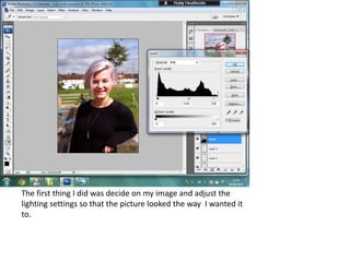
1. The first thing I did was decide on my image and adjust the
lighting settings so that the picture looked the way I wanted it
to.
2. Next I resized the image to make it what I thought was an
appropriate size for the main image.
3. From here I posted a masthead and cropped out the white
background which was attached.
4. After this I changed the overlay colour of the masthead
making it darker which I did so that it would stand out more. I
chose black as it is bold and also does not clash with any of
the other colours visible.
5. I then added different blending effects to my masthead. These
were: drop shadow, bevel and emboss, colour overlay and
also gradient overlay. These effects have made my masthead
bolder and more 3D. In my opinion this makes my cover look
more interesting and less flat and boring.
6. After receiving feedback from my teacher I changed the pull
quote font. This is because the one in the first image was too
handwriting like and the letters were very close together. The one
which I’ve chosen to replace it with is larger and better spaced
out making it a lot clearer than it previously was, therefore easier
to read.
7. I added circle pink graphics (which match the models hair) and another
puff to the cover making it look more realistic, more balanced and less
empty.
8. I changed the image to one more suitable, added the ‘stroke’
effect to my graphics and my pull quote to make them easier to
read. I then changed the opacity of my graphics to make them
look softer and more inviting.
9. I changed the colour of the P in my masthead to add more colour and
personality to the cover. Another thing which I have changed is the size of
the black box graphic at the bottom of the page. I changed this as it was
too big and drew way too much attention from everything else on the
page. I also changed the stroke size around the circle graphics to make
them again look softer and a lot less bold.
10. I changed the colour of the P from purple to pink to match my colour
scheme better. Another thing I did was slant the pull quote to make it
look more gossipy which would tie in better with the magazine theme. I
also took the ‘-Sydney Head’ and replaced it with ‘Sydney Head:’ as she is
the main model in my whole magazine so it gives her more focus. Lastly I
shrunk the size of the left circle graphic to make it fit better.
11. I changed the font again of my pull quote after receiving feedback that I
should make it look more personal and I thought that the best way to do
that would be to add a handwriting styled font. This makes it look casual
and gives a feel that its genuinely from the person being quoted. I then
tweaked the positioning of the different puffs and graphics on my screen
to put them into locations where they worked best.
12. Here I have removed the black box graphic and the quiz caption
and then enlarged the image. I edited the ‘Sydney Head:’ even
further and deleted the right graphic and its puff. The pull quote
has also been enlarged.
13. Next I added a small graphic with ‘inside’ written inside it. I also
started to rewrite out the puffs underneath it.
14. In this screenshot I have finished typing out and re-wording the
puffs and also lined them up using the grid tool.
15. To finish off I changed the puffs font and added different effects to make
it more visible against the background. I changed the text inside the
graphic and made the font the same as that of the main puff. To finish off
I shrunk the size of the graphic to make it fit the text inside better.