
Recommended
More Related Content
What's hot
What's hot (18)
Viewers also liked
Viewers also liked (11)
Similar to Media printscreens
Similar to Media printscreens (20)
More from rubyasmedia
More from rubyasmedia (16)
Recently uploaded
Recently uploaded (20)
Media printscreens
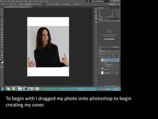
- 1. To begin with I dragged my photo onto photoshop to begin creating my cover.
- 2. I then pasted in my masthead, cropped the white background out and added some different blending options. These options make the masthead look more 3D so it stands out more.
- 3. I then added some cover lines which were the names of different bands in the alternative rock genre.
- 4. Following this I changed the colour to that which is common in a rock magazine and added some blending options to make the writing pop.
- 5. Next I made the coverlines unseen so I could edit the image. I manipulated the photo by changing the lighting making the background whiter in comparison to the original grey it was.
- 6. Eventually I decided that the photo that I had selected didn’t work as well as I thought it would so I replaced it for another.
- 7. I then brought my coverlines back in a grey because the colours that I used earlier didn’t look right. I also copied and pasted bits of my image to make it appear as if it was larger than it is covering the page.
- 8. From here I then cut down he amount of band names featured as I had too many and it made the cover look too crowded.
- 9. I then went on to type the cover lines out as individual lines and not a clumped text as they were before.
- 10. I then lined them up making them look neater and more sophisticated.
- 11. I created a graphic at the top then used a smudge tool to make it look rough.
- 12. Further from this I added different blending options to make it look better and look less flat.
- 13. Following this I removed the graphic because it looked rubbish then replaced it with text then went on to add my anchor which is the artists name making it clear who the cover image is. Also I added a barcode.
- 14. Next I adjusted the image position, added a pullquote and also a puff. I also added some colour in the form of red text.
- 15. Following on from feedback I shortened my cover lines and made my masthead larger. I added a graphic behind the pullquote and changed its font too. Also I changed the font for 10 and made it smaller.
- 16. I then changed the graphic colour to make the pullquote more readable.
- 17. . Here I began to move my text into better places also changed the pull quote colour. As well as doing this I added a yellow graphic filled with text typical of an alternative rock magazine. I also changed the artists hair colour.
- 18. To make the magazine seem more realistic I used a graphic to elongate the barcode then typed a price in. I know from my market research that this price is not too expensive.
- 19. Next I moved the barcode positioning to the bottom left corner where there was more space.
- 20. To finish off I changed part of my anchor to a yellow colour matching the graphic on the cover. This makes the cover flow better as there is not a random looking, unmatched yellow graphic anymore.