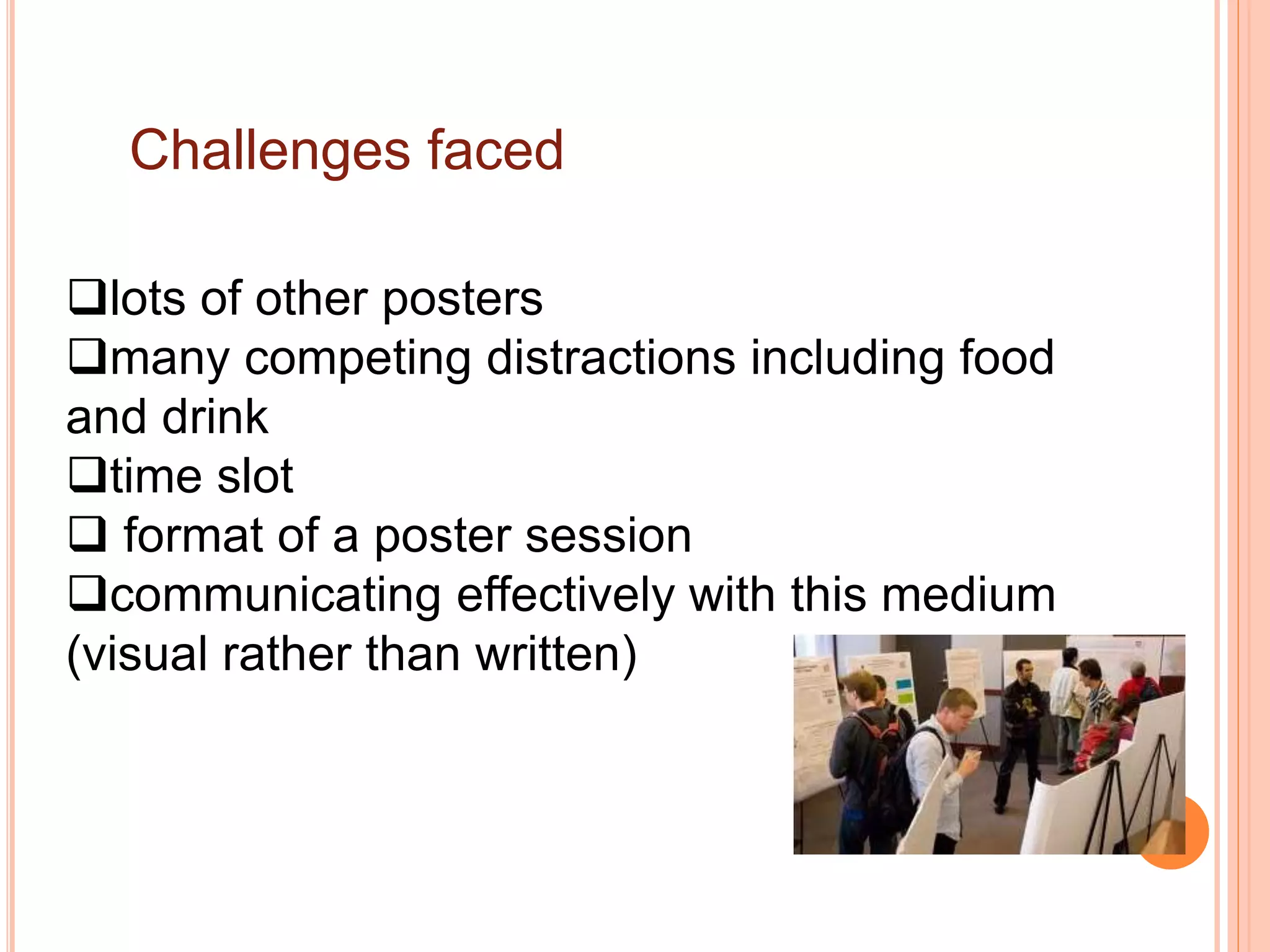
How to present a poster in a conference
Prof. Afaf El-Ansary
How to design and present a poster
Prof. Afaf El-Ansary
What are posters?
Posters are a special type of presentation. When
well designed, they are not simply journal papers
pasted onto boards.
The purpose of scientific posters is to present
work to an audience who is walking through a
hallway or exhibit.
Why present a conference poster?
Communicate a message (your research)
 Reach a large number of people (potentially)
 Obtain feedback
 Become known
 Network
Challenges faced
lots of other posters
many competing distractions including food
and drink
time slot
 format of a poster session
communicating effectively with this medium
(visual rather than written)
Some key considerations when designing your
poster
 it’s about your audience and not about you
 your poster is a visual form of communication
o layout given size and shape of poster
o balance of text and graphics
o can text be replaced by graphics?
 people usually spend little time in front of a poster
 most posters are viewed from a distance of at least 1.5m
away
Some Tips: layout
Title should be across the whole width of the poster
 organise text/graphics in “eye-sized”chunks
 columns and text boxes
o 2 columns for a “portrait”oriented poster
o 3 columns for a “landscape”oriented poster
the order of reading should be down columns rather
than across rows
Some Tips: fonts
Use no more than 3 different fonts (usually 2)
Arial is good for titles and for axis labels
Century Gothic is good for text
Times New Roman don’t enlarge well, so don’t use
fonts that are OK for text are Palatino, Bookman or
Courier
Font size ? Bigger is best !
Ensure fonts are large and easy to read. The
words need to be legible from 1.5 meters away.
 Recommended sizes: Title: 72 pt; Headings:
48-60 pt; Body text: 24-48 pt.
Restrict boldface to title or headings
Do not underline
Therefore:
 design poster to be easily seen and easily
scanned by eye
focus on the central question and take-home
message (use and repeat key words)
use simple and clear but appropriate language
The specific sections such as the results
should be easy to locate on the poster.
For instance, many will read only the objectives (or
goals) of the work, and then the final results.
 Others, who have a deep interest in the topic, will
try to read the poster from beginning to end.
Given these different approaches to reading posters,
another characteristic of an effective poster is that
specific sections are easy to locate.
So what then makes for an effective
poster?
This question is not easy to address because the
expectations by the audience vary significantly from
discipline to discipline. For instance, what an audience
of a medical poster session expects differs significantly
from what the audience of an engineering poster
session expects.
How to Design a Great Poster…The
BASICS
A Great Poster Is...
Readable
Well Organized
Getting started….
Clear design starts with clear thinking.
Before you begin writing text and selecting
photos, ask yourself this question:
If the viewer only carries away one idea,
what do I want it to be?
Now write down your answer. This is the
theme of your poster, the focal point.
Everything you include on your poster
should support that theme.
Posters tell stories: provide clear flow of
information from introduction to conclusion.
Your poster tells viewers what you did, why you did
it and what you found out from doing it. Focus on
your major findings - a common fault is to try to
cover too much. Few delegates are going to read
everything on your poster, so get to the point.
The poster should include a statement of the
project description, how you conducted the
project, results or findings of the project, and a
summary tying in your reflection component.
An effective poster operates on multiple
levels:
source of information
conversation starter
advertisement of your work
summary of your work
The Title
Use a brief title
a sub-title can help describe what the
poster is about.
The title needs to accurately reflect the
content of the poster.
Be creative and capture viewer's
imaginations!
The title-2
A TITLE ALL IN CAPITAL CASE
IS DIFFICULT TO READ.
Compulsory content:
Author's name/s
Author's organisation/s
Organisation's logo/s
Contact details (website, email,
phone, postal address.
A great poster catches your eye, and is:
Clear and simple
Easy to read
Organised with a logical flow
Relevant to viewers in its content
Taking advantage of the visual medium
Providing viewers with 1 or 2 main
messages
Focus on 1 or 2 main messages and
do NOT overcrowd the poster.
Keep it simple.
What are the main messages you want
to convey?
Graphics convey your message quickly
Posters are a visual medium and should include
graphics.
Graphics not only catch people's eye and draw
viewers in for a closer look… they are
understood more quickly than text so are
valuable tools for communication of your main
messages.
Use photos, cartoons, figures, tables, diagrams.
Label them if necessary.
Some Tips: colour
Choose colours wisely
Don’t let use of colouror your background detract from the
message
Do not combine either primary colours or complementary
colours
primary = red, green, blue
complementary = cyan, magenta, yellow, black
(except yellow on black)
Choose light rather than dark colours
Some Tips: text boxes
if you put text in a coloured box, make
sure there is a text-free border of colour
around the text to increase readability
default margins inside text boxes are not
wide enough in Powerpoint
increase internal margin through format,
textbox, internal margin menu
Scientific posters
need to effectively communicate the
research
may require more text than other types of
posters
but omit much of the detail that would go
into a paper (use handouts to elaborate)
Scientific posters: content
Title -enticing but short (question?)
Background –justification for study
Objectives –purpose of study
Methods
Results –usually use figures rather than tables;
if used, tables should be simple
Conclusions
Scanning from top left to bottom right
Software issues
Powerpoint commonly used but not necessarily
the best package
sometimes has memory problems and omits bits
(copy into Corel Draw and save as Tif)
print out poster as a PDF file before final printing
to check layout and see if everything is there
Most importantly
proofread a printed copy before the final print
pin up an A3 sized copy and walk past it
eliminate unnecessary detail
check spelling and grammar AGAIN before printing
Standard Paper size
Presenting the poster
Some conferences include précis-
presentation sessions where poster
authors talk about their poster to
delegates for 3-5 minutes.
Before you get there……
Find out who the audience will be: what
will they already know, what new
information will they be interested in?
Practice: time yourself, record it on tape
and listen to yourself.
Rehearse in front of colleagues and ask
for constructive feedback.
Check with conference organizers:
How/where your poster will be
hung/displayed, poster size guidelines and
handout guidelines.
Prepare handouts.
Take with you
Materials to hang your poster
(if required): pins, tape. Your
handouts .
A plastic sleeve to hang your
handouts up with your poster.
Business cards to hand out.
An electronic copy of the
poster (some conferences
display the winning poster on a
screen.
During the presentation
Do not stand in front of the poster and block it
from the audience.
Make eye contact with audience members and
speak clearly.
Use simple language.
State why the research/project is important and
relevant to the audience.
Don't read directly from the poster: talk about
your work and bring it to life.
You may wish to point to a key point on the
poster, for people to peruse later.
SMILE! Relax (breathe!) and enjoy sharing your
knowledge
References and additional resources
1. Advice on designing scientific posters and link to a poster template in
Powerpoint. This template will prompt you if the amount of white space in the
poster decreases below 35%.
http://www.swarthmore.edu/NatSci/cpurrin1/posteradvice.htm Accessed 26th
October 2007.
2. Effective Poster Presentations on-line tutorial
http://www.kumc.edu/SAH/OTEd/jradel/effective.html
3. How to Prepare a Poster
http://www.siam.org/meetings/guidelines/poster.php
4. Online journal for Scientific and Medical Posters
http://eposters.net
You can view a large number of posters at this site, and submit your own posters to
it. You may also use this site to obtain feedbackon your poster.
6. http://phdposters.com/gallery.phpdisplays a number of PhD posters and includes
some evaluative commentary
https://posters4research.com/free
-templates/a-36x48ppt.php
How to present a poster

How to present a poster

  • 1.
    How to presenta poster in a conference Prof. Afaf El-Ansary
  • 2.
    How to designand present a poster Prof. Afaf El-Ansary
  • 3.
    What are posters? Postersare a special type of presentation. When well designed, they are not simply journal papers pasted onto boards. The purpose of scientific posters is to present work to an audience who is walking through a hallway or exhibit.
  • 4.
    Why present aconference poster? Communicate a message (your research)  Reach a large number of people (potentially)  Obtain feedback  Become known  Network
  • 5.
    Challenges faced lots ofother posters many competing distractions including food and drink time slot  format of a poster session communicating effectively with this medium (visual rather than written)
  • 6.
    Some key considerationswhen designing your poster  it’s about your audience and not about you  your poster is a visual form of communication o layout given size and shape of poster o balance of text and graphics o can text be replaced by graphics?  people usually spend little time in front of a poster  most posters are viewed from a distance of at least 1.5m away
  • 7.
    Some Tips: layout Titleshould be across the whole width of the poster  organise text/graphics in “eye-sized”chunks  columns and text boxes o 2 columns for a “portrait”oriented poster o 3 columns for a “landscape”oriented poster the order of reading should be down columns rather than across rows
  • 8.
    Some Tips: fonts Useno more than 3 different fonts (usually 2) Arial is good for titles and for axis labels Century Gothic is good for text Times New Roman don’t enlarge well, so don’t use fonts that are OK for text are Palatino, Bookman or Courier
  • 9.
    Font size ?Bigger is best ! Ensure fonts are large and easy to read. The words need to be legible from 1.5 meters away.  Recommended sizes: Title: 72 pt; Headings: 48-60 pt; Body text: 24-48 pt. Restrict boldface to title or headings Do not underline
  • 10.
    Therefore:  design posterto be easily seen and easily scanned by eye focus on the central question and take-home message (use and repeat key words) use simple and clear but appropriate language
  • 11.
    The specific sectionssuch as the results should be easy to locate on the poster. For instance, many will read only the objectives (or goals) of the work, and then the final results.  Others, who have a deep interest in the topic, will try to read the poster from beginning to end. Given these different approaches to reading posters, another characteristic of an effective poster is that specific sections are easy to locate.
  • 12.
    So what thenmakes for an effective poster? This question is not easy to address because the expectations by the audience vary significantly from discipline to discipline. For instance, what an audience of a medical poster session expects differs significantly from what the audience of an engineering poster session expects.
  • 13.
    How to Designa Great Poster…The BASICS A Great Poster Is... Readable Well Organized
  • 14.
    Getting started…. Clear designstarts with clear thinking. Before you begin writing text and selecting photos, ask yourself this question: If the viewer only carries away one idea, what do I want it to be? Now write down your answer. This is the theme of your poster, the focal point. Everything you include on your poster should support that theme.
  • 15.
    Posters tell stories:provide clear flow of information from introduction to conclusion. Your poster tells viewers what you did, why you did it and what you found out from doing it. Focus on your major findings - a common fault is to try to cover too much. Few delegates are going to read everything on your poster, so get to the point.
  • 16.
    The poster shouldinclude a statement of the project description, how you conducted the project, results or findings of the project, and a summary tying in your reflection component.
  • 17.
    An effective posteroperates on multiple levels: source of information conversation starter advertisement of your work summary of your work
  • 18.
    The Title Use abrief title a sub-title can help describe what the poster is about. The title needs to accurately reflect the content of the poster. Be creative and capture viewer's imaginations!
  • 19.
    The title-2 A TITLEALL IN CAPITAL CASE IS DIFFICULT TO READ.
  • 20.
    Compulsory content: Author's name/s Author'sorganisation/s Organisation's logo/s Contact details (website, email, phone, postal address.
  • 21.
    A great postercatches your eye, and is: Clear and simple Easy to read Organised with a logical flow Relevant to viewers in its content Taking advantage of the visual medium Providing viewers with 1 or 2 main messages
  • 22.
    Focus on 1or 2 main messages and do NOT overcrowd the poster. Keep it simple. What are the main messages you want to convey?
  • 23.
    Graphics convey yourmessage quickly Posters are a visual medium and should include graphics. Graphics not only catch people's eye and draw viewers in for a closer look… they are understood more quickly than text so are valuable tools for communication of your main messages. Use photos, cartoons, figures, tables, diagrams. Label them if necessary.
  • 24.
    Some Tips: colour Choosecolours wisely Don’t let use of colouror your background detract from the message Do not combine either primary colours or complementary colours primary = red, green, blue complementary = cyan, magenta, yellow, black (except yellow on black) Choose light rather than dark colours
  • 25.
    Some Tips: textboxes if you put text in a coloured box, make sure there is a text-free border of colour around the text to increase readability default margins inside text boxes are not wide enough in Powerpoint increase internal margin through format, textbox, internal margin menu
  • 26.
    Scientific posters need toeffectively communicate the research may require more text than other types of posters but omit much of the detail that would go into a paper (use handouts to elaborate)
  • 27.
    Scientific posters: content Title-enticing but short (question?) Background –justification for study Objectives –purpose of study Methods Results –usually use figures rather than tables; if used, tables should be simple Conclusions Scanning from top left to bottom right
  • 28.
    Software issues Powerpoint commonlyused but not necessarily the best package sometimes has memory problems and omits bits (copy into Corel Draw and save as Tif) print out poster as a PDF file before final printing to check layout and see if everything is there
  • 29.
    Most importantly proofread aprinted copy before the final print pin up an A3 sized copy and walk past it eliminate unnecessary detail check spelling and grammar AGAIN before printing
  • 30.
  • 31.
    Presenting the poster Someconferences include précis- presentation sessions where poster authors talk about their poster to delegates for 3-5 minutes.
  • 32.
    Before you getthere…… Find out who the audience will be: what will they already know, what new information will they be interested in?
  • 33.
    Practice: time yourself,record it on tape and listen to yourself. Rehearse in front of colleagues and ask for constructive feedback.
  • 34.
    Check with conferenceorganizers: How/where your poster will be hung/displayed, poster size guidelines and handout guidelines. Prepare handouts.
  • 35.
    Take with you Materialsto hang your poster (if required): pins, tape. Your handouts . A plastic sleeve to hang your handouts up with your poster. Business cards to hand out. An electronic copy of the poster (some conferences display the winning poster on a screen.
  • 36.
    During the presentation Donot stand in front of the poster and block it from the audience. Make eye contact with audience members and speak clearly. Use simple language. State why the research/project is important and relevant to the audience. Don't read directly from the poster: talk about your work and bring it to life. You may wish to point to a key point on the poster, for people to peruse later. SMILE! Relax (breathe!) and enjoy sharing your knowledge
  • 37.
    References and additionalresources 1. Advice on designing scientific posters and link to a poster template in Powerpoint. This template will prompt you if the amount of white space in the poster decreases below 35%. http://www.swarthmore.edu/NatSci/cpurrin1/posteradvice.htm Accessed 26th October 2007. 2. Effective Poster Presentations on-line tutorial http://www.kumc.edu/SAH/OTEd/jradel/effective.html 3. How to Prepare a Poster http://www.siam.org/meetings/guidelines/poster.php 4. Online journal for Scientific and Medical Posters http://eposters.net You can view a large number of posters at this site, and submit your own posters to it. You may also use this site to obtain feedbackon your poster. 6. http://phdposters.com/gallery.phpdisplays a number of PhD posters and includes some evaluative commentary
  • 38.