Download to read offline


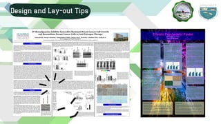
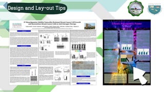
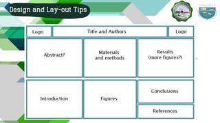
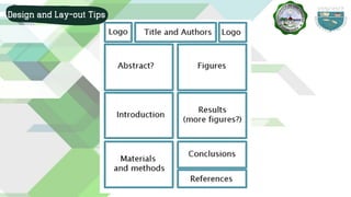
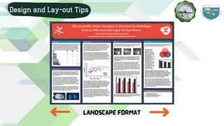
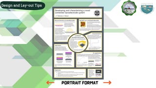
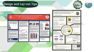
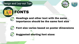
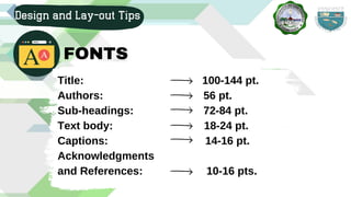
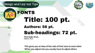
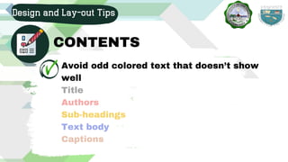
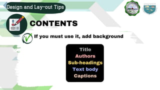

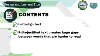
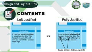
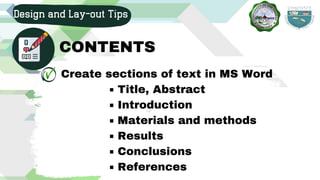
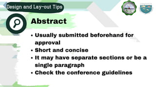
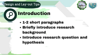
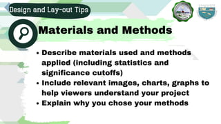


The document outlines tips for designing and presenting research posters, highlighting the importance of effective communication tools in academic presentations. It provides detailed guidance on layout, font sizes, color choices, and content organization, stressing the need for clarity and visual appeal to engage viewers. Additionally, it emphasizes maintaining a logical flow and avoiding excessive text to enhance viewer understanding and interest.


