2. Format: Magazine
I am going to produce a new indie music magazine called Riff. My magazine ideas come
from Q however they cover a range of music genres compared to my magazine which
focuses on indie. In the future I hope that Riff magazine could become a market leader in
the indie genre, above their competitors NME and Kerrang. I will be creating a front cover
and double page spread to explore the layout of my magazine for the first issue which
will be released; this will also allow me to explore how I will be using my colour scheme
throughout each issue. Both my front cover and double page spread will be used to
advertise Riff magazine.
Working Title:
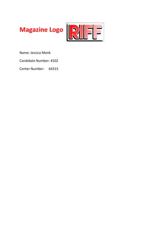
The masthead name I have chosen is Riff, however I did have other possibilities such as Stringz
and Bass, which I felt also, met the indie genre. The font I have chosen for my masthead is
Lemon/Milk, however there was also Maxxii Serif and Mangosteen, which worked well with my
other two masthead ideas.
My masthead will be in the top left hand corner of the magazine, with red gradient text, a white
stroke effect and a black drop shadow. Just like Q I will be including a shape behind which will
also be white. My cover lines will also be down the left hand side of the cover, the text will be red
with a black drop shadow. My main image will be positioned towards the right of the magazine,
with my main headline below, which will also be red with a black drop shadow. In the top right
hand corner will be my puff promotion which will be gold with white text, and my barcode will be
at the bottom right showing the magazine’s web address, links to social media and the date
which the magazine will be released.
Genre:
My chosen sub-genre for Riff magazine is indie, as this proved to be most popular within
my target audience survey and questionnaire results. Riff will include both male and
female cover stars from the indie genre who appeal highly to both genders; they will
either be well-known or smaller indie bands. Riff magazine will be in competition with
Kerrang and NME and potentially Q, both Kerrang and NME share the same indie genre
were as Q covers multiple genres, they also share the same target audience.
Content:
Riff magazine will be a 120 page indie music magazine filled with exclusive information
such as;
• Double page spread interviews, with popular artists in the indie genre,
• Quick fire question interviews, to introduce the reader to smaller indie bands,
• Album and artists reviews from music producers and DJ’s of the best male and
female indie artists,
• ‘Riff’s top 10 indie tracks’ a playlist which selects the 10 indie tracks each month
both new and old.
• 16 full page advertisements to engage the reader throughout the magazine, and
keep them entertained,
• Exclusive double page posters,
• And festival guides, such as reading and Leeds, Glastonbury and many more.
Including both male and female artists will help my magazine to gain ‘Star Appeal’ and
attract both male and female readers, as both will be equally entertained.
Style or Approach:
Overall my chosen colour scheme is red, white and black.
The denotation of the colour scheme for the magazine front cover will be red, white and
black.
The colour red was chosen for the masthead because this is the first feature which the
reader will notice, therefore using a bright eye-catching colour, will make Riff an easily
recognisable magazine.
The colour black was chosen for my text as this is stereotypically the most common
colour for interview text. This colour also represents mystery which will invite the reader