
Recommended
More Related Content
What's hot
What's hot (20)
Viewers also liked
Similar to Analysing music magazine front covers
Similar to Analysing music magazine front covers (20)
Recently uploaded
Recently uploaded (20)
Analysing music magazine front covers
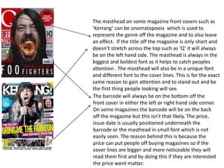
- 1. The masthead on some magazine front covers such as ‘Kerrang’ can be onomatopoeia which is used to represent the genre off the magazine and to also leave an effect. If the title off the magazine is only short and doesn’t stretch across the top such as ‘Q’ it will always be on the left hand side. The masthead is always in the biggest and boldest font as it helps to catch peoples attention . The masthead will also be in a unique font and different font to the cover lines. This is for the exact same reason to gain attention and to stand out and be the first thing people looking will see. The barcode will always be on the bottom off the front cover in either the left or right hand side corner. On some magazines the barcode will be on the back off the magazine but this isn't that likely. The price, issue date is usually positioned underneath the barcode or the masthead in small font which is not easily seen. The reason behind this is because the price can put people off buying magazines so if the cover lines are bigger and more noticeable they will read them first and by doing this if they are interested the price wont matter.
- 2. The main image on a front cover is usually a mid close up or a mid shot. Some magazines do break this code and convention especially if the image is of a band. The cover lines should always frame the face off the subject and they should never overlap on to the subjects face. The subjects face should also convey attitude which relates to the band/artist and the genre of music. The photographer will do this by the positioning off the body and the facial expressions used. This is because if the subject looks blank with no expression it wouldn’t attract people as they most likely will be bored by the lack off enthusiasm and look at different magazines. Its important that the subject is always looking at the camera as it creates a personal relationship with the audience.
- 3. The main cover line will always be linked to the main image. It will be in bigger and bolder font than the other cover lines so it catches peoples attention and stands out among everything else. The reason for this is for those who don’t know who the artist on the main image is. The other cover lines will also be about the more interesting stuff the magazine features as it will help lure people into buying the magazine. The colour scheme will only feature 3-4 colours as if there was any more it would be to much and wont look as visually interesting. The background off the magazine is usually a simple plain colour so the cover lines are easy and clear to read for everyone. In some cases the background wont be a block off colour but if this is the case the cover lines will be a colour which stands out so that they are still clear.