
Recommended
More Related Content
What's hot
What's hot (19)
Viewers also liked
Viewers also liked (20)
Similar to Evaulation media studies
Similar to Evaulation media studies (20)
Recently uploaded
Recently uploaded (20)
Evaulation media studies
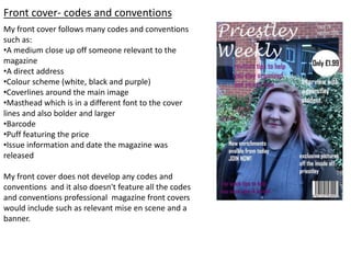
- 1. Front cover- codes and conventions My front cover follows many codes and conventions such as: •A medium close up off someone relevant to the magazine •A direct address •Colour scheme (white, black and purple) •Coverlines around the main image •Masthead which is in a different font to the cover lines and also bolder and larger •Barcode •Puff featuring the price •Issue information and date the magazine was released My front cover does not develop any codes and conventions and it also doesn't feature all the codes and conventions professional magazine front covers would include such as relevant mise en scene and a banner.
- 2. Front cover- construction To create my front cover I used a new media technology called Photoshop this allowed me to create my front cover up to the highest standard possible. The first step was to select international paper as this was the correct format size for my front cover. I then selected my main image which is a medium close up of somebody who is relevant to the magazine, i took the picture with a SLR camera to ensure the quality was the standard expected. once this was done I could add the details which would make my product complete. As shown in the picture I then added my masthead which i chose a unique font for as this one off the many codes and conventions to a magazine, i also made sure to make the size off the font bigger as its very important that it stands out to help attract more buyers. I then added all my cover lines around my main image ensuring none overlapped on the medium close up off the Priestley student. Whilst doing this i made sure all the cover lines were in different colours as this helps the front cover to look more visually attractive. The last step was to add the smaller details such as the barcode, the puff which fits in with the colour scheme and also shows the price in bold lettering so its easily seen and finally the issue number and the release date off the magazine. These are really important features to a magazine as this is what people want to know.
- 3. Front cover- strengths and weaknesses Strengths: • My main image is good quality and clear. •Features all information buyers would want to know. •My front cover features majority off the codes and conventions professional magazines would feature. •The main image is relevant. Weaknesses: •Does not include all codes and conventions such as relevant mise en scene. •Main image is not visually interesting. •The background could be seen as distracting. •The cover lines are not as clear to read as there's to much going on in the background. •Doesn't look professional
- 4. Contents page- codes and conventions My contents page follows many codes and conventions such as: •Multiple images which are relevant •Section headings •Regular content and featured content so its easy for readers to find what they want •Repetition off the masthead ‘Priestley weekly’ •Contents written in bold lettering at the top off the page •Columns •Issue number and release date My contents page follows most off the codes and conventions professional magazines would feature however it doesn't develop any off its own and it doesn't feature them. For example my contents page doesn't have a picture off my front cover on and it also doesn't have one main bigger image which is the centre off attention.
- 5. Contents page- construction To make my contents page i used a new media technology called quark which allowed me to make my contents page up to the highest standard. The first step I did was navigating where i wanted my pictures to be and then importing them into the places i wanted. The reason i did this first was because it helped me know exactly where to add my columns. The 3 pictures i added to my contents page were took with an SLR camera and were relevant to the articles my magazine featured. I then adding text at the top off my page saying ‘contents’ i made sure it was in bigger writing so it stood out and was bold. Underneath this i then added my masthead’ Priestley weekly’ in smaller font and also the issue number and release date . The final step to making my contents page was adding my regular content in the first column and then my featured content in the second column. I made this as clear and easy to read as possible as that what people reading would want.
- 6. Contents page- strengths and weaknesses Strengths: •Contains majority off the codes and conventions professional magazines do. •Clear and easy to read. •Features all the correct information which people would be interested in knowing. •Has pictures which are relevant . Weaknesses: •Very simplistic/ plain isn't a colour scheme. •Not professional/ not visually interesting. •Doesn't have one main photo. •Does not have a small picture off the front cover