2. Indie haircuts and expressions conform to styles seen in similar products Morphsuit used to show a relevance to the music video Same picture is used for the advert Indie style of clothing, used throughout Same sans-serif font (chunk) used as the advert (house style)
3. The photoshop ‘sketch’ effect gives a homemade feel that is seen in other products of the same genre The red matches the red of the morphsuit on the cover of the digipak Same sans-serif font (chunk) used throughout, matches the digipak. (house style) The image used is also used on the digipak
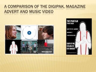
4. Digipak Music video The morph suit in my digipak is coherent to the music video as they both have a red morph suit in them. However, the digipak doesn’t have a picture of all of the morph suits together, this is because Ifelt that a picture of all of the morph suits together on my digipak would not attract my target audience well.
5. Digipak Music video The use of just the head of the band member in the digipak is coherent to the music video as the music shows the same band member revealing his head.This works well as the audience can relate the band members to the video.
6. Digipak Music video The digipak is slightly coherent to the music video as the digipak shows the band members against a garage door, and the music video shows the band infront of garage doors. However, the music video could be more coherent if the band members where in the same outfits. I would have achieved this if I had had more time to film.
7. Magazine advert The magazine advert has no coherence to the music video as it was used to attract my target audience. I could have made the advert more coherent to the music video by using a morph suit, however, I feel that this would not have been as effective as the picture that I used.