
Recommended
More Related Content
What's hot
What's hot (20)
Similar to Manickz Magazine Front Page Edit
Similar to Manickz Magazine Front Page Edit (20)
More from miniminimini
More from miniminimini (6)
Recently uploaded
Recently uploaded (20)
Manickz Magazine Front Page Edit
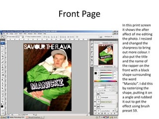
- 1. Front Page In this print screen it shows the after affect of me editing the photo. I resized and changed the sharpness to bring out more colour. I also put the title and the name of the rapper on the front with a black shape surrounding the word “Manickz”. I did this by rasterizing the shape, putting it on a angle and rubbed it out to get the effect using brush preset 59.
- 2. Front Page In this screenshot I again rasterized a shape with some other writing in it. I found the fonts by searching through the fonts and though the just jamming looked good in the feedback font. I also put a barcode price and date on the magazine in the bottom right corner with a shape behind them to make it stand out.
- 3. Front Page This is the finished front page. The final touches I put on were putting some names of other rap artists. I did this because it looks good and fills up the empty space which is just a wall.
- 4. Contents Page This is the starting of my contents page. I resized the image and cut a bit of the wall off on the left. I also put the word Manickz in parallel to the man in the picture and also fits in there as there is a black drain pipe on he other side.
- 5. Contents Page In this print screen I put a black background and a yellow shape with writing in that stands out. I also put a photo in also in the black shape. For the start of the writing I put some rulers in so I could line up the page numbers so it would look neat. I also put the contents title at the top.
- 6. Contents Page This is the finished contents page and the final touches where putting the writing next to the numbers and I also put some more writing in the bottom right and the highest yellow shape .
- 7. Double Page Spread This is a print screen of the starting of my double page spread. I put one half of the page in yellow as that is a colour I have been using quite a lot in my magazine. I also put Manickz and new album in different fonts and in black and than yellow shapes to make them stand out.
- 8. Double Page Spread In this screenshot I put the writing about Manickz on a photo of some of his crew dancing and the interview. I used bold for the questions as it makes them stand out and also spaced everything out to make it look neat.
- 9. Double Page Spread This is the finished double page spread, I put gray backgrounds behind the text so it was easier to read. I also put a title at the top. I used rulers a lot to make everything fit and be the same size.