
Recommended
More Related Content
What's hot
What's hot (16)
Viewers also liked
Viewers also liked (14)
Similar to Content page analysis 2
Similar to Content page analysis 2 (20)
More from lilywilkinson
More from lilywilkinson (20)
Content page analysis 2
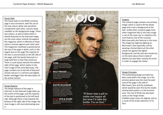
- 1. Design Principles The Guttenberg design principle has been used within the image, as in the primary optical area the most focused area of the page is the side of Morrissey’s face and the masthead, which would be seen first by the reader, alsothe black jacket is in the terminal area. The rule of thirds has also been used, as the image shows thatMorrissey’s eyes are aligned, and as a result of this draws attention to his face. House Style The house style on the MOJO contents page is very consistent, with the use of the text colours white and red which complement each other, and are easily readable on the background image. These two colours, as well as black which is heavily featured on the featured image, are the main colour scheme throughout the magazine, which is effective as these colours contrast against each other well. The magazines masthead is positioned at the top of the page in white, and it is the largest text on the page.The majority of the text is concentrated on the left side of the page, with the bands featured in a large bold font so that they stand out. There is a pull quote towards the bottom right of the page, which relates to the main image of the artist Morrissey. The page numbers are to the left of featured articles and are in a red font and slightly bolder and bigger than the description of the article content. Imagery This contents page contains one primary image, which is used to fill the whole page and is also a background to the text. Unlike other contents pages from other magazines like Q, the main image is not of the cover star or related to the main feature, but of the musician Morrissey who also features in the issue. The image has high key lighting on Morrissey’s face especially, and by wearing a formal black suit the artist stands out against the lighter background, and the text also stands out on the dark colour.Direct mode of address has also been used by the artist in order to engage the reader. Design Balance The design balance of the page is informal, as the featured image takes up the centre of the page, and the majority of the text is positioned to the left hand side. Although there is text towards the bottom of the right side of the image, the main image is still more dominating over it. Contents Page Analysis – MOJO Magazine Lily Wilkinson