Download as PDF, PPTX

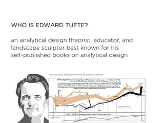


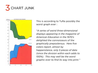


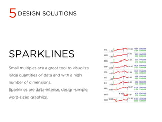


Edward Tufte, a theorist on analytical design, emphasizes the importance of graphical integrity, which involves accurately representing data, labeling thoroughly, and maximizing data-ink. He advocates for avoiding chart junk, ensuring high data density, and using classic design solutions like small multiples. Tufte underscores the significance of aesthetics and technique in data visualization to enhance clarity and credibility while maintaining viewer engagement.


