
Recommended
More Related Content
What's hot
What's hot (20)
Viewers also liked
Viewers also liked (20)
Similar to Typography Analysis
Similar to Typography Analysis (20)
Recently uploaded
Recently uploaded (20)
Typography Analysis
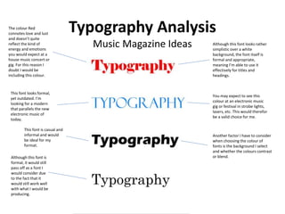
- 1. Typography Analysis Music Magazine Ideas Although this font looks rather simplistic over a white background, the font itself is formal and appropriate, meaning I’m able to use it effectively for titles and headings. The colour Red connotes love and lust and doesn’t quite reflect the kind of energy and emotions you would expect at a house music concert or gig. For this reason I doubt I would be including this colour. This font looks formal, yet outdated. I’m looking for a modern that parallels the new electronic music of today. You may expect to see this colour at an electronic music gig or festival in strobe lights, lasers, etc. This would therefor be a valid choice for me. Another factor I have to consider when choosing the colour of fonts is the background I select and whether the colours contrast or blend. This font is casual and informal and would be ideal for my format. Although this font is formal, it would still pass off as a font I would consider due to the fact that it would still work well with what I would be producing.
- 2. Typography Analysis Music Magazine Ideas This text is colourful and could be appropriate to use as a masthead or heading. I could alternate between colours in order to match the kind of colours that my magazine’s format is based around. For example, for electronic music I could use the colour blue or yellow to connote electricity or energy. This font could be described as difficult to distinguish and therefor wouldn’t be appropriate for me to include in my magazine. However, this is a stylistic way of presenting the text and could be appropriate and appreciated by an artistic audience. This kind of font appears too formal to be used in a music magazine. But on the other hand, as a heading that introduces or presents an artist could add an element of formality or professionalism to the artists persona. This font proves ideal for the main text you would expect from an article. The font is easily distinguishable and appears casual, perfect for an interview article or anything of a similar format.
- 3. Typography Analysis Music Magazine Ideas Although this font is rather formal, the coloured pattern adds an artistic element to it which makes It appear casual. I believe this would be an appropriate font and colour/pattern I could use for a heading introducing an artist perhaps on my front cover. Adding a smooth colour pattern to the background of this font allows it to appear stylistic and effective. I would consider using a font similar to this as my masthead. This font could appear on headings amongst a white background and be easily distinguishable. This is good because the average reader will be able to recognise articles from a distance This font could also be a good choice for headings because of how defined it is and proves effective.