
Recommended
More Related Content
What's hot
What's hot (18)
Viewers also liked
Viewers also liked (9)
Similar to Evaluation question 7
Similar to Evaluation question 7 (20)
More from matt_roberts
More from matt_roberts (20)
Recently uploaded
Recently uploaded (20)
Evaluation question 7
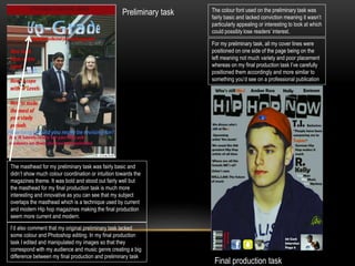
- 1. The masthead for my preliminary task was fairly basic and didn’t show much colour coordination or intuition towards the magazines theme. It was bold and stood out fairly well but the masthead for my final production task is much more interesting and innovative as you can see that my subject overlaps the masthead which is a technique used by current and modern Hip hop magazines making the final production seem more current and modern. Final production task Preliminary task The colour font used on the preliminary task was fairly basic and lacked conviction meaning it wasn’t particularly appealing or interesting to look at which could possibly lose readers’ interest. For my preliminary task, all my cover lines were positioned on one side of the page being on the left meaning not much variety and poor placement whereas on my final production task I’ve carefully positioned them accordingly and more similar to something you’d see on a professional publication I’d also comment that my original preliminary task lacked some colour and Photoshop editing. In my final production task I edited and manipulated my images so that they correspond with my audience and music genre creating a big difference between my final production and preliminary task