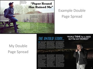
2. Similarities
We both have used one whole natural background
with the model on the side so it stretches to cover
the whole page. This adds a more technical detail to
spread instead of importing a blank background.
They are both using an indirect address to create a
hip-hop feel to the cover. It makes them look cool
and nasty but still entices the audience. Both
models have head wear on to show a more street
style proving to be hip-hop genre. The expression is
also blunt, they are showing no emotion.
3. Differences
The pictures used both are different times of the day,
one is used in the day whilst the other at night. I
personally used night because it creates a feeling
which makes the magazine seems more hip-hop
genre and unique. I have a skyline in the background
to adapt my other features around it and make it one
of the main focuses. I flipped the example so my
spread was opposite tot hat one, this way it is
unique. I have also used external lighting not natural
on my model because it was night and there was no
light in the surroundings.
4. How Does my media product
represent particular social groups?
I think my cover represents boys more than girls because I have used
more serious quotes/stories whilst girls would like more happy
information. The color scheme I have used also matches males
because I haven’t used any bright/primary colors other than a dull blue
to make the heading stand out. The clothes the model is wearing
represents the young adult age group around 16-21, because a lot of
that group are starting to like artists such as kendrick lamar and drake
who wear this kind of clothing. It shows that this group is beginning to
become more mature and cooler, turning away from the pop culture
and being more unique, not following trends. The overall target
audience for my magazine is young adults so I focused on the image
being more formal and professional whereas a pop/girly magazine
would try and focus on being more chatty and an informal magazine to
appeal to the younger audience.