1. My idea How I will layout my magazine
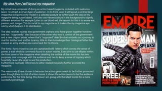
My initial idea composes of doing an action based magazine included with explosion,
lasers to attract a certain type of audience . In its front cover I will layout a centred large
image that will portray my model in a selected posture to further push the idea of my
magazine being action based. I will also use vibrant colours in the background to signify
different emotions for example I plan to use blood red, the reason for this is to evoke war,
passion, and danger. This is crucial to my magazine as it makes the my magazine eye
catchy which helps in it its distribution.
The idea revolves rounds two government orphans who have grown together however
one has “supposedly” died because of the other who now is control of the government
and a new chapter arises where that’s “supposed” dead brother embarks on a journey to
rival his brother and end his tyranny, little to their knowledge their biological father has
created an army and has also came back for his throne.
The fonts I have chosen to use are capitalized bold letters which convey the sense of
power, a trait which is commonly found in action movies. I also aim to use ellipses within
the front cover of the magazine when detailing the outline of the movie this has two
purposes, one to engage with the audience and two to keep a sense of mystery which
hopefully causes the urge to see the production.
Furthermore I will add references to other related movies to further promote the
magazine.
The reason why I have chosen is because the action genre needs to be further promoted
even though there is a lot of action movie, it shows the action seems to be the audience
preference for the time being, this shows I am going with the latest trends for a more
successful percentage.
2. Audience profile:
My magazine will maintain appropriate content throughout, this
is due to the fact that my primary audience consists 11-16yrs
will also make sure its also suitable for my secondary audience
10-12yrs. I will do this by