Presentation on how to chat with PDF using ChatGPT code interpreter
Final 5 edits
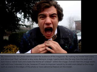
1. My intentions for this photo were to scare the audience of the magazine. By making my model look scary
and abnormal I feel I achieved a very scary demonic image. I particularly like the way how the teeth and
eyes have a ‘weird’ look and create the theme of ‘undead’ within the image. Overall I feel this image works
well with how I intended it to be, however if I were to improve I would try to add more detail to the image
such as cracks in the edges of the photo or more abnormal feature on the model.
2. For this image I wanted to go for a more subtle scare for the audience. I feel that the blue tint and darker
lighting levels really compliment the theme of voyeurism and being watched. I also think that the
expressions and positioning of the model really completes the picture and creates the overall scary feeling
whilst being subtle and eerie.This is what I wanted for this particular the image and thus I am pleased with
the outcome. However I would have liked to experiment with different brushes and other effects to see if I
could add any extra details into the picture to give it a bit more of an ‘undead’ feeling.
3. This picture was intended to be used as a poster or advertisement of some sort for the Zombified energy
drink. I feel that this photo was not my best work and even though it gives a sense of eerie feelings and
has a scary theme, I feel it is not scary enough and is also too bright and contradicts the whole theme of
‘darkness’ and ‘evil’ in a bad way.Therefore I feel I did not achieve what I particularly wanted with this
picture, and if I were to do it again, I would have made it darker by changing the levels as well as possibly
adding darker tints to create a scarier look.
4. For this photo I wanted to create an image that was very abstract and quite serious to be catchy. By
changing the hue and saturation I created a contrasting tone between the models facial expressions and
the background. I feel this photo turned out half as well as I expected, I did like the abstractness of the
model, however I feel this image could have been better by possibly adding a darker background and
experimenting with different colours for the models face.
5. For my final picture I wanted to go for another catchy, abstract image, whilst using it as an advertisement for my drink.
Therefore I changed the saturation and hue to a suitable level and experimented in various ways, this picture stood out to
me in particular with the way that both the models skin are green yet the zombies clothes are covered in purple bits
therefore showing the different between human and zombie. Overall I think this picture turned out well for the purpose
and intentions I had in mind. If I were to edit this picture again I would have tried to add specific effects in certain areas
such as brushes and tints in order to create a more interesting image.