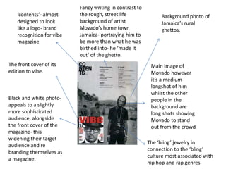
1. Fancy writing in contrast to
‘contents’- almost the rough, street life Background photo of
designed to look background of artist Jamaica’s rural
like a logo- brand Movado’s home town ghettos.
recognition for vibe Jamaica- portraying him to
magazine be more than what he was
birthed into- he ‘made it
out’ of the ghetto.
The front cover of its Main image of
edition to vibe. Movado however
it’s a medium
longshot of him
whilst the other
Black and white photo- people in the
appeals to a slightly background are
more sophisticated long shots showing
audience, alongside Movado to stand
the front cover of the out from the crowd
magazine- this
widening their target
The ‘bling’ jewelry in
audience and re
connection to the ‘bling’
branding themselves as
culture most associated with
a magazine.
hip hop and rap genres
2. This contents page of Vibe holds the stereotypical components of a
contents page for example page numbers, key images and a title
‘Contents’. The title helps to set a trend for the running colour theme
of grey and black throughout the contents page; the yellow within
this theme helps to create a plain and sophisticated base colour. The
grey colour has stereotypical connotations of expense as it connotes
a luxury when put against other light colours. It contrasts with the
very dark and strong colour of black, which varies its self with an
genre but can be used very well with the hip-hop/ R’N’B genre. The
sophisticated font used within the contents page also helps to
neutralise the bold stereotypical look of hip hop, this could have
been done to appeal to a mass audience as it is a much more generic
font in comparison to the usual niche font a hip hop magazine would
use. When it comes to the images – they play as a visual contents
which is also visually appealing to anyone reading the page; it helps
to highlight the key image, in which the artists body posture connotes
sexuality, using her legs to imitate the v in vibe alongside her intense
eye contact. Moreover the contents page also has an editorial which
introduces the magazine and gives a more personal approach for the
reader.
3. Connotations of black- Brand recognition – ‘m’
Clean light sophisticated, dark, edgy,
purple colour rebellion
against the black
– stands out- like
her new look
Medium image
Sell lines that would of her in all
also attract new black with
audiences and her leather gloves-
current ones a more edgier
styled Miley
Cyrus –
rebranding
herself
Re targeting Miley Cyrus
Connotations of white- bright,
fresh , new, renovation