Task two - detailed analysis of music magazine
•Download as DOCX, PDF•
0 likes•189 views

detailed analysis of music magazine

Recommended
More Related Content
What's hot
What's hot (15)
Viewers also liked
Similar to Task two - detailed analysis of music magazine
Similar to Task two - detailed analysis of music magazine (20)
Recently uploaded
Recently uploaded (20)
Task two - detailed analysis of music magazine
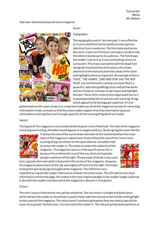
- 1. Zoë Leeder Media Mr Hibbert Task two- Detailedanalysisof musicmagazine Cover: Typography- The typographyusedin‘we love pop’isveryeffective as it usesa boldfontwhichstandsoutand captures attentionfromisaudience. The fontstyle usedacross the cover issans-serif fontasitconnotesa modernvibe therefore itstandsoutto itsaudience. The fontdraws the reader’seye toit as itusescontrastingcoloursto surroundit.Theyhave usedwhite withthe blackfont alongside redandyellow fontcolours,thisdraws attentiontothe textand promotesareasof the cover and highlightsthemasimportant.Anexample of thisis ‘5SOS’,‘THE VAMPS’,‘ONEDIRCTION’and‘THE HOT ISSUE’ use redfontwitha yellow surround.Redisa powerful,attentiongrabbingcolourandyellow works well asit helpstoincrease visual impactandhighlight the text. These fontsrelate tothe targetaudience asit isaccompaniedby lotsof picturesand‘exciting’things whichappeal tothe teenage girl audience.It’sfun- packedstyle onthe cover showsitina waythat makesyouthinkthe magazine haslotsof interesting informationinside,somuchso that theyhave made itappearthat theyhave had to squeeze informationonbeingthere isn’tenoughspace forall the excitingthingwhichare inside. Layout- The layoutof this magazine isverycluttered whichgivesitafun filled look.The lookof the magazine isexcitingandinviting,therefore wouldappeal toitstargetaudience. Bydesigningthe coverlikethis it allowsthe routof the eye to draw attention tothe mastheadwhere the main topicof the magazine isadvertised. Asyoufollow the routof the Z evenmore excitingthingsare shownonthe coverthat are includedinside to entice the readerin. Thishelpstowidenthe audience of the magazine.The magazine name isinthe topleftcornerthisis because thisiswhere the routof the eye startsand typically people readfromlefttoright. The principle of thirdsisalsoused here,typicallythe mainartistisfeaturedinthe centre of the magazine.However, thismagazine placesthematthe top and slightlyoff centre tothe right.Thishelps to keepthe qwertydesignthroughoutthe magazine.The leftthirdisvery importantas itgivesthe readerinformation of whatistocome inside.The leftside hasthe most informationonfromthe page,thismakesitthe most impressionable tothe reader/ targetaudience. It alsotellsthe readera lotaboutwhat the magazine isaboutat a firstglance. Colour- The main coloursfeaturedare red,yellow andwhite.The redcolourisa bright and boldcolour whichattracts the readeras the yellowisusedto helpmake the redseemevenbolderandhighlight certainareasof the magazine. The coloursaren’t contrastinghowevertheyare usedtospecifythe issue,forexample ‘thehotissue’,thiscanentice the readerin.The redandyellow workwellhere as
- 2. Zoë Leeder Media Mr Hibbert redand yelloware associatedwithheatandfire.The maincelebritiesfeaturedare all dressedinthe same colourscheme of red,white andblack. The magazine hasa white backgroundwhichhelpsthe textand colouringtostandout and notdistract the readerfromthe importantpart of the magazine, thisdrawsthe reader’sattentiontothe keycomponentsof the magazine cover. The magazinealso usessplashesof pinkinplaceswhichidentifiesitasa ‘girly’magazine andtargetsthe reader. Images- The imagesusedto appeal to the target audience are celebrities.Thesecelebritiesare all ones whose owntargetaudience isyounggirlstoo.The artistsfeaturedare: Zoella TaylorSwift Megan Trainor 5SOS The Vamps One Direction Little Mix Casperand Joe Ariana These are all people whoinfluence younggirlswithfashion,look,lineof businessandthe mainone; music. The shot typesonthe cover are close up as itdirectsthe focus to the individual andshows the audience clearly/easilywhoisfeaturedinthe magazine.The mainimagesare largerastheyare of more importance andare the mainfocusoff the magazine.Thisparticularmagazinesmainfeature Is Zoella, TaylorSwiftandMeganTrainor,thisfocusesontwo poptypes of musicand a fashion vlogger. Thisteachesyounggirlsaboutfashionandstyle atthatmoment,itkeepsthe audience upto date withwhat’sgoingon. The imagesusedare conventionalforthistype of magazine astheyare funand friendly. Language- The language usedonthe coverisveryenergetic,funandintriguing.The factthat itusesa heart symbol insteadof sayingheart presentsitasa youngmagazine.Itusessimplistictechniquesto create an effective looktothe cover. It uses self-promotingphraseslike ‘the world’smostwanted’ whenreferringtothisweek’sissue of the magazine. Itusesshort,snappy,captivatingsentences,for example ‘LOUISBABY!ZAYN SPLIT!’thisdrawsthe readerinand straightawayhas themasking questionsandwanted toreadmore. All the language onthe coveris innote form to focus onthe keyinformation. Conventions- Thismagazine hasmany conventionalelements, suchasthe placingof the mastheadinthe top left corner andthe energeticallycolouredtypography. The magazineassociatesitsself throughcolour, for example the dominate coloursusedare pinkandyellow,thisthenrelatestothe specificmusic genre;pop.The coloursare energetic,funandupbeat,exactlywhatyouwouldexpectfroma pop magazine aimedatgirlsmainlyaroundthe age of thirteen. Thissortof targetaudience is easily influencedastheyidolise the celebritiesfeatured.
- 3. Zoë Leeder Media Mr Hibbert Contents: Typography- All of the fontsusedon the contentspage are sans-serif, thisprovidedaclearand boldtextwhichiseasyto read.Thisfont drawsthe reader’s eye tothe mainparts, whichtend to be ina largerfontto the othersas it isof greaterimportance.The headings are ina differentfontcolour whichmakesthemstandout.The contentspage inveryorganised,this makesiteasierforthe readerto understandthe information. The main storypage numbersare inserif which contraststo the restof the page.Againall the mainpagesof interestare ina larger fontthen the rest of the information.It’s fun-packedstyle connotesyouthwhich workswell consideringitstargetmarketis for younggirls. Layout- The layoutis more organisedthenthe frontcover.This isbecause eachtopicis dividedupintosectionandin abox formation. The routof the eye works reallywell here asitisveryclear.Atfirstyou readthe page title ‘We Love This’,then your eyesare drawnto the mainimage locatedinthe centre of the page. This isthenfollowedupbythe contentslisting inthe bottom leftcornerof the page.Next,the eye isdrawnacrossthe bottomof the page whichisa listfromlefttorightof postersfeaturedinthe magazine. Inthe principle of thirdsthe righthand columnfromtop to bottomshows the secondmostimportantstoriesof the magazine, these three imagesare of equal size andhave the same amountof information.Whereasthe mainimage inthe centre isaccompanied witha longpiece of textdownthe leftandside of the image. Colour- The colourson the contentspage keepthe girlytheme goingthroughoutasitappealstothe target market. The maincolour ispink,itisfeaturedinthe backgroundand inthe contentslisting.The secondmostusedcolouris blue,itisusedforthe headingsandas part of the bottomof the backgroundcoloursusedat the bottomof the page. The large font page numbersare then highlightedwithayellow shapebehind. Thismakesthemstandoutandtellsthe readerthatthese page references are mostimportantasthey leadonto fun andexcitingnews presumably.
- 4. Zoë Leeder Media Mr Hibbert Images- The images whichare usedconnotesa funfeel asthe mainimage and one of the smallerimages showthe celebritytohave theirtongue out.Thisshowsa funandplayful manor whichenticesthe readerinand makes themthinkthattheycan relatestothe celebrity. The shottype usedof The Saturdaysrepresentsthemasa bandand showsshow theysticktogether.Italsoconnotesafun, silly, relaxed, teenagefeel asthey’re shownnotbeingserious. The largerpicture showsimportance to the readeras it’sthe main storyon that page.The imagesaccompaniesthe textasitmakes it easierforthe readerto associate whothe textistalkingabout. Thissimplisticmanorshowshow the magazine isaimedatyounggirlsas it veryeasyto understandandred,whereasanadultmusic magazine wouldhave more textandlesspicturesastheycare aboutthe informationandaboutthe musicand not whatthe artist lookslike andtheirfashion. Language- The language usedissimplisticandinformal,thiscreatesaverylaidback feel tothe contentspage.It usesshortenednamesonthe artist,forexample ‘The Sats’and‘Beibs’forThe SaturdaysandJustin Beiber.Thiswouldbe acommonhyphenationforyounggirls,whichshowshow it’sfocusedtoits target audience andwouldn’tappeal toanyotheraudience astheywouldn’t be able to relate/understandthese commonlyusedterms. The languageisverymodernandbubblyand spreadsnotjust acrossthe contentspage, butthe whole of the magazine.Itusestextlike ‘Snuggle up withthe Sats’in orderto make the readerfeel like theyare partof the artist or friendswiththem as it invitesthemtospendtime withthemthroughtheirinterview whichispublishedlateronnthe magazine. Conventions- There are manyconventional elementsinthismagazine,forexample the placingof the mastheadin the top left/middleiscommonlyused.Alsothe largerimage beingthe maininterestandthe colours usedtypicallyrepresentsyouthandgivesabright, funfeel,whichrelatestothe specificgenre.The mostdominantispink,shortlyfollowedbyblue these coloursare oftenassociatedwithyouthwhich isthe focusof the targetaudience. Anothernormwouldbe thatthe mainpagesare featuredonthe contentspage ina largerfontthan the restto show theirimportance.
- 5. Zoë Leeder Media Mr Hibbert Double page spread: Typography- The artists name isat the verytopleftcornerjustabove the masthead whichisspreadacross the double page usesasans-serif fonttocreate a boldenticinglookandthe restof the textusesa serif fontstyle.Thisgivesita professional feel andmakesiteasierforthe readertoread.A lotof informationispresentedonthispage therefore the editorhashadto make it not lookas daunting. Thisencouragesthe readertoread it,if not theywouldbe putoff by the amountof information givenandcouldpossiblyfinditboring.Itisimportantthatthe textisclear andusesmore than one colouror else itwouldlose itsfun,youthfeel andthe targetaudience wouldnotwanttoread it. The use of colour,symbolsandlayoutconnotesyouth,butalsoaddressesthe readersotheyfeel older thentheyare.The magazine doesn’tbelittle the reader,itmakesthemfeel goodaboutthemselves. Layout- The layoutfeaturediscentral andsymmetrical,thisshowsorganisation.Symmetrical themesare oftenassociatedwithchildren’sdrawings asitisaesthetically pleasingtothem,thereforeitappealstothe targetaudience. The double page spreadconsistsof fourcolumns,separatedintotwo groups;leftandright.These containthe textaboutthe artistwhose image iscentrally placedinthe magazine.There are a total of three imagesusedwhichare all situatedinthe middle of the magazine.Astheyare inthe middle thismeans the mainimage bleedsacrossthe gutter. The rout of the eye
- 6. Zoë Leeder Media Mr Hibbert workshere as youare instantlydrawntothe masthead‘CarrierBag Of Question’towhichyoureyes thenlookacross the imagesinthe centre followingthemdownfromthe righttopcornerto the bottomleftcornerand thenfinishoff bylookingatthe secondcolumnof text.The magazine clearly displaysthe principle of thirds,dividingthe twochunksof textdowneitherside andhavingthe imagesinthe centre,sowhenyouopenup the page you are drawn to the artist. Colour- The colour scheme changesslightlyhere,itdiesfrompinktoredbeingdominant.Thisisbecause the artistfeaturedisa boyband so ratherthan themlookinggirlywithpinkthe editorhasusedredas it worksfor bothgirlsand boyseventhoughthe targetaudience isyounggirls.A redbackground coversthe majorityof the double page spreadandhelpstomake the mastheadstandoutagainst the red. Red isseenas a ‘warm’therefore itiswelcomingtothe reader. There are splashesof pink, yellow,blueandgreenonthe pagesas theyrepresentakeythatis given,whichmakesiteasierfor the readersto understand. Images- There are a total of three imagesusedof the artist,whichare all clumpedtogetherinthe middle. The main image isat top half of the page andlargerthan the other two.The last twoare of equal size andplacedunderthe mainimage.The imagesshow a lackof variety,howevertheyconnote fun and youth. The imagesshowthe artistsmessingroundandhavinga goodtime,thisshowsthe readerfriendshipandfun. Inthe image,one of the band membersiswearingbrandedclothing,this advertises‘Adidas’tothe targetaudience asa cool/musthave brandwhichisa keyclothingbrandto own. All the bandmemberseye line isstraighttothe camera,whichinvitesthe readerintothe article witha welcomingtone. Language- The textusesmainlyinformal languageasitisan interview of the bandthatis aroundthe age of fourteen.The readerwill be able torelate tothe phrasesandwords usedas theyare commonterms whichteenagersare usedtosaying,hearingandreading. Thisrelaxesthe reader,makesthemfeel comfortable andenjoythe storiesfeaturedinthe magazine. Conventions- It istypical where the mastheadisplacedasit isseeninalmosteverymagazine.The colourscheme of white andredworkwell togetherandare commonlyusedastheycontrastand make information standout whenneeded. White andredare oftenusedtogetherastheycanmeanlove,warmthand danger,whereaswhite canmeanpurity,innocence and marriage. The darknesscontrastswiththe white tomake it more bold.Boldnessisassociatedwithpopaspopis ‘inyourface’and energetic whichalsosumsup the target audience.