2. This is the search icon. The magnifying
glass is often use to indicate the presence
of a search bar, which in this case is
directly to the right. This clearly indicates
to the user that this is where they can
search for content or other users.
This is the Camera icon. This is where users can
upload a photo to their members’ page or upload
a photo to send to another user. This icon clearly
indicates to the user where they can go to
take/upload photos as the camera is an icon that
is used on many other social media sites, and so
it will be familiar to the user.
This is the Universe icon. This is where members
can go back to their page that they can update
and share the content that they are interested in.
This will be explained to the user upon entry to
the app for the first time and it is useful as it
means that they do not have to trawl through
multiple hyperlinks to go back to their main page.
This is the messages icon. This is where users can
go to their inbox and see what messages they
have received from other users and send
messages themselves. This speech bubble is
often used to represent a messages section and
is therefore useful to the audience as they can
find their way around the app more easily.
This is the news icon. This is made clear by the shaping of
the newspaper and by the fact that it says news. This is
where all of the breaking news stories or most talked about
stories of the day will be contained so that the user does
not have to look in all of the categories to see what
everyone is talking about, with a full explanations of what
is going on. This is useful for the user as it collects
information and allows users to access information in a
simpler way.
This is the multiverse icon, as seen by the image of one
universe icon connected to others. This is where the
posts of friends and followed pages can be seen. This
allows information to be focused to what the user likes
and posts from people that they care about, unlike the
more general categories which shows what everyone is
saying about a particular subject. This is useful for the
user as it collects their information allowing usage of
the app to be simpler for them.
The rest of the boxes on the page are
hyperlinks to brand/subject specific pages,
that the user can use to find people who are
interested in the same thing as them,
materials based on their interests and
content filtered to only include content for
that topic. If a user clicks on a box or the
writing underneath the box, they will be
taken to another page. This is useful for the
user as they can find information easier and
not have to read through things that do not
interest them, making the app easier and
more attractive to use.
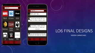
3. This is the search icon. The magnifying
glass is often use to indicate the presence
of a search bar, which in this case is
directly to the right. This clearly indicates
to the user that this is where they can
search for content or other users.
This is the multiverse icon, as seen by the image of one
universe icon connected to others. This is where the
posts of friends and followed pages can be seen. This
allows information to be focused to what the user likes
and posts from people that they care about, unlike the
more general categories which shows what everyone is
saying about a particular subject. This is useful for the
user as it collects their information allowing usage of
the app to be simpler for them.
This is the Camera icon. This is where users can
upload a photo to their members’ page or upload
a photo to send to another user. This icon clearly
indicates to the user where they can go to
take/upload photos as the camera is an icon that
is used on many other social media sites, and so
it will be familiar to the user.
This is the Universe icon. This is where members
can go back to their page that they can update
and share the content that they are interested in.
This will be explained to the user upon entry to
the app for the first time and it is useful as it
means that they do not have to trawl through
multiple hyperlinks to go back to their main page.
This is the messages icon. This is where users can
go to their inbox and see what messages they
have received from other users and send
messages themselves. This speech bubble is
often used to represent a messages section and
is therefore useful to the audience as they can
find their way around the app more easily.
This is the news icon. This is made clear by the shaping of
the newspaper and by the fact that it says news. This is
where all of the breaking news stories or most talked about
stories of the day will be contained so that the user does
not have to look in all of the categories to see what
everyone is talking about, with a full explanations of what
is going on. This is useful for the user as it collects
information and allows users to access information in a
simpler way.
These boxes indicate the posts that would appear
on the Universe (members’ page). The top
indicates where the user can post, a box to type
messages in that will appear on their universe for
their friends to see. The next are posts from
friends and here they indicate what types of
things can be posted (including videos, photos
and articles). This page can be personalised to
the user’s tastes and will come to resemble a
personal blog, but with friends able to post things
that they think another user will be interested in.
This is useful for the user as it is a place where
they can express themselves about whatever
they like in a space filled with like-minded
individuals.