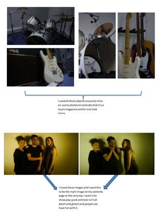
1. I usedall these objectsaspurelymise-
en-scene photosto reiterate thatitisa
musicmagazine andfor itto look
classy.
I lovedthese imagesandIwantthis
to be the mainimage onmy contents
page at the verytop.I want itto
show pop-punkandrock isn’tall
doomand gloomand people can
have funwithit.
2. Thisis the image I wasoriginallygoingto
use as my frontcover,as Beckyhere is
wearingthe exactclothingwhichI
describedaspop-punk.Iusedthe bass
guitaras thislinksinwith the pop-punk
genre as well.HoweverIchose notto use
thisphotoas she is notgivingdirect
address
Thisis the image which Iam definitely
goingto use as my frontcoveras I have
leftroomabove herhead on the leftfor
the masthead.Ido needto editthisa bit
as I needtoget ridof the overall yellow
tone and hopefullychange the pinktoa
redon her tshirt.
I was goingto use thisimage asmy double page
spreadbut the photofocusedonthe buildings
rather thanBeckyso she was silohuetted.
Thisis one of the designsIamgoingto use for
my double page spread.Iwill have itfade
intoa white backgroundonthe right handside
so I can write mymainarticle withinit.
Thisphotois goingto go onmy contentspage as a
smallerimage tolinkit/anchortoone of the
articles.
3. Thiswas an image I wasgoingto include onmycontentspage at the top;
Beckyand Danielle lookverystereotypicallypop-punk/rocksoIthought
theywouldstandcentre stage onthe contentspage.
Thiswas anotherstill Iwas
goingto use as the front cover
but I feel the handinthe hairis
too popfor my magazine.This
iswhy I chose to have the one
withBeckydoingthe rock
pose,as thiswould attractmy
target audience aloteasier.