
Recommended
More Related Content
What's hot
What's hot (20)
Viewers also liked
Similar to Poster Draft
Similar to Poster Draft (20)
More from kelseywatkinsx
More from kelseywatkinsx (7)
Recently uploaded
Recently uploaded (20)
Poster Draft
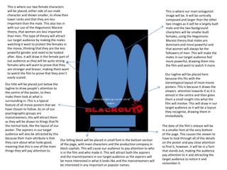
- 1. This is where our main antagonist image will be. It will be centrally composed and larger than the other two images as it will be a largely built male and the two background characters will be smaller built females, using the Hegomonic Marxist theory that males are dominant and more powerful and that women will always be the followers of men. This will make the males in our target audience feel more powerful, drawing them into the film and want to watch it more. This is where our two female characters will be placed, either side of our male character and shown smaller, to show their lower ranks and that they are less important than the male. This also ties in with our use of the Hegomonic Marxist theory, that women are less important than men. This type of theory will attract our target audience by making the males watching it want to protect the females in the movie, thinking that they are the less powerful gender and need to be looked after. Also, it will draw in the female part of out audience as they will be quite strong females who will want to prove that they are stronger and braver, making them want to watch the film to prove that they aren’t easily scared. Our tagline will be placed here because this fits with the stereotypical layout of most movie posters. This is because it draws the viewers attention towards it as it is almost in the centre and then gives them a small insight into what the film will involve. This will draw in our target audience as it will be a layout they recognise, drawing them in immediately. Our title will be placed just below the tagline to draw people’s attention to the centre of the poster, to then make them look at what is surrounding in. This is a typical feature of all movie posters that we have chosen to follow. As on of our psychographic groups are mainstreamers, this will attract them as they will be drawn to things that fit the normal look, like the layout of our poster. The aspirers in our target audience will also be attracted by this because their main attribute is that they care about what looks good, meaning that this is one of the main things they will pay attention to. The date of the film’s release will be in a smaller font at the very bottom of the page. This causes the viewer to have to look through all of the details on the poster and pay close attention to find it, however, it will be in a font that stands out, making the audience pay attention to it and attracting the target audience to notice it and remember it. Our billing block will be placed in small font in the bottom section of the page, with main characters and the production company in block capitals. This will cause our audience to pay attention to who is in the film and who made it. This will attract both the aspirers and the mainstreamers in our target audience as the aspirers will be more interested in what it looks like and the mainstreamers will be interested in any important or popular names.