3. FILM TITLE
The film title is always placed over a plain section of the main
image. Therefore, we didn’t place it over the eyes because this
would distract attention away from them. The title always over
laps the central image to visually link the title with the image.
We followed this convention as we like the visual link it creates
between the title and the image.
The font style usually suits the genre of the
film. We chose this font because it looks a
little ghostly and connotes thriller. The idea
of having the letters fairly thin came from
studying the letters on the poster for A
Dangerous Method which is also a thriller.
The colour of the film title always seems to feature in another area on the film
poster. This helps to visually link together all the elements on the poster. Therefore,
we followed this convention to make the title link in with the rest of the poster. Our
film title is black and the colour black also features in the main image.
4. FILM TITLE
The main influence for the positioning of the film title came from studying The Expendables 2
poster. Their poster is the same orientation as ours so we thought it would be best to study the
layout for this poster the most. The film title is in the lower section of the poster running almost
from one side to the other. We found this was a conventional position for a film title on quite a few
posters (as you can see on the poster for A Dangerous Method). Placing it here doesn’t distract
attention away from the main image but it still gains quite a bit of attention which is important
because people who view the poster will need to be able to see the title clearly for them to
remember what film they want to see if it interests them.
As we noticed from the poster research we
did, film titles are pretty much always typed in
capital letters and are in the biggest font on the
poster. This is to make it stand out, be
noticeable and clear to read. We feel it is
important for the title to do this so we followed
this convention.
5. COLOUR SCHEME
We studied existing posters of films to analyse their colour schemes.
We found that most posters, like magazine covers, have a colour
scheme of three colours. The colours represent the genre of the films.
For example, the dark colours in the Harry Potter poster connotes
danger, evil and coldness representing the antagonist. Red connotes
danger, violence and even death.
Keeping this in mind we decided to come up with three
colours which would represent the genre thriller well and
colours that link back to our magazine cover. We decided
black would reflect our genre and links back to our
magazine cover. Black connotes death, mystery and the
unknown antagonist. These are elements you expect
from a thriller. White connotes mystery (like it does in the
poster for A Dangerous Method). It also connotes ghosts.
The strongest colour you can see in the background
image is red. This connotes danger, evil and death. As the
character is wearing a red hoodie it suggests that she
could be targeted as a victim.
6. CREDITS, INSTITUTIONAL REFERENCES AND RELEASE DATE
Looking at the bottom of the film posters that we
researched we found that institutional logos can be seen but
in black and white much like on film trailers. As you can see it
is conventional for the institutional logos to be situated
below the credits. We decided to follow this convention as
placing them below the credits puts them out of the way so
they don’t distract attention from the rest of the poster. The
logos are not something which helps to promote the film
much which is why they don’t need to stand out. We made
the logos black and white which allows them to blend into
the main image.
The text on The Expendables poster is all white. This allows the text to all
link visually together. We thought this was an interesting technique and
therefore applied it to our poster. Much like The Expendables 2 poster, we
used different font sizes to make some words stand out more than others
depending on how important they were and what would help to sell the film
the most to people walking past the poster just getting a quick glance of it.
7. CREDITS, INSTITUTIONAL REFERENCES AND RELEASE DATE
We noticed that at the bottom of the majority of the film
posters we researched there is film credits written in the
same style as on film trailers. To make our poster look
professional we decided to follow this convention and put
the same credits from our trailer onto the poster. We were
inspired put the Tron film poster as to where to place it. We
decided to place the credits in the centre of the poster and
the bottom and centre aligned it. The credits on the Tron
poster doesn’t run completely across the bottom of the
poster. We thought this visually looks good as it doesn’t
distract attention away from the main image.
Therefore, we decided to use the same layout which was
used for the Tron poster.
The release date (if the release date is known) will
feature on film posters so the public knows when to
expect to be able to see the film in cinemas. On The
Expendables 2 poster and the Harry Potter poster
the film release date is situated at the bottom of the
poster. I think this is so once again it doesn’t distract
attention away from the centre image and the film
title. We followed the convention from the
Expendables 2 film poster of placing the release
date beneath the credits but in a slightly bigger font
so it stands out slightly more and can be noticed.
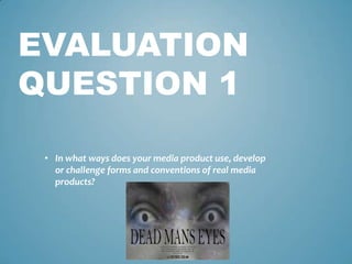
8. CENTRAL IMAGE
Looking back at our research we noticed that the main image tends to be
taken with a medium shot which allows you to see the characters body
language and faces clearly. Also, the images are of the main characters;
normally antagonists or protagonists. We followed the convention of
showing antagonists and protagonists on the poster as if you show the main
characters, audiences will know who’s staring in the film and will look out for
other advertising which might give more of the plotline away such as
spotting the antagonist on the magazine front cover.
We didn’t follow the convention of taking a medium shot for our central
image. We wanted to draw emphasise on the antagonists eyes as this is his
main feature that makes him noticeable. Therefore, we decided to take an
extreme close- up of his eyes. This keeps him quite anonymous still adding to
the sense of thriller and being scared of the unknown. To make sure the
poster didn’t look overly busy and confusing we took the background image
with a long shot of the protagonists. This way you don’t see much detail of
them but enough to notice that these are the characters who feature in the
trailer. Like we found with our research, the characters you spot on the
advertising posters and magazine covers will defiantly feature in the trailer.
We made the image of the antagonist black and white
to represent him as a ghost and so the colours of the
background image helps it to stand out. If the eye
image was in colour, you wouldn’t really notice the
background image. This isn’t conventional for film
posters but we feel it represents our film genre well
and represents our antagonist well.
9. CENTRAL IMAGE
The main inspiration for our posters image came from looking at the
poster for A Dangerous Method and The Expendables 2. We saw it is
conventional for the image to take up the whole poster and for text to
be placed over it. We thought this makes the poster visually
interesting and attracts attention well. Therefore, we decided to
follow this convention when we designed and created our poster.
The idea of overlapping two images came from looking at the poster
for A Dangerous Method. We liked the fact it creates a ghostly feeling
representing the genre thriller well. We decided to overlap an image
of the antagonists eyes on top to represent him as a ghost and to
make it appear like he’s haunting and thinking about the other
characters as you can see them through him. We feel our poster
represents our antagonist well.