1. Genre convention in music magazine
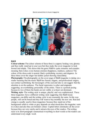
R&B
Colour scheme-The colour scheme of these three is coppery looking very gloomy
and they really stand up to your eyes but they make the cover magazine to look
formal and simple. This shows that the genre R&B is quite romantic and complex
meaning that evokes every human emotion (happiness, madness, sadness) The
colour of the dress code is neutral, black symbolising mystery and elegance. In
these three cover the singer has leather jacket showing masculinity.
Photography-The photography on the cover page of R&B magazine is taking on a
studio meaning that the music R&B has formal, elegant, and professional singers,
eye contact symbolising the messengers of the soul and also is can suggest that the
attention is on the audience. The facial expression is sober and enigmatic
suggesting an overthinking personality of the artists. There is a portrait posing
because in two of them the hands are not visible or at least not dominant.
Writing style- The writing style is unique, playful, and very sophisticated. These
three magazines have a different writing style suggesting that R&B music
magazines can differ and the writing style is not constantly the same. In this way
people, will not be bored and they will want to buy monthly the new one. Red and
orange is usually used in these magazines because they stand out of the
background which is white or grey depends on what mood does the magazine want
to evokes and also they are feminist colour. Capital letters dominates all the cover
because they are very catchy and it attracts the eyes of the readers. The writing
style is in short paragraph summarised everything in short words so the readers can
understand every single word.
2. Overall look- The overall look of the magazine is very simple because the writers
put more accent on posing and writing style rather than look. The magazines are
balanced because there is a contrast and a good design on the cover page.
Text picture ratio- There is more text and just one principal picture who is in the
middle of the cover.
Fonts-The front cover of the R&B music and the masthead is written in a bold font
which is also bright and white making it stand out from the page and this attracts
the audience and represents the company. There are used a variety of fonts going
against the typical conventions of a magazine. Withholds theme from cover by
occasionally using bold subheadings however headings are more formal with the
use of a more fluid font. Stylish and more interesting.
Publisher-The R&B magazine are normally very brightly coloured. The target for
such magazines are without doubt teenagers judging by the language used in this
kind of magazine. However, there is a content of hip hop shown in R&B. So, this
shows that there is a gap in the market.
ROCK&ROLL
3. Colour scheme- The colour scheme of the Rock magazine is dark because the
dominated colours are black /grey and white. Black is associated with evil and
dead being a mysterious colour and having a negative connotation. Usually the
Rock music has something to do with death because the lyrics contain words like
evil and death and the symbol of Rock Roll is related to a mysterious spirit.
Photography- For the rock music the photography shows a hypnotically looking
because the way that the singers are looking with a deep sight makes us think that
Rock music is hypnotic and can change immediately our mood. The photography
is taken in a studio of a professional photographer and the pose is from profile and
taken as a portrait. The gender who appeared mostly in Rock are male as we also
see in these covers. Male have a stronger voice so they can interpret better the rock
music. They represent the rock music.
4. Writing style- The writing style used in the rock music magazines is very different
from the R&B because is has more paragraphs and they are plot everywhere not
just on the background. The writing style is bring to front which suggests that as an
audience we need to concentrate on what is writing rather than looking just at the
singer.
Overall look- The overall look of the magazine is related to the Rock music
because the outfit is black with a range of accessories; scarf,hat,necklace and
sunglasses.
Text picture ratio- The text stands out a lot because the picture is on the back of it
suggesting that the picture is minor in comparison with the message transmitted to
the audience. Also, the picture is black/white whereas the text is more expressive
even if the blackness and the whiteness is still there, but some words have different
colours: pink
Fonts- The text stands out a lot because the picture is on the back of it suggesting
that the picture is minor in comparison with the message transmitted to the
audience. Also, the picture is black/white whereas the text is more expressive even
if the blackness and whiteness is still there, but some words have different colour
for example pink and red.
Publisher-These publishers are focusing mostly on the accentuation of rock music
having as a layout colour black meaning madness and drama in some ways. The
overall structure of Kerrang Magazine is very different to other magazines.
Kerrang however is much less organised. The different headings are scattered
about and look rough. This is because Kerrang is more ‘hardcore' and 'gothic'.It is
the canted angles of things that reflects and conveys this.
POP
5. Colour scheme- The colour scheme of these three magazines is very girlish. The
pink colour shows a primitive and very optimistic magazine and mood and is
addressed to girls especially because they love pink and pop music .The pop music
is catalogued to the pink colour because the artists who sing this type of genre are
very young and they emanates energy by singing..
Photography- The photography is very bright and is a very large use of Photoshop
because it doesn't show any imperfection of the skin. It is taken in the studio like
any other magazine to show more professionalism of the publisher and also to
spotlight the artists. Also is more use of the photography in the background ,the
photos being smaller and having different artists. This shows to the audience the
content of the magazine with picture not just by words. In comparison other
magazines who've got other type of genres are fulfil with more than just pictures.
6. Writing style-The text is written in short paragraphs which contain also symbols
at the end of a phrase or some words between the title .Also there are capital letter
used to attract and to accentuate more things towards the audience.
Overall look - The outfit is very simple, the look is more complex because the
look is flatulent. The overall look is white meaning innocence suggesting that the
pop music doesn't contain any swear words or any inappropriate symbols.
Text photo ratio- The outfit is very simple but the look is more complex because
the hair is flatulent. The overall look is white meaning innocence. This can
suggests that the pop music doesn’t contain any swear word or a any rude symbol.
Fonts-The outfit is very simple but the look is more complex because the hair is
flatulent. The overall look is white meaning innocence. This can suggests that the
pop music doesn’t contain any swear word or a any rude symbol.
Additionally, the magazine oozes this sense of playfulness and fun from the stance
and smile both the cover stars have, this will attract the target demographic as they
will feel as if they are getting to read large amount of contents about their favourite
artists and bands while the content is discussing fun and exciting topics appropriate
to them.
Additionally, the bold and bright coloured fonts used grab the target demographics
attention immediately as the large font will catch their attention before anything
else. More so the use of the cover stars such as Rihanna and One direction
reinforce this idea that the target demographic is tweens since the artists are young
singers or bands writing music that applies to the younger generations as well as
there target audience being younger people.
More so, having other topics discussed rather than just music such as fashion tips
with images of female clothing supports that the magazine is for younger females
who would want a magazine that discusses a variety of issues within their lives
rather than having a magazine cover a wide range of content on one topic, and so
therefore appeals to younger girls.
JAZZ
7. Colourscheme- The colourscheme of the magazine hasa verydifferentcontrastbecause one isall
blackand otherare white.One colourisusedbythese three magazinesandisred.Redisusually
usedto pointouta wordor a sentence.Also,the redcolourisusedintitle maybe it’ssymbolise the
love forthe jazz musicor the love towardsthe audience.
Photography- The photographyistakeninastudiolike anyotherphotographyof the magazines.The
photographyof the Jazz magazine isunique becauseithasa instrument;aquitter,asaxophone ,a
piano,dependsonwhatartististhere.Alsothe photographyiswitholdartistsshowingthe genre of
audience anddemonstratingthatthe jazzis classy,tranquil andsuave.
Writingstyle- The writingstyleisverytidy,the paragraphsbeingveryshortandequivalentbetween.
In the rightand leftof the photothe paragraphare equal.
Overall look-Theoveralllookiselegant because the artistsare dressedinanelegantsuiteindark
colourssuch as blackand grey.
Text/photoratio-The ratioof the photoishigherthanthe ratioof the textbecause the magazine is
more stylishthanthe popone.
Fonts- The fontsare retroand serif.Serif fontsare typefacescomposedof lineswiththeirends
embellishedwithsmallmarksorstrokesmakingthemeasytoread.Retro type isusedto carry a
8. viewerdecadesintothe pastachievingan“oldfashioned”looktocreative pieces
COUNTRY
Colourscheme- The colourscheme bringsafreshnessandahappinessmoodtowardsthe audience
because it’scontainsyellowcolour.It'sthe colourof happiness,andoptimism, of enlightenmentand
creativity,sunshine andspring.Alsothereisbrown.Itissensual,sensitive andwarm, engulfingone
ina feelingof calmnessandcomfort.Itisa practical and sensiblecolourwhichimpliescommon
sense.These colourare usedincountrymusicbecause theyare natural coloursand theylinkwith
the nature and freedom.
Photography- The photographydiffersbecausesome of themare takeninthe studioandsome in
differentplaces.Theywanttoshowthatthe countrymusicis more relaxingandmore moderate
beingforelderlypeople ratherthanforyoungergeneration. There are profile picture,eye contact
and a friendlysmile.Generally,inthe country/jazzmusicthere are alwaysmenwhoare promoting
9. the genre and inpop andR&B women's.The hatissymbolictothe country musicbecause makes
menlookmore manlyand as the one fromcountryside.The backgroundisblurredandisnot white
as inother magazines.
Writingstyle- The writingstyleisnotthatmuch colourful orsomethingthatisverycatchy as the pop
magazineshave.There issome writingsonthe covertwhich showsthe name of the artists.
Overall look- The overall lookisverysimple,artistsare beingdressedinplaidshirtandanaccessory
,mostlyahat. The plaidshirtisvintage usedbypeople whoare now old.
Text/picture ratio-There ismore textandjustone principal picture whoisinthe middleof the cover.
Fonts- A retro fontsisusedinthese type of magazines.Retrotype isusedtocarry a viewerdecades
intothe past achievingan“oldfashioned”looktocreative pieces.Retrofontsare foundinserif,sans
serif,andscripttypefacesandare oftenusedas boldheadlinesinvintage andclassicposters,logos
and packaging.
HIP HOP
10. Colourscheme- The colourscheme of these magazine isdifferenttomostmagazine coverswiththe
3 maincolours being:black,white,greenandpurple.Ratherthanthe classic:black,white and
red.Howeverthe thirdcolour(inthiscase green) isunique toeachissue,whichservesto
differentiatethe differentissue'scoverswithoutcompletelychangingthe layout.The greenis
focusedona verycrisp and cleanfont,andislimitedtoonlythe a few areasof the mainmasthead
and coverlines.The brightfluorescentcolourisalsoreminiscentof motherboardsandelectronics
whichare the basisforthe electronicgenre itself.The nooncolourisalsoimportantinmakingthe
textstandout fromthe blackand white background.
Photography- The picture isof a electronicmusicartistssuchas Pharrell and&DuftPunk,Elvis
CostelloandThe Roots.The menare dressedinsuit,sweaterwhichagainreflectsthe sophistication
lookthe coveris typingtoachieve aspart of it’shouse style.However,the menisdresseddownto
an extent,withanoff centre coat,messyhairsweptaside,eyesclosedandnotlookingintothe
camera.The image isalsoin blackand white makesthe imagescrisperlooking,andhelpsitfitinwith
the black andwhite colourscheme better.
Writingstyle- The layoutof the coverisorganisedandneat.All the textishorizontal andthe
majorityof textisat one side of the photo.
The cover linesare all the same size anddistance fromeachotherwhichmeansthat no one toryis
seenasmore importantbybeingbiggerthananother.The listof bandsand artistsshowsthe reader
whatcontenttheycan expecttosee in the magazine andenticingpeople wholikesome of them
artiststo buythe magazine.Thisshowsthattheyare targetinga specificaudiencethatlike thisgenre
of music.
Overall look- The overall lookof the magazine isshowsalotof ‘electricity’and the artistsuse
electronicssuchas‘ headphones’electricglassesandtheircostumesare greenwithblackwho
symbolise evolutionandalsotechnology.
Text/photoratio- The ratiobetweenthe textandthe photodiffersbecausethere isaphotoand
more texts.
Fonts-The coversutilisesavarietyof fontsbuttheyare all quite similarinthattheyare smart and
cleanlooking,andhelpestablishthe sophisticated,almostclinical lookthe coveristryingtoachieve.
The mastheadisdefinedfromthe restof the textonlybyits size andboldness.Asopposedtoother
coversinwhichthe mastheadhas a differentfont,size,colouretc.
Publisher- The magazine isnowpurelyinadigital formatthisisa growingtrendwithsmaller
magazinesbecause of the financial advantagesthatcome withthe medium.Goingdigital means
theycan publishanytime theywantforfree.Theycan alsouse othermediasuchas
internet,radio,music,videos.
ELECTRIC MUSIC
11. Colourscheme-The colourschemeof these magazineisdifferenttomostmagazine coverswiththe 3
main colours being :black,white,green and purple. Rather than the classic:black,white and
red.However the third colour (in this case green) is unique to each issue, which serves to
differentiate the different issue's covers without completely changing the layout. The green is
focusedon a very crisp and clean font, and is limited to only the a few areas of the main masthead
and cover lines. The bright neon’flouorescent colour is also reminiscent of motherboards and
electronics which are the basis for the electronic genre itself. The noon colour is also important in
making the text stand out from the black and white background.
Photography- The picture is of a electronic music artists such as Pharrell and& Duft Punk,Elvis
CostelloandThe Roots.The menare dressedinsuit,sweaterwhichagainreflects the sophistication
lookthe coveris typingtoachieve as part of it’s house style. However, the men is dressed down to
an extent ,with an off centre coat, messy hair swept aside, eyes closed and not looking into the
camera.The image isalsoin blackand white makesthe imagescrisperlooking,andhelpsitfitinwith
the black and white colour scheme better.
12. Writing style- The layout of the cover is organised and neat. All the text is horizontal and the
majority of text is at one side of the photo. The cover lines are all the same size and distance from
each other which means that no one tory is seen as more important by being bigger than another.
The listof bandsand artists shows the reader what content they can expect to see in the magazine
and enticing people who like some of them artists to buy the magazine. This shows that they are
targeting a specific audience that like this genre of music.
Overall look- The overall look of the magazine is shows a lot of ‘electricity’ and the artists use
electronics such as ‘headphones’ electric glasses and their costumes are green with black who
symbolise evolution and also technology.
Text/photo ratio-The ratio between the text and the photo differs because there is a photo and
more texts.
Fonts- The covers utilizes a variety of fonts but they are all quite similar in that they are smart and
cleanlooking,andhelpestablishthe sophisticated,almostclinical lookthe coveristrying to achieve.
The mastheadisdefinedfromthe restof the textonlybyits size and boldness. As opposed to other
covers in which the masthead has a different font,size,colour etc.
Publisher- The magazine is now purely in a digital format this is a growing tren with smaller
magazinesbecause of the financial advantagesthatcome withthe medium.Goingdigital meansthey
can publishanytime theywantforfree.Theycan alsouse other media such as internet,radio,music
,videos.