1. This is the logo for Marina and the diamonds. I like the
way in which it incorporates a signature affect, which is
suitable for the artist who sings about personal life
experiences or thoughts. It also looks as though it is a
signature in a diary, because of the contrasting sizes, which
creates a hand written effect. As Nabilla J‘s album is
playful, mockery and almost like a diary, it will fit the
theme of the album.
Taking inspiration from above, I chose a similar fonts
which correspond the Marian and the diamonds logo.
The Nabilla J fonts also represent and handwritten
affect – almost like a doodle because of the repetition
of the lines. This font also demonstrates a playful
theme which corresponds with our theme. However,
the font is bland and the back ground image may
overpower the font because it lacks in creativity that I
am looking for.
The thing that I love about this logo is that it really does
represent the theme and genre of Katy Perry’s album
which is fun, girly and energetic. I love the colours used
in this logo. The Blue really adds the finishing touch to
the hot pink in the inner layer of the font. It is also
Attention grabbing and will appeal to the right target
audience (as mentioned above). It seems as if the font is
written with a tube of melted candy, which reflects the
feistiness of Katy Perry and a positive rebellious nature
she portrays.
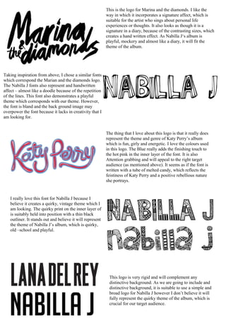
I really love this font for Nabilla J because I
believe it creates a quirky, vintage theme which I
am looking. The quirky print on the inner layer of
is suitably held into position with a thin black
outliner. It stands out and believe it will represent
the theme of Nabilla J’s album, which is quirky,
old –school and playful.
This logo is very rigid and will complement any
distinctive background. As we are going to include and
distinctive background, it is suitable to use a simple and
broad logo for Nabilla J however I don’t believe it will
fully represent the quirky theme of the album, which is
crucial for our target audience.