1. In what ways does your media product use, develop or challenge
forms and conventions of real media products?
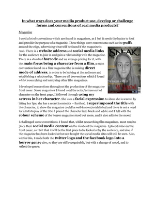
Magazine
I used a lot of conventions which are found in magazines, as I feel it needs the basics to look
and provide the purpose of a magazine. These things were conventions such as the puffs
around the edge, advertising what will be found if the magazine is
read. There is a website address and social media links
for the audience to join in and gain a relationship with the magazine.
There is a standard barcode and an average pricing for it, with
the main focus being a character from a film, a main
convention found on a film magazine.She is making direct
mode of address, in order to be looking at the audience and
establishing a relationship. These are all conventions which I found
whilst researching and analysing other film magazines.
I developed conventions throughout the production of the magazine
front cover. Some magazines I found used the actor/actress out of
character on the front page, I followed through using my
actress in her character. She uses a facial expression to show she is scared, by
biting her lips; she has a secret (semiotics – Barthes). I superimposed the title with
the character, to show the magazine could be well-known/established and there is not a need
for a full display of the title. I placed the character into black and white and I felt with the
colour scheme of the horror magazine stood out more, and it also adds to the mood.
I challenged some conventions. I found that, whilst researching film magazines, most tend to
place their social media content on the inside of the magazine. I placed mine on the
front cover, as I felt that it will be the first place to be looked at by the audience, and also if
the magazine has been looked at but not bought the social media sites will still be seen. Also,
within this, I made both the twitter logo and the facebook logo into a
horror genre also, so they are still recognisable, but with a change of mood, and to
reflect the genre.