
Recommended
More Related Content
What's hot
What's hot (19)
Viewers also liked
Viewers also liked (18)
Similar to Website analysis
Similar to Website analysis (20)
More from katambwa
More from katambwa (16)
Recently uploaded
Recently uploaded (20)
Website analysis
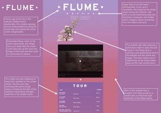
- 1. Flume logo at the top of the website creates brand awareness, this creates synergy across media platforms using the same logo and makes the artists name recognisable. Embedded Music video of the artists latest track, this keeps fans up to date with the artists music and sets up the tone and image of the artist and the music for consumers to expect. Skin of the website has a gradient from light purple to a pastel pink to reflect the light aesthetic of the artists brand. Hyper links to social media, merchandise, music and a newsletter, this expands the artists reach across the internet, with links to social networking sites like Facebook, Instagram and Twitter which creates a direct connection from the artist to the fans. The website skin also features a bell flower made of gold, the use of gold in the flower give a luxurious and professional tone to the website and the artists star image. This also makes use of Interactivity as the flower fades away as the user scrolls down. Tour dates are also displayed to keep fans updated on the artists shows, the tour grid also continues the same purple colour scheme as the skin of the website emphasising the light aesthetic of the artists brand.
- 2. GYKKGYKG Poster of the artists next show, this keeps fans up to date with the artists whereabouts, the poster also doubles as a hyperlink to tickets for the show featured utilising interactivity for the fans. Skin of the website is all black, this reflects the dark and complex tone of shlohmo’s music. Hyper links to social media, merchandise, music and a newsletter, this expands the artists reach across the internet, with links to social networking sites like Facebook, Instagram and Twitter which creates a direct connection from the artist to the fans. Embedded Music video of the artists latest track, this keeps fans up to date with the artists music and sets up the tone and image of the artist and the music for consumers to expect. The poster also feature stencils of roses which is the same rose used in shlohmo’s latest album cover, this helps with brand recognition giving fans a symbol to recognise and associate with the artist. Record Label logo to utilise Transferability and so consumers can associate this artists with artists from the same label. Tour dates are also displayed to keep fans updated on the artists shows.
- 3. Ryan Hemsworth logo in the artists handwriting. This makes a connection to the artist for the listener by having his handwriting as the logo and makes the artist name recognisable. The logo is also in pink to reflect the light tone of Ryan’s music. Embedded tour video, this is used as a promotional piece to utilise and boost the artists star image while also setting up the tone and image of the artist and the music for consumers to expect. Skin of the website is all white, this reflects the light tone of Ryan’s music. while bringing a clean and professional aesthetic to the artists star image. Embedded feeds of all of the artists social media accounts, this expands the artists reach across the internet, with feeds from social networking sites like Facebook, Instagram, Twitter and Soundcloud which creates a direct connection from the artist to the fans. Tour dates are also displayed to keep fans updated on the artists shows, the tour grid also continues the same white and pink colour scheme as the skin and logo of the website emphasising the light aesthetic of the artists brand.