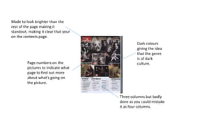
1. Made to look brighter than the
rest of the page making it
standout, making it clear that your
on the contexts page.
Page numbers on the
pictures to indicate what
page to find out more
about what's going on
the picture.
Dark colours
giving the idea
that the genre
is of dark
culture.
Three columns but badly
done as you could mistake
it as four columns.
2. Information
moshed into
one column.
Three clear
columns.
Very clear
what page
your on.
The colours
don’t
correspond
well with each
other.
Not clear
information
about the
images.
3. The photos are
overwhelming as there
are an overdone
amount of them, just
smeared all over the
page. Some images
collide with others,
making it more difficult
to keep your eyes
focused on the one
photo.
There are more than
four colours compiling
on the page, causing it
to look more fabulous
rather than the genre
its meant to be
supporting.
The page numbers are
placed walleye as they
mark right up to the
pictures that they’re
meant to be
representing. Making it
easier for the reader to
find the page associated
with the pictures.
There is three columns,
but there is one column
that manly stands out
more immensely than
the other two.