ICT Role in 21st Century Education & its Challenges.pptx
Magazine cover analysis - Zac Efron
1. Salford City College
Eccles Centre
AS Media Studies
Foundation Portfolio
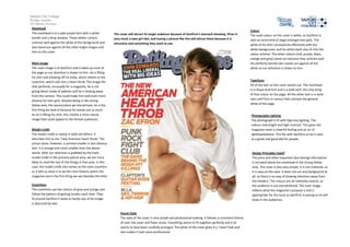
Masthead
The masthead is in a pale purple font with a white
border and a drop shadow. These darker colours
contrast well against the white of the background and
also stand out against all the other bright images and
text on the cover.
The cover will attract its target audience because of ZacEfron’s stomach-showing. Efron is
very much a teen girl idol, and having a picture like this will attract them because it is
attractive and something they want to see.
Main image
The main image is of ZacEfron and it takes up most of
the page so our attention is drawn to him. He is lifting
his shirt and showing off his body, which relates to the
coverline, which calls him a heart throb. The image fits
that perfectly. Unusually for a magazine, he is not
giving direct mode of address and he is looking away
from the camera. This could make him look even more
dreamy for teen girls. Despite being in the strong
fallow area, the second place we should look, he is the
first thing we look at because he stands out so much.
As he is lifting his shirt, this creates a more sexual
image that could appeal to the female audiences.
Colour
The main colour on the cover is white, as ZacEfron is
seen as some kind of angel amongst teen girls. The
white of his shirt corresponds effectively with the
white background, and his white teeth also fit into the
colour scheme. The other colours (red, purple, black,
orange and grey) stand out because they contrast well.
His perfectly tanned skin stands out against all the
white so our attention is drawn to him.
Typefaces
All of the text on the cover stands out. The masthead
is in Royal Acid font and is a bold serif, the only thing
of that colour on the page. All the other text is in bold
sans-serif font in colours that contrast the general
white of the page.
Photography Lighting
The photograph is lit with high-key lighting. The
colours look bright and high contrast. This gives the
magazine cover a cheerful feeling and an air of
lightheartedness. This fits with ZacEfron as he is seen
as a great and good idol for people.
Model credit
The model credit is mainly in bold red letters. It
describes him as the “new American heart throb.” His
actual name, however, is printed smaller in less obvious
text. It is orange and much smaller than the above
words. After our attention is grabbed by the main
model credit in the primary optical area, we are more
likely to read the rest of the things in that area. In this
case, the model credit also serves as the main coverline
as it tells us what is to be the main feature within the
magazine and is the first thing we see (besides the title).
Design Principles Used?
The price and other important (but boring) information
is included above the masthead in the strong fallow
area. The cover is also very simple. It is not cluttered, so
it is easy on the eyes. It does not use any background at
all, so there is no way of drawing attention away from
the headers. The colours are all relatively neutral, so
the audience is not overwhelmed. The main image
reflects what the magazine’s purpose is and is
appropriate for the issue as ZacEfron is posing so he will
draw in the audiences.
Coverlines
The coverlines use the colours of grey and orange and
follow the pattern of getting smaller each time. They
fit around ZacEfron’s body so hardly any of his image
is obscured by text.
House Style
The style of the cover is very simple and professional-looking. It follows a consistent theme
all over the cover and flows nicely. Everything seems to fit together perfectly and it all
seems to have been carefully arranged. The white of the cover gives it a “clean”look and
also makes it look more professional.