
Recommended
More Related Content
What's hot
What's hot (20)
Similar to Generic Conventions of Pop Digipaks and Magazine Adverts
Similar to Generic Conventions of Pop Digipaks and Magazine Adverts (20)
More from jadedowse123
Recently uploaded
Recently uploaded (20)
Generic Conventions of Pop Digipaks and Magazine Adverts
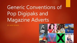
- 1. Generic Conventions of Pop Digipaks and Magazine Adverts BY JADE DOWSE
- 2. Introduction In this powerpoint, I will look at existing products for digipaks and magazine adverts to see if there are any common themes. Pop digipaks/adverts have different styles depending on the artist or the album name. Some artists have brand identity where there is a visual connection in the music artist's album cover and other media products that promote the artist. The target audience of pop tends to be a young audience so the artwork and style has to appeal to them.
- 3. Genre - CMINTS Iconography – The iconography depends on the image that the artist has chosen through Mise en Scene and the representation of the artist. Most pop artists chose bright colours so that it connotes a happy/fun product. The pop artist is usually young and attractive and usually present themselves in an appealing way to their audience. Therefore, they are an icon to their fans as they aspire to be like them, or to know someone like them. Themes – The generic artwork may differ depending on the songs and the title of the album that they produce. However, many pop artists choose a direct facial portrait – sometimes without much more design or styling.
- 4. Colours The colours used in pop digipaks and magazine adverts are bright colours in order to stand out to their target audience. The artists’ use brand identity within their artwork so that the audience can easily identify an artist’s product. The colours that the artist uses may depend on the artist’s personality or the title of the album, for example Taylor Swift’s album and advert for ‘Red’ uses that colour for the font colour and the colour along the bottom of the advert. Also, due to the background being black and white, it stands out to the target audience. Sometimes black and white imagery is used for artistic appeal.
- 5. Camera Shot Stereotypically, a mid shot/close up shot of the artist in an attractive pose that is positioned centrally is used. This is so that the artist can promote themselves and their product to the best advantage. Sometimes the subject might not be the artist if it is a concept piece. Alternatively, it might be a long shot of the artist. Sometimes, a cutaway of a different body part is used, for example, Michael Jackson’s ‘Dirty Diana’ shows Jackson’s booted feet.
- 6. Pose and Expression The artist’s pose and facial expression is important for portraying the artist’s personality, or portraying a mood or concept. Facial expressions and posture vary with different artists as some artists tend to be quite provocative – Katy Perry, some artists tend to have a casual ‘girl next door’ approach - Taylor Swift. However, most artists look directly into the camera, like Beyoncé who is heavily made up to look attractive and thus appeal to her audience. As a whole the pop artist is usually promoting themselves as much as they are promoting their music.
- 7. Font and Font Placement The font of the digipak and magazine advert tends to be large and bold and thus eye catching for the audience to see. The colour of some fonts harmonises with the rest of the colours seen such as Ellie Goulding’s advert and digipak The back cover has an ordered structure and usually has the same font as the front cover. For example Olly Mur’s ‘Right Place Right Time’ has the track list as the main focus to the left side of the back cover with the legal requirements across the bottom of the cover. It is the same font style/colour as on the front cover on the track list The placement of the text for an advert is either at the side of the subject or at the bottom as the viewer’s eye is drawn from top to bottom. The font style is usually the same for both the digipack and the advert. The artist’s name is usually the largest font on the digipak and/or advert because the pop artist tends to market themselves to their fans as an individual as much as they market their music. There are many pop artists trying to attract an audience, so any font used on a product has to be bold and eye catching to attract attention and thus sell the product. AdvertsFrontCoversBackCovers
- 8. Composition The artist’s image will be the major focus before the text as the viewer's eye will automatically be drawn first to an image. It therefore needs to be eye- catching. Composition can be dictated by the image that the artist wants to put across to their audience or by the title of the album. The second point of interest is bold text - especially for the artist’s name - for easy recognition of the product to the buying public.
- 9. Mise en Scène Costume – The clothing worn by artists varies, as different artists have different styles such as Lady Gaga is known for wearing unique outfits whereas other artists wear casual outfits, formal suits, dresses or go near naked! Some artists have a particular signature item of clothing - that they wear such as hats or glasses. Boy George always wears a hat. Lighting – The lighting is usually controlled as most digipaks and adverts are set in a studio, so they use three point lighting where the subject is lit fully. Sometimes they would not use all the lighting in three point lighting - so they would create a light balance. If the lighting was based on natural lighting, the editors might Photoshop the image to make the image stand out and look artificial like Ellie Goulding’s albums uses a bokeh effect to make her the main focus but still lighting the subject. Actors – The artist will facially express themselves in a way which suits their image or a given theme – such as an album title.
- 10. Mise en Scene Continued Make Up - On female artists, the make up is clearly seen, such as red lips or eyeliner around the eye. The Rihanna advert is a good example as, even though it is in black and white, you can see the dark shadows of the make up worn. Props – Props are rarely used but when they are used, they are used effectively to show the style of the artist, for example Lady Gaga’s ‘The Fame’ album uses sunglasses that is a close up shot with the title of thea lbum within the glasses to make the shot quirky. Some use musical instruments for their props to represent their musical style. Setting – The setting of most digipaks and adverts tend to be in a studio with a simple background so that the audience’s main attention is on the artist as the main purpose of a digipak and advert is to promote the artist. Adele’s ‘21’ shows a studio setting in black and white. There are two different shots for the digipak and the advert which is effective as the lighting is controlled to make light and dark shadows that balance each other out. However some shots can have a setting from their music video, if it is for their single or a setting that would relate to the title.
- 11. Connotations The connotations of pop digipaks and adverts vary depending on the artist and album title, as there is no specific connotations such as rap having jewellery to connote power. The artist is always present within the digipak and advert to connote their importance as a sole artist. The Michael Jackson example is an album that has images of his most popular song ‘Thriller’ - which would connote the theme of spoof horror. Rixton advertises their album with an image of the band on a road which links to the album title ‘Let The Road’ and is also the first track on this album. The back cover also links to this theme.
- 12. Conclusion In conclusion, the generic conventions of pop help show some features I should use for my digipak and advert, such as the use of bright colours. I will pay attention to the layout of my digipak and advert and I realise the importance of a strong facial image to promote the artist. I will try to use the features I have researched to make a stand out digipak and advert. These features vary between different artists so I will carefully examine my artist to see what features should be included - which relate to them specifically.