SlideShare a Scribd company logo
1 of 10
Download to read offline
INTERNATIONAL RESEARCH JOURNAL OF ENGINEERING AND TECHNOLOGY (IRJET) E-ISSN: 2395-0056
VOLUME: 06 ISSUE: 06 | JUNE 2019 WWW.IRJET.NET P-ISSN: 2395-0072
© 2019, IRJET | Impact Factor value: 7.211 | ISO 9001:2008 Certified Journal | Page 2820
Best Practices of UI Elements Design
Pragya Srivastava1, Ms. Vinita Sharma2
1,2Dept. of Computer Science & Engineering, ABSS Institute of Technology, Meerut, India
---------------------------------------------------------------------------***---------------------------------------------------------------------------
Abstract— This paper is emphasized on the importance of
designing good user interface and how to do that. After
comparison of graphical elements on multiple basis, I have
figured out a few ideal practices which will enhance the user
experience for customers and help the businesses. The Website
should be fully responsive and should have a uniform layout.
Images should be unique and look professional.
Keywords—user experience, user interface, graphic
designing, elements, brand identity, user engagement,
conversion rate.
1. INTRODUCTION
User interface elements plays main role in the conversion
between a user and system. Better placement of elements will
helpful for increasing rate of conversion as well as user
experience. For this, It should be easy to access and located at
the position where user expects it to.
Following are some UI elements but are not limited to:
 Input Fields: text-fields, buttons, radio-buttons,
checkboxes, list, dropdown-list, toggles, date picker
field etc.
 Navigational Components: Attribution based
breadcrumb, location based breadcrumb, slider,
search-box, pagination, tags, icons.
 Informational Components: tooltips, progress bar,
progress circle, arrows notifications, meatballs
menu, modal windows, message box.
 Containers: accordion(for expand and collapse
sections)
After discussion about main elements, now I will discuss the
size and design of every section in website.
2. Designing a Button:
 Buttons are small but important element of
interaction design. It plays great role between a user
and system & tells about user’s action.
 In this section, I’ll describe some rules to create
effective buttons in user interface design:
i. Eye-catchy buttons
When user comes to a website, they should get the button
instantly and need to know what is ‘clickable’ and what’s not.
When It will take more time to understand a interface for a
user, UI becomes less usable for them. Usablity is all about
user satisfaction and how they understand and use the things.
When Usability and utility comes together then increase
usefulness of the product.
Usability + Utility = Usefulness
 Techniques changes very quickly while user changes
very slowly. They use their previous experience
about UI elements and accordingly set their mind
among UI objects. Like if this is a button then it
should be inside a shape. That can be in a rectangle,
filled rectangle, rounded rectangle, filled rounded
rectangle, filled button with shadow and also have
the properties such as size, color, shadow etc to
make the object look like a button.
 Following are some designs of buttons that are
familiar to most users:
 Filled button with square borders
 Filled button with rounded corners
 Filled button with shadows
 Ghost button
Figure 1. Different types of button designs
 I felt that “Filled button with shadow” is better than
all the designs of buttons, because this design is
easily understandable to the user and looks realistic
like a button that can be press. Shadow effect make
things more realistic.
INTERNATIONAL RESEARCH JOURNAL OF ENGINEERING AND TECHNOLOGY (IRJET) E-ISSN: 2395-0056
VOLUME: 06 ISSUE: 06 | JUNE 2019 WWW.IRJET.NET P-ISSN: 2395-0072
© 2019, IRJET | Impact Factor value: 7.211 | ISO 9001:2008 Certified Journal | Page 2821
 In some websites, I found the button between the
content with no white spacing which looks like a box
not more than this. Buttons surrounded by text or
visible elements are not very much visible on the
web page. In order to get user’s attention buttons
should be placed in spacious regions where it could
be seem easily.
Figure 2. A Button surrounded by messy text
As a user, you can’t tell whether it’s a box or a button.
ii. Placement of button
 Button should be located at the place which can
easily get users attention and user expects to see.
Button existence is wastes if user cannot find it in
first navigate.
iii. Work of the Button
 Button should be like, that is understood to a user by
reading its label. Confusing labels on button can be
the cause of major problem. Let me give you a small
example. Imagine that you accidentally clicked delete
action and a dialogue box opened that shows
following message.
Figure 3. Buttons with irreversible actions
The label ‘OK’ doesn’t describe about action button. It will
confuse the user, Most of users will ask themselves “What
happens when I click on ‘OK’?” Dialog box design should not
consisted these two options ‘OK’ and ‘Cancel’ rather than this
the action of the button should be use as its label. This will
help users to understand the work of button and for
differentiate the buttons red color can take in use for delete
button as red states danger.
Figure 4. Designing of ‘delete’ button
Now ‘Delete’ button clears the meaning of the button itself.
iv. Size of a button
 Button size tells about the priority of element on the
web page or any application. Small button means less
important action whether large button means more
important action. By making button like this,
engagement of users will increase.
 Most important button should look like it’s the most
important. The designing of this should different
(size, color) so that it captures user’s attention.
Figure 5. Example of good CTA design
Example:
 I have seen in many mobile apps, buttons are too
small. Which may cause of mistyping and it made bad
impact on users. So button should also be finger-
friendly. Proper spacing between two buttons and
properly sized buttons are must for user friendliness.
Figure 6. Comparing Size of button
INTERNATIONAL RESEARCH JOURNAL OF ENGINEERING AND TECHNOLOGY (IRJET) E-ISSN: 2395-0056
VOLUME: 06 ISSUE: 06 | JUNE 2019 WWW.IRJET.NET P-ISSN: 2395-0072
© 2019, IRJET | Impact Factor value: 7.211 | ISO 9001:2008 Certified Journal | Page 2822
Left: properly-sized button. Right: buttons are too small.
Image: Apple[1]
 (MIT Touch Lab) study found that finger pads
averages are between 10-14mm and fingertips are
between 8-10mm. So atleast 10mm*10mm will be
good touch target size.
v. Fix number of buttons
 So many buttons on a single web page or an
application can be confusing for audience. Limited
number of button can help in better results.
3. Designing a Search Box
 Though the simple combination of input box and a
submit button made search box. But search box
design must be attractive. When a user come to a
new website he find for search box first, to get their
response quickly.
 The design of search box matters a lot for user
experience. So in the following section, I’ll describe
about improving search box designing.
i. Magnifying Glass Icon
 In mostly sites, we see the icon use for search is
magnifying glass. So most of users have a mindset
that search box should look like this. By magnifying
glass icon user can know about this even without any
text-label.
ii. Highlighted Search Bar
 If search bar is an important function for a website or
application then it should be highlighted
prominently. It has to be easy to use as they not need
waste their time in searching it.
Figure 7. Comparing search bar designs[2]
In above pictures, left image shows that without text field
a search bar become less noticeable whereas in right side
image it become more noticeable because of text-field with
magnifying glass.
iii. Search bar must contain a search button
 A search button helps people understand that there
is one more step to do or they can press enter to
reach on their destination of search. Whereas When
search bar has no search button it gets complicated
to understand what to do next.
 Following are main points which helps in engaging
users and help them to focus on the search button:
a. Moderate size of search button will help users to spot
search field.
b. It should be better if search button has some
different color than the search field or if color is
same then button should carved-out, so that user will
get to know easily.
c. ‘Search’ label in the text field is must.
Figure 8. Comparing search bar designs
iv. Search box on every page
 Far from designing, It is also necessary that every
page of site contain search button. So that when user
needs to find the content that they are looking for,
user can use search box from that page where he is
on the website.
v. Simple Search Box
 According to usability study, Simple design is easily
understandable by users whereas complex design
decreases usability and non-understandable for
users. It is more convenient for user having no
INTERNATIONAL RESEARCH JOURNAL OF ENGINEERING AND TECHNOLOGY (IRJET) E-ISSN: 2395-0056
VOLUME: 06 ISSUE: 06 | JUNE 2019 WWW.IRJET.NET P-ISSN: 2395-0072
© 2019, IRJET | Impact Factor value: 7.211 | ISO 9001:2008 Certified Journal | Page 2823
advanced features in search box, if site is not
complicated.
 If a website is complicated then advanced search is
must. So it will be good if site contain both search bar
simple and advanced. Advanced search bar with
filters is good for e-commerce websites such as
Amazon, Flipkart etc.
Figure 9. Advance Search Design
vi. Placement of Search Box
 The placement of search box should at the place
where user expect to find it. This is better for user
experience if there is no need to find search box, is
spotted by all easily. The pattern you see below was
taken from a study.
 I asked people(150 participants) where they expect
search bar placed to. The study found mostly people
want it on the top-right or top-mid of the website. It
is more convenient for them to spot search field.
Figure 10. Search box placement survey chart
Above chart shows mostly users expected it on top-right
side. Then in middle of the web page. In many websites such
as Amazon, Flipkart this box is in center and on Apple website
it is located in top-right corner. when user comes to their
website they do not need to find for search they get it by
itself. Whereas in WhatsApp application it’s in top-right
corner.
Figure 11. Placement of search bar in flipkart
Figure 12. Placement of search bar in Amazon
Thus, search box should be on place where user expect it
to be. If it’s not visible or located at the place where user have
to scroll page or behind the navigation then it badly impact
on engagement and can be cause of down-fall in conversion
rate.
vii. Proper Field Size
 In some website I found input fields that are too
short, which can affect the usability. When a text box
is too short user can able to write long queries but
only few words are visible at a time that is tough for
editing.
 While a text-field with limited number of characters
helps in usability. As user already knows they have to
write limited content, so they will write short and
imprecise query. And they are able to read and edit
their queries easily. A rule says text-field size should
be of 27-characters input.
For Example: Search box used by Amazon is proper
sized.
Figure 13. Counting characters of Amazon search bar
 It would be also nice if a search grow with a mouse-
click, this will save space and convenient for users.
Sometimes complete search box information is not
INTERNATIONAL RESEARCH JOURNAL OF ENGINEERING AND TECHNOLOGY (IRJET) E-ISSN: 2395-0056
VOLUME: 06 ISSUE: 06 | JUNE 2019 WWW.IRJET.NET P-ISSN: 2395-0072
© 2019, IRJET | Impact Factor value: 7.211 | ISO 9001:2008 Certified Journal | Page 2824
shown to users whatever they type like done in
following image, it becomes hectic for users. So
search box information should be visible to users.
Figure 14. Properly sized search bar design
viii. Auto-Suggestion work well
 When user start typing query then auto-suggestion
mechanism helps them to find a query quickly. This
mechanism not only save time but also guides user to
find proper query. Some users are very bad in
searching their queries in proper manner and they
do not get good answers in first try, they switch to
substitutes websites. Which reflects negative impact
on the users. While auto suggestion makes positive
impact with better search queries.
 Tips: Auto-suggestions should be related and useful.
When user start writing a query and as after 3rd
character entered, suggestion should be display. It
will convenient for user if they get quick suggestions.
Suggestion-list length should not be so lengthy(less
than 10 items without scrollbar) which may
overwhelmed the content. Suggested item should be
in bold format that shows difference.
Figure 15. Designing of Google search box
 Google search[3] is a good example of perfect search
box.
ix. Label in the search box
It will be better if what you can search for, is clear to all
users. For this, sample or hint can be add as placeholder
within input field then user will know about the search field
for.[4]
Figure 16. Designing of Flipkart search box
 Search is a function which is used by overall users for
finding their queries, the designing of this box is not
simple as minor changes can decrease the usability
and by doing such activity as the proper size of input
field and set the limit of characters in search field
can increase usability with overall user experience.
4. Designing a Form
Figure 17. Comparing form designs
i. Sections Alignment
 Alignment is the process of arranging content in well
defined structure. If data on a website organized in a
structured way that will be eye-pleasing, effective to
their customers. Proper padding, margin, spacing
between the text and text field can be proved helpful
in making a form proper.
 In a research I found that left-hand side alignment
has good readability than others and it also takes less
completion time.
 In above image there are 4 options, with proper
alignment and having the label text as close to the
text field makes this more relatable. Spacing between
all labels should be same, it will help to the user in
scanning form in one go.
ii. Related fields can be grouped
 Grouping related field in a form can be a good way to
reduce the space. Like If a form has a field city and
second field is country then it can be grouped in
same row rather than two different rows.
Proper and good amount of spacing between the columns
and also between each section is must.
INTERNATIONAL RESEARCH JOURNAL OF ENGINEERING AND TECHNOLOGY (IRJET) E-ISSN: 2395-0056
VOLUME: 06 ISSUE: 06 | JUNE 2019 WWW.IRJET.NET P-ISSN: 2395-0072
© 2019, IRJET | Impact Factor value: 7.211 | ISO 9001:2008 Certified Journal | Page 2825
Figure 18. Comparing facebook form designs
 Here is a example of facebook sign-up form. in old
version first name and last name field was in
different rows. For the improvement of user
experience in updated version of facebook they
launched their new sign-up form which is eye
soothing and having a single row of name. The row
consist two columns First Name and Surname. And
also giving label as a placeholders which saves space
and increase readability.
iii. Format of Input fields
 Every text field should contain different foreground
and background color for example input field color
can be solid white and placeholders can be grey.
Though border with same grey color will look better
and people will pay more attention for it. And If hint
will placed with tough labels(hardly understandable
by users) then chances of error will reduced.
iv. Adding visual hints
 In the input fields where users have to answer
manually is tough for them. Sometimes users become
lazy to type it manually so giving them few
suggestions upfront and knowing their thoughts
from it, can be a better way to get their perceptions.
v. Optional vs compulsory
 This is the point which defines the quality of a form.
Using asterisk at the place of ‘required’ will look
quite cool. But if in a form mostly options are
mandatory while only one or two are optional then
showing optional on that field should be used rather
putting asterisk on all the fields.
vi. CTA conversion
 Though, Interface is pretty but call to actions are not
clear enough or too small then conversion rate will
be decrease. Call to actions should be visible to all of
it’s users. Mostly forms contains two CTA; primary is
proceed and secondary is cancel. CTAs can look like
a text link or a solid rectangle but prominence should
be given to one of them.
5. Designing a Navigation Bar
i. Easy to find
Menu bar should be visible to all users easily so that they
can easily interact with the user interface. When navigation
and content of website text contains the same color, size and
font which is not prominent and conspicuous for visitors of
the site. It should be observable and distinguished. Most
important thing is spacing between all the navigation links
which has to be same. And Navigation Bar should be placed
on the top of web page or at left hand side(commonly used
place).
ii. Easy to operate
Font size of the navigation links should be at least 14 pt or
16 pt so that user can facilitate click on it. Websites or mobile
applications having small menu options can become a cause
of trouble to its users. Due to bad user experience they might
lose their customers. Letting click users in easy way and
having clear interface will be great for improvement of user
experience.
When a user click on dummy menu options then they will
not get response which reflects negative impact on the user.
So if there is no content in the link, then it should not be
shown in the navigation link. Only clickable menu links
should be there, that are responsive. Unclikable links can
affect site users.
iii.Order of Menu Links
Menu ordering is the most important principle in
navigation bar design. Menu are first interactive element for
user, if a user comes on website then for getting knowledge
about the company or business opens the links such as
Services, About us, Contact us etc. Keeping main menus
option characters 7 or less than it is the proof of good
navigation design.
iv. Clear User Interface
The content on the web page must be clear. Messy and
lengthy content that is not easily readable become trouble
sometimes for its users. Whereas simple, short and
straightforward content could be understood.
INTERNATIONAL RESEARCH JOURNAL OF ENGINEERING AND TECHNOLOGY (IRJET) E-ISSN: 2395-0056
VOLUME: 06 ISSUE: 06 | JUNE 2019 WWW.IRJET.NET P-ISSN: 2395-0072
© 2019, IRJET | Impact Factor value: 7.211 | ISO 9001:2008 Certified Journal | Page 2826
Figure 19. Simple Navigation bar design
v. Simple Design
Less items in the main navigation is very attractive. If a
site have more data to add then it can be add in vertical
menus. Sites having complex and many menus in main
navigation distracts the user’s attention that affects user
experience.
vi. Minimalistic Design
Now a days minimalistic and simple web designs are in
trend. Descent colors of the menu made user interface cool. If
entire site follows some specific color then navigation bar
should be picked up from any of these color, which suites
with the web page better.
Figure 20. Minimalistic Navigation bar design
vii. Important should on top
A website quality measurement is all depends on the
usability. Site will become user friendly if user get all
expected options without finding. All the options which could
have chances to get clicked by users such as services, should
be on top. It will increase usability as well as conversion rate.
viii. Solve the navigation problem, provide a good user
experience
Having good and useful content is worthless if user can
not properly access that website. Sometimes, in a complex
interface users may find the elements for what they searching
for but if they can not find it easily, this may become
frustrated and reason to leave the site.
There are some points for making a better navigation bar
so that more users can share the content of web page and
content become more readable for them.
a. Navigation menu should be easy to find on the web
page.
b. User could operate navigation links only by the
mouse hover or mouse click over it.
c. Each item should redirect to some link. None of these
should empty.
d. Navigation text should be précised and clear for all.
e. Styling of every menu should be in same pattern.
f. When someone moved their mouse over menus then
it’s appearance should change.
g. A navigation bar should consist maximum 8 menus,
not more than this.
h. Ordering of menu bar should according to the
importance and in standard pattern.
i. Navigation bar should be sticky which can resizes
itself on scroll and not disappear when user scroll
down website.
j. It should also be universal(on every page).
k. When there are mega menus to show on the landing
page then it will be nice to use hamburger menu.
6. Fonts & Typography[5]
i. Minimum Fonts
Having more than 2 fonts on a single page distracts reader
while reading content available on the website. Different size
fonts using in single web page are also disgusting and put bad
impact on users. Pairing of fonts are also a typical task. If a
text have its sub text, that is written in different font then it
should be harmonious with that text.
In following image if we compare the combination of
Raleway and Open Sans(Left) & Raleway and
Broadway(Right) then we found left fonts combination
creates a harmonious pairing whereas in right, due to heavy
weight of broadway font combination is looking
unprofessional.
INTERNATIONAL RESEARCH JOURNAL OF ENGINEERING AND TECHNOLOGY (IRJET) E-ISSN: 2395-0056
VOLUME: 06 ISSUE: 06 | JUNE 2019 WWW.IRJET.NET P-ISSN: 2395-0072
© 2019, IRJET | Impact Factor value: 7.211 | ISO 9001:2008 Certified Journal | Page 2827
Figure 21. Comparing combination of Fonts
ii. Length of Line
 A line with heavy content looks messy, having a
correct amount of words or characters in each line
can be more readable for the users. It should be nice
if each paragraph contain limited content which will
be easy to maintain sites user experience.
“For a good user experience a line should have
around 60-70 characters, whereas for mobile devices it
will be 30-40 characters. Having right amount in each
line might increase readability of site content.”
Line should be like this, if a reader starts reading content
there should not be breakage of rhythm. The content of each
line should not be too short or too long. Only main terms can
be focused so that user read it once and fit in their mind
forever.
iii. Typeface
 User can work on web, mobile and multiple of
devices so there is a typeface required that works
well on all the devices. A typeface which is legible for
all the screens might prove better for user
experience.
Figure 22. Different typefaces in typography
iv. Use of standard Fonts
 The use of cursive fonts such as Rouge Script, Vivaldi,
Lovely Home can make content difficult to read.
Although the font can be beautiful but it may tough
while read by users. So font that has good readability
like Roboto, Helvetica, Lato can be take in use. User
Experience is not all about interface it also depends
on the typography, good typography make good
impression on the users.
 In many of typefaces some letters looks same
specifically with “L”s and “I”s & spacing is also not
proper. So This can make whole content confusing
and messy which distracts users.
v. All Caps Text
 Content becomes difficult to read if written in all
caps text. It may also a cause of poor user experience.
Generally, to highlight something important in the
web page or section, it is capitalized. But if text is
capitalized in abundance, its readability decreases.
User finds it rude.
vi. Don’t Minimize Spacing Between Lines
 User faces many difficulty while reading complex
content on web page. Due to this, many times they
switch for the substitute web page. Nobody want to
invest their time in understanding content which is
not clear, so conversion will decreases.
 To minimize complexity of text spacing between two
lines- leading can be set accordingly. As a rule says, it
should be around 30% of characters height for better
readability.
vii. Proper Color Contrast
When background color and text written over it, are same
then it may not be visible clearly. Color contrast should be
proper when a user came to site then able to read content
faster.
In a study, I found the contrast ratio of small text(i.e. at
12pt regular and less) should be 4:5:1 against its background
whereas the contrast ratio of large text((i.e. at 14pt bold/18
pt regular and up) should be 3:1 against its background.
viii. Poor color combination/Use of bright colors
 Eye-pleasing is also a main factor in user interface. If
users don’t find good color combination or find
bright colors like red, green, yellow then they can not
tolerate it as it will distract their mind and also force
INTERNATIONAL RESEARCH JOURNAL OF ENGINEERING AND TECHNOLOGY (IRJET) E-ISSN: 2395-0056
VOLUME: 06 ISSUE: 06 | JUNE 2019 WWW.IRJET.NET P-ISSN: 2395-0072
© 2019, IRJET | Impact Factor value: 7.211 | ISO 9001:2008 Certified Journal | Page 2828
to read content. Mostly users get headache by
reading such colorful or bright content. It decreases
user experience.
 So use of good colors is also required with the
legibility in typography. If background is dark then
text over it should be light and when background is
light then text should be dark. In a study, it is found
color blindness is a common in mostly men, so it will
be nice if important information have distinguished
property such as bold or underlined.
ix. Blinking Text
 Blinking text grab attention easily but due to this
sometimes most important content are missed by
users. Also it doesn’t look professional, do distract
users mind and is annoying also.
 Readability can be increased by avoiding blinking
text. In some sites this is used when any update
available for the users. For example when result
declares then the link which takes user to result page
is also blink. But it doesn’t create problem or distract
mind. Blinking text should be used only for
temporary or in important information which user
should know definitely.
 There are two types of typography every web page
contains:
i. Micro Typography
ii. Macro Typography
 Micro typography deals with readability, spacing,
white-spacing, glyph-width while Macro typography
deals with the grid, format and hierarchy.
 Typography plays an important role in making site
more understandable and readable. If it is perfect
then website looks polished and grab users attention
easily which is essential for better user experience.
6. Colors & Gradient
Color should according to brand like if there is a brand of any
service like cosmetics. Then the brand should have a color
which relates from its service somewhere. So it should be any
shade of pink or purple or something like this. On other side,
if it is a brand for example- app development. Then serious
colors will suits and fit with it rather than funky colors.
Every brand should have their brand color which dictate
as their identity. They can promote their brand with that
color for getting better user experience. It can make impact
on users mind as user will know the brand with their color
also.
Most of brands used shades of blue and black colors.
Brand should use one or maximum two color in their brand
identity despite using multiple of colors. It makes design
childish.
Brand Color States shows the colors mostly used in web
design.[6]
Figure 23. Brand Color Stats
 I usually see combination of colors which do not fit
together. A design with strange gradients looks fake
whether good gradients makes design more real.
There are lot of gradients which looks good together.
For example: Sky; red-purple, blue-purple, red-
orange gradients are good gradients while there
should not combination of red-green, purple-yellow.
 I often see many websites using gradient with no
match which look like colors are going to fight
together for showing their presence. Here are few
color combinations, shows good and bad
combination gradients:
Figure 24. Comparing gradients[7]
INTERNATIONAL RESEARCH JOURNAL OF ENGINEERING AND TECHNOLOGY (IRJET) E-ISSN: 2395-0056
VOLUME: 06 ISSUE: 06 | JUNE 2019 WWW.IRJET.NET P-ISSN: 2395-0072
© 2019, IRJET | Impact Factor value: 7.211 | ISO 9001:2008 Certified Journal | Page 2829
Note: RGB color format is used for digital and web media
whereas CMYK color format is used for print media.
REFERENCES
[1]Retrieved from uxmag.com, retrieved on 25 april 2019.
[2]Retrieved from thinkwithgoogle.com, retrieved on 18
march 2019.
[3]Google, “Google Search Page” retrieved from google.com,
retrieved on 12 march 2019.
[4]Flipkart, “Flipkart Search Bar” retrieved from flipkart.com,
retrieved on 14 march 2019.
[5]Nick Babich, “10 tips on typography in web design”, Font
and Typography, retrieved from uxplanet.org, retrieved on 23
june 2017.
[6]Matt Solar, “What brand colors reveal about your
business”, retrieved from blog.marketo.com, retrieved on 20
April 2019.
[7]Anna Grenn, “The Secret of great gradient”, retrieved from
uxplanet.org, retrieved on 15 dec 2017.

More Related Content

Similar to IRJET- Best Practices of UI Elements Design

IRJET- Photographer Profiling and Hiring
IRJET- Photographer Profiling and HiringIRJET- Photographer Profiling and Hiring
IRJET- Photographer Profiling and HiringIRJET Journal
 
Study On User Interface(UI) Attributes Of Web Forms For Better User Experience
Study On User Interface(UI) Attributes Of Web Forms For Better User ExperienceStudy On User Interface(UI) Attributes Of Web Forms For Better User Experience
Study On User Interface(UI) Attributes Of Web Forms For Better User Experienceiosrjce
 
UIUX Design - report on summer training.docx
UIUX Design - report on summer training.docxUIUX Design - report on summer training.docx
UIUX Design - report on summer training.docxbhawnamangla2
 
Ux tips to design better online forms
Ux tips to design better online formsUx tips to design better online forms
Ux tips to design better online formsFibonalabs
 
IRJET- City Complaint Management System
IRJET-  	  City Complaint Management SystemIRJET-  	  City Complaint Management System
IRJET- City Complaint Management SystemIRJET Journal
 
The UX Process Behind Compelling User Experiences
The UX Process Behind Compelling User ExperiencesThe UX Process Behind Compelling User Experiences
The UX Process Behind Compelling User ExperiencesBelatrix Software
 
Why Does a UI Matters?
Why Does a UI Matters?Why Does a UI Matters?
Why Does a UI Matters?NotifyVisitors
 
GUI & Modern UI Design
GUI & Modern UI DesignGUI & Modern UI Design
GUI & Modern UI DesignMalik Zahid
 
IRJET- Cloud-Based Naive Bayes Classifier for Dynamic Design to Support Usabi...
IRJET- Cloud-Based Naive Bayes Classifier for Dynamic Design to Support Usabi...IRJET- Cloud-Based Naive Bayes Classifier for Dynamic Design to Support Usabi...
IRJET- Cloud-Based Naive Bayes Classifier for Dynamic Design to Support Usabi...IRJET Journal
 
human computer interaction of movie booking system project
human computer interaction of movie booking system projecthuman computer interaction of movie booking system project
human computer interaction of movie booking system project201roopikha
 
HCI Group Project Report
HCI Group Project ReportHCI Group Project Report
HCI Group Project Reportweilong1113
 
Rishabh UI Presentation - HDFC Website.pdf
Rishabh UI Presentation - HDFC Website.pdfRishabh UI Presentation - HDFC Website.pdf
Rishabh UI Presentation - HDFC Website.pdfRishabh Tiwari
 
UX: Interaction Design
UX: Interaction DesignUX: Interaction Design
UX: Interaction DesignAngela Duggan
 
Boost a Fintech Startup's Success Through UX Design
Boost a Fintech Startup's Success Through UX DesignBoost a Fintech Startup's Success Through UX Design
Boost a Fintech Startup's Success Through UX DesignFibonalabs
 
Scopic UX Design Test Task.pdf
Scopic UX Design Test Task.pdfScopic UX Design Test Task.pdf
Scopic UX Design Test Task.pdfAtiqur Rahaman
 

Similar to IRJET- Best Practices of UI Elements Design (20)

IRJET- Photographer Profiling and Hiring
IRJET- Photographer Profiling and HiringIRJET- Photographer Profiling and Hiring
IRJET- Photographer Profiling and Hiring
 
Problem
ProblemProblem
Problem
 
Study On User Interface(UI) Attributes Of Web Forms For Better User Experience
Study On User Interface(UI) Attributes Of Web Forms For Better User ExperienceStudy On User Interface(UI) Attributes Of Web Forms For Better User Experience
Study On User Interface(UI) Attributes Of Web Forms For Better User Experience
 
E017363243
E017363243E017363243
E017363243
 
UIUX Design - report on summer training.docx
UIUX Design - report on summer training.docxUIUX Design - report on summer training.docx
UIUX Design - report on summer training.docx
 
Ux tips to design better online forms
Ux tips to design better online formsUx tips to design better online forms
Ux tips to design better online forms
 
IRJET- City Complaint Management System
IRJET-  	  City Complaint Management SystemIRJET-  	  City Complaint Management System
IRJET- City Complaint Management System
 
The UX Process Behind Compelling User Experiences
The UX Process Behind Compelling User ExperiencesThe UX Process Behind Compelling User Experiences
The UX Process Behind Compelling User Experiences
 
Why Does a UI Matters?
Why Does a UI Matters?Why Does a UI Matters?
Why Does a UI Matters?
 
GUI & Modern UI Design
GUI & Modern UI DesignGUI & Modern UI Design
GUI & Modern UI Design
 
IRJET- Cloud-Based Naive Bayes Classifier for Dynamic Design to Support Usabi...
IRJET- Cloud-Based Naive Bayes Classifier for Dynamic Design to Support Usabi...IRJET- Cloud-Based Naive Bayes Classifier for Dynamic Design to Support Usabi...
IRJET- Cloud-Based Naive Bayes Classifier for Dynamic Design to Support Usabi...
 
human computer interaction of movie booking system project
human computer interaction of movie booking system projecthuman computer interaction of movie booking system project
human computer interaction of movie booking system project
 
Agrobazaar - The customer Experience process
Agrobazaar - The customer Experience processAgrobazaar - The customer Experience process
Agrobazaar - The customer Experience process
 
HCI Group Project Report
HCI Group Project ReportHCI Group Project Report
HCI Group Project Report
 
Rishabh UI Presentation - HDFC Website.pdf
Rishabh UI Presentation - HDFC Website.pdfRishabh UI Presentation - HDFC Website.pdf
Rishabh UI Presentation - HDFC Website.pdf
 
Usability thinking
Usability thinkingUsability thinking
Usability thinking
 
UX: Interaction Design
UX: Interaction DesignUX: Interaction Design
UX: Interaction Design
 
GUI Web Designs.pdf
GUI Web Designs.pdfGUI Web Designs.pdf
GUI Web Designs.pdf
 
Boost a Fintech Startup's Success Through UX Design
Boost a Fintech Startup's Success Through UX DesignBoost a Fintech Startup's Success Through UX Design
Boost a Fintech Startup's Success Through UX Design
 
Scopic UX Design Test Task.pdf
Scopic UX Design Test Task.pdfScopic UX Design Test Task.pdf
Scopic UX Design Test Task.pdf
 

More from IRJET Journal

TUNNELING IN HIMALAYAS WITH NATM METHOD: A SPECIAL REFERENCES TO SUNGAL TUNNE...
TUNNELING IN HIMALAYAS WITH NATM METHOD: A SPECIAL REFERENCES TO SUNGAL TUNNE...TUNNELING IN HIMALAYAS WITH NATM METHOD: A SPECIAL REFERENCES TO SUNGAL TUNNE...
TUNNELING IN HIMALAYAS WITH NATM METHOD: A SPECIAL REFERENCES TO SUNGAL TUNNE...IRJET Journal
 
STUDY THE EFFECT OF RESPONSE REDUCTION FACTOR ON RC FRAMED STRUCTURE
STUDY THE EFFECT OF RESPONSE REDUCTION FACTOR ON RC FRAMED STRUCTURESTUDY THE EFFECT OF RESPONSE REDUCTION FACTOR ON RC FRAMED STRUCTURE
STUDY THE EFFECT OF RESPONSE REDUCTION FACTOR ON RC FRAMED STRUCTUREIRJET Journal
 
A COMPARATIVE ANALYSIS OF RCC ELEMENT OF SLAB WITH STARK STEEL (HYSD STEEL) A...
A COMPARATIVE ANALYSIS OF RCC ELEMENT OF SLAB WITH STARK STEEL (HYSD STEEL) A...A COMPARATIVE ANALYSIS OF RCC ELEMENT OF SLAB WITH STARK STEEL (HYSD STEEL) A...
A COMPARATIVE ANALYSIS OF RCC ELEMENT OF SLAB WITH STARK STEEL (HYSD STEEL) A...IRJET Journal
 
Effect of Camber and Angles of Attack on Airfoil Characteristics
Effect of Camber and Angles of Attack on Airfoil CharacteristicsEffect of Camber and Angles of Attack on Airfoil Characteristics
Effect of Camber and Angles of Attack on Airfoil CharacteristicsIRJET Journal
 
A Review on the Progress and Challenges of Aluminum-Based Metal Matrix Compos...
A Review on the Progress and Challenges of Aluminum-Based Metal Matrix Compos...A Review on the Progress and Challenges of Aluminum-Based Metal Matrix Compos...
A Review on the Progress and Challenges of Aluminum-Based Metal Matrix Compos...IRJET Journal
 
Dynamic Urban Transit Optimization: A Graph Neural Network Approach for Real-...
Dynamic Urban Transit Optimization: A Graph Neural Network Approach for Real-...Dynamic Urban Transit Optimization: A Graph Neural Network Approach for Real-...
Dynamic Urban Transit Optimization: A Graph Neural Network Approach for Real-...IRJET Journal
 
Structural Analysis and Design of Multi-Storey Symmetric and Asymmetric Shape...
Structural Analysis and Design of Multi-Storey Symmetric and Asymmetric Shape...Structural Analysis and Design of Multi-Storey Symmetric and Asymmetric Shape...
Structural Analysis and Design of Multi-Storey Symmetric and Asymmetric Shape...IRJET Journal
 
A Review of “Seismic Response of RC Structures Having Plan and Vertical Irreg...
A Review of “Seismic Response of RC Structures Having Plan and Vertical Irreg...A Review of “Seismic Response of RC Structures Having Plan and Vertical Irreg...
A Review of “Seismic Response of RC Structures Having Plan and Vertical Irreg...IRJET Journal
 
A REVIEW ON MACHINE LEARNING IN ADAS
A REVIEW ON MACHINE LEARNING IN ADASA REVIEW ON MACHINE LEARNING IN ADAS
A REVIEW ON MACHINE LEARNING IN ADASIRJET Journal
 
Long Term Trend Analysis of Precipitation and Temperature for Asosa district,...
Long Term Trend Analysis of Precipitation and Temperature for Asosa district,...Long Term Trend Analysis of Precipitation and Temperature for Asosa district,...
Long Term Trend Analysis of Precipitation and Temperature for Asosa district,...IRJET Journal
 
P.E.B. Framed Structure Design and Analysis Using STAAD Pro
P.E.B. Framed Structure Design and Analysis Using STAAD ProP.E.B. Framed Structure Design and Analysis Using STAAD Pro
P.E.B. Framed Structure Design and Analysis Using STAAD ProIRJET Journal
 
A Review on Innovative Fiber Integration for Enhanced Reinforcement of Concre...
A Review on Innovative Fiber Integration for Enhanced Reinforcement of Concre...A Review on Innovative Fiber Integration for Enhanced Reinforcement of Concre...
A Review on Innovative Fiber Integration for Enhanced Reinforcement of Concre...IRJET Journal
 
Survey Paper on Cloud-Based Secured Healthcare System
Survey Paper on Cloud-Based Secured Healthcare SystemSurvey Paper on Cloud-Based Secured Healthcare System
Survey Paper on Cloud-Based Secured Healthcare SystemIRJET Journal
 
Review on studies and research on widening of existing concrete bridges
Review on studies and research on widening of existing concrete bridgesReview on studies and research on widening of existing concrete bridges
Review on studies and research on widening of existing concrete bridgesIRJET Journal
 
React based fullstack edtech web application
React based fullstack edtech web applicationReact based fullstack edtech web application
React based fullstack edtech web applicationIRJET Journal
 
A Comprehensive Review of Integrating IoT and Blockchain Technologies in the ...
A Comprehensive Review of Integrating IoT and Blockchain Technologies in the ...A Comprehensive Review of Integrating IoT and Blockchain Technologies in the ...
A Comprehensive Review of Integrating IoT and Blockchain Technologies in the ...IRJET Journal
 
A REVIEW ON THE PERFORMANCE OF COCONUT FIBRE REINFORCED CONCRETE.
A REVIEW ON THE PERFORMANCE OF COCONUT FIBRE REINFORCED CONCRETE.A REVIEW ON THE PERFORMANCE OF COCONUT FIBRE REINFORCED CONCRETE.
A REVIEW ON THE PERFORMANCE OF COCONUT FIBRE REINFORCED CONCRETE.IRJET Journal
 
Optimizing Business Management Process Workflows: The Dynamic Influence of Mi...
Optimizing Business Management Process Workflows: The Dynamic Influence of Mi...Optimizing Business Management Process Workflows: The Dynamic Influence of Mi...
Optimizing Business Management Process Workflows: The Dynamic Influence of Mi...IRJET Journal
 
Multistoried and Multi Bay Steel Building Frame by using Seismic Design
Multistoried and Multi Bay Steel Building Frame by using Seismic DesignMultistoried and Multi Bay Steel Building Frame by using Seismic Design
Multistoried and Multi Bay Steel Building Frame by using Seismic DesignIRJET Journal
 
Cost Optimization of Construction Using Plastic Waste as a Sustainable Constr...
Cost Optimization of Construction Using Plastic Waste as a Sustainable Constr...Cost Optimization of Construction Using Plastic Waste as a Sustainable Constr...
Cost Optimization of Construction Using Plastic Waste as a Sustainable Constr...IRJET Journal
 

More from IRJET Journal (20)

TUNNELING IN HIMALAYAS WITH NATM METHOD: A SPECIAL REFERENCES TO SUNGAL TUNNE...
TUNNELING IN HIMALAYAS WITH NATM METHOD: A SPECIAL REFERENCES TO SUNGAL TUNNE...TUNNELING IN HIMALAYAS WITH NATM METHOD: A SPECIAL REFERENCES TO SUNGAL TUNNE...
TUNNELING IN HIMALAYAS WITH NATM METHOD: A SPECIAL REFERENCES TO SUNGAL TUNNE...
 
STUDY THE EFFECT OF RESPONSE REDUCTION FACTOR ON RC FRAMED STRUCTURE
STUDY THE EFFECT OF RESPONSE REDUCTION FACTOR ON RC FRAMED STRUCTURESTUDY THE EFFECT OF RESPONSE REDUCTION FACTOR ON RC FRAMED STRUCTURE
STUDY THE EFFECT OF RESPONSE REDUCTION FACTOR ON RC FRAMED STRUCTURE
 
A COMPARATIVE ANALYSIS OF RCC ELEMENT OF SLAB WITH STARK STEEL (HYSD STEEL) A...
A COMPARATIVE ANALYSIS OF RCC ELEMENT OF SLAB WITH STARK STEEL (HYSD STEEL) A...A COMPARATIVE ANALYSIS OF RCC ELEMENT OF SLAB WITH STARK STEEL (HYSD STEEL) A...
A COMPARATIVE ANALYSIS OF RCC ELEMENT OF SLAB WITH STARK STEEL (HYSD STEEL) A...
 
Effect of Camber and Angles of Attack on Airfoil Characteristics
Effect of Camber and Angles of Attack on Airfoil CharacteristicsEffect of Camber and Angles of Attack on Airfoil Characteristics
Effect of Camber and Angles of Attack on Airfoil Characteristics
 
A Review on the Progress and Challenges of Aluminum-Based Metal Matrix Compos...
A Review on the Progress and Challenges of Aluminum-Based Metal Matrix Compos...A Review on the Progress and Challenges of Aluminum-Based Metal Matrix Compos...
A Review on the Progress and Challenges of Aluminum-Based Metal Matrix Compos...
 
Dynamic Urban Transit Optimization: A Graph Neural Network Approach for Real-...
Dynamic Urban Transit Optimization: A Graph Neural Network Approach for Real-...Dynamic Urban Transit Optimization: A Graph Neural Network Approach for Real-...
Dynamic Urban Transit Optimization: A Graph Neural Network Approach for Real-...
 
Structural Analysis and Design of Multi-Storey Symmetric and Asymmetric Shape...
Structural Analysis and Design of Multi-Storey Symmetric and Asymmetric Shape...Structural Analysis and Design of Multi-Storey Symmetric and Asymmetric Shape...
Structural Analysis and Design of Multi-Storey Symmetric and Asymmetric Shape...
 
A Review of “Seismic Response of RC Structures Having Plan and Vertical Irreg...
A Review of “Seismic Response of RC Structures Having Plan and Vertical Irreg...A Review of “Seismic Response of RC Structures Having Plan and Vertical Irreg...
A Review of “Seismic Response of RC Structures Having Plan and Vertical Irreg...
 
A REVIEW ON MACHINE LEARNING IN ADAS
A REVIEW ON MACHINE LEARNING IN ADASA REVIEW ON MACHINE LEARNING IN ADAS
A REVIEW ON MACHINE LEARNING IN ADAS
 
Long Term Trend Analysis of Precipitation and Temperature for Asosa district,...
Long Term Trend Analysis of Precipitation and Temperature for Asosa district,...Long Term Trend Analysis of Precipitation and Temperature for Asosa district,...
Long Term Trend Analysis of Precipitation and Temperature for Asosa district,...
 
P.E.B. Framed Structure Design and Analysis Using STAAD Pro
P.E.B. Framed Structure Design and Analysis Using STAAD ProP.E.B. Framed Structure Design and Analysis Using STAAD Pro
P.E.B. Framed Structure Design and Analysis Using STAAD Pro
 
A Review on Innovative Fiber Integration for Enhanced Reinforcement of Concre...
A Review on Innovative Fiber Integration for Enhanced Reinforcement of Concre...A Review on Innovative Fiber Integration for Enhanced Reinforcement of Concre...
A Review on Innovative Fiber Integration for Enhanced Reinforcement of Concre...
 
Survey Paper on Cloud-Based Secured Healthcare System
Survey Paper on Cloud-Based Secured Healthcare SystemSurvey Paper on Cloud-Based Secured Healthcare System
Survey Paper on Cloud-Based Secured Healthcare System
 
Review on studies and research on widening of existing concrete bridges
Review on studies and research on widening of existing concrete bridgesReview on studies and research on widening of existing concrete bridges
Review on studies and research on widening of existing concrete bridges
 
React based fullstack edtech web application
React based fullstack edtech web applicationReact based fullstack edtech web application
React based fullstack edtech web application
 
A Comprehensive Review of Integrating IoT and Blockchain Technologies in the ...
A Comprehensive Review of Integrating IoT and Blockchain Technologies in the ...A Comprehensive Review of Integrating IoT and Blockchain Technologies in the ...
A Comprehensive Review of Integrating IoT and Blockchain Technologies in the ...
 
A REVIEW ON THE PERFORMANCE OF COCONUT FIBRE REINFORCED CONCRETE.
A REVIEW ON THE PERFORMANCE OF COCONUT FIBRE REINFORCED CONCRETE.A REVIEW ON THE PERFORMANCE OF COCONUT FIBRE REINFORCED CONCRETE.
A REVIEW ON THE PERFORMANCE OF COCONUT FIBRE REINFORCED CONCRETE.
 
Optimizing Business Management Process Workflows: The Dynamic Influence of Mi...
Optimizing Business Management Process Workflows: The Dynamic Influence of Mi...Optimizing Business Management Process Workflows: The Dynamic Influence of Mi...
Optimizing Business Management Process Workflows: The Dynamic Influence of Mi...
 
Multistoried and Multi Bay Steel Building Frame by using Seismic Design
Multistoried and Multi Bay Steel Building Frame by using Seismic DesignMultistoried and Multi Bay Steel Building Frame by using Seismic Design
Multistoried and Multi Bay Steel Building Frame by using Seismic Design
 
Cost Optimization of Construction Using Plastic Waste as a Sustainable Constr...
Cost Optimization of Construction Using Plastic Waste as a Sustainable Constr...Cost Optimization of Construction Using Plastic Waste as a Sustainable Constr...
Cost Optimization of Construction Using Plastic Waste as a Sustainable Constr...
 

Recently uploaded

Structural Analysis and Design of Foundations: A Comprehensive Handbook for S...
Structural Analysis and Design of Foundations: A Comprehensive Handbook for S...Structural Analysis and Design of Foundations: A Comprehensive Handbook for S...
Structural Analysis and Design of Foundations: A Comprehensive Handbook for S...Dr.Costas Sachpazis
 
Introduction to IEEE STANDARDS and its different types.pptx
Introduction to IEEE STANDARDS and its different types.pptxIntroduction to IEEE STANDARDS and its different types.pptx
Introduction to IEEE STANDARDS and its different types.pptxupamatechverse
 
Decoding Kotlin - Your guide to solving the mysterious in Kotlin.pptx
Decoding Kotlin - Your guide to solving the mysterious in Kotlin.pptxDecoding Kotlin - Your guide to solving the mysterious in Kotlin.pptx
Decoding Kotlin - Your guide to solving the mysterious in Kotlin.pptxJoão Esperancinha
 
247267395-1-Symmetric-and-distributed-shared-memory-architectures-ppt (1).ppt
247267395-1-Symmetric-and-distributed-shared-memory-architectures-ppt (1).ppt247267395-1-Symmetric-and-distributed-shared-memory-architectures-ppt (1).ppt
247267395-1-Symmetric-and-distributed-shared-memory-architectures-ppt (1).pptssuser5c9d4b1
 
Introduction to Multiple Access Protocol.pptx
Introduction to Multiple Access Protocol.pptxIntroduction to Multiple Access Protocol.pptx
Introduction to Multiple Access Protocol.pptxupamatechverse
 
VIP Call Girls Service Hitech City Hyderabad Call +91-8250192130
VIP Call Girls Service Hitech City Hyderabad Call +91-8250192130VIP Call Girls Service Hitech City Hyderabad Call +91-8250192130
VIP Call Girls Service Hitech City Hyderabad Call +91-8250192130Suhani Kapoor
 
Coefficient of Thermal Expansion and their Importance.pptx
Coefficient of Thermal Expansion and their Importance.pptxCoefficient of Thermal Expansion and their Importance.pptx
Coefficient of Thermal Expansion and their Importance.pptxAsutosh Ranjan
 
Extrusion Processes and Their Limitations
Extrusion Processes and Their LimitationsExtrusion Processes and Their Limitations
Extrusion Processes and Their Limitations120cr0395
 
High Profile Call Girls Nagpur Isha Call 7001035870 Meet With Nagpur Escorts
High Profile Call Girls Nagpur Isha Call 7001035870 Meet With Nagpur EscortsHigh Profile Call Girls Nagpur Isha Call 7001035870 Meet With Nagpur Escorts
High Profile Call Girls Nagpur Isha Call 7001035870 Meet With Nagpur Escortsranjana rawat
 
Top Rated Pune Call Girls Budhwar Peth ⟟ 6297143586 ⟟ Call Me For Genuine Se...
Top Rated  Pune Call Girls Budhwar Peth ⟟ 6297143586 ⟟ Call Me For Genuine Se...Top Rated  Pune Call Girls Budhwar Peth ⟟ 6297143586 ⟟ Call Me For Genuine Se...
Top Rated Pune Call Girls Budhwar Peth ⟟ 6297143586 ⟟ Call Me For Genuine Se...Call Girls in Nagpur High Profile
 
Introduction and different types of Ethernet.pptx
Introduction and different types of Ethernet.pptxIntroduction and different types of Ethernet.pptx
Introduction and different types of Ethernet.pptxupamatechverse
 
Booking open Available Pune Call Girls Koregaon Park 6297143586 Call Hot Ind...
Booking open Available Pune Call Girls Koregaon Park  6297143586 Call Hot Ind...Booking open Available Pune Call Girls Koregaon Park  6297143586 Call Hot Ind...
Booking open Available Pune Call Girls Koregaon Park 6297143586 Call Hot Ind...Call Girls in Nagpur High Profile
 
UNIT-III FMM. DIMENSIONAL ANALYSIS
UNIT-III FMM.        DIMENSIONAL ANALYSISUNIT-III FMM.        DIMENSIONAL ANALYSIS
UNIT-III FMM. DIMENSIONAL ANALYSISrknatarajan
 
Call Girls in Nagpur Suman Call 7001035870 Meet With Nagpur Escorts
Call Girls in Nagpur Suman Call 7001035870 Meet With Nagpur EscortsCall Girls in Nagpur Suman Call 7001035870 Meet With Nagpur Escorts
Call Girls in Nagpur Suman Call 7001035870 Meet With Nagpur EscortsCall Girls in Nagpur High Profile
 
(SHREYA) Chakan Call Girls Just Call 7001035870 [ Cash on Delivery ] Pune Esc...
(SHREYA) Chakan Call Girls Just Call 7001035870 [ Cash on Delivery ] Pune Esc...(SHREYA) Chakan Call Girls Just Call 7001035870 [ Cash on Delivery ] Pune Esc...
(SHREYA) Chakan Call Girls Just Call 7001035870 [ Cash on Delivery ] Pune Esc...ranjana rawat
 
College Call Girls Nashik Nehal 7001305949 Independent Escort Service Nashik
College Call Girls Nashik Nehal 7001305949 Independent Escort Service NashikCollege Call Girls Nashik Nehal 7001305949 Independent Escort Service Nashik
College Call Girls Nashik Nehal 7001305949 Independent Escort Service NashikCall Girls in Nagpur High Profile
 
Call Girls Service Nashik Vaishnavi 7001305949 Independent Escort Service Nashik
Call Girls Service Nashik Vaishnavi 7001305949 Independent Escort Service NashikCall Girls Service Nashik Vaishnavi 7001305949 Independent Escort Service Nashik
Call Girls Service Nashik Vaishnavi 7001305949 Independent Escort Service NashikCall Girls in Nagpur High Profile
 
Porous Ceramics seminar and technical writing
Porous Ceramics seminar and technical writingPorous Ceramics seminar and technical writing
Porous Ceramics seminar and technical writingrakeshbaidya232001
 

Recently uploaded (20)

Structural Analysis and Design of Foundations: A Comprehensive Handbook for S...
Structural Analysis and Design of Foundations: A Comprehensive Handbook for S...Structural Analysis and Design of Foundations: A Comprehensive Handbook for S...
Structural Analysis and Design of Foundations: A Comprehensive Handbook for S...
 
Introduction to IEEE STANDARDS and its different types.pptx
Introduction to IEEE STANDARDS and its different types.pptxIntroduction to IEEE STANDARDS and its different types.pptx
Introduction to IEEE STANDARDS and its different types.pptx
 
Decoding Kotlin - Your guide to solving the mysterious in Kotlin.pptx
Decoding Kotlin - Your guide to solving the mysterious in Kotlin.pptxDecoding Kotlin - Your guide to solving the mysterious in Kotlin.pptx
Decoding Kotlin - Your guide to solving the mysterious in Kotlin.pptx
 
247267395-1-Symmetric-and-distributed-shared-memory-architectures-ppt (1).ppt
247267395-1-Symmetric-and-distributed-shared-memory-architectures-ppt (1).ppt247267395-1-Symmetric-and-distributed-shared-memory-architectures-ppt (1).ppt
247267395-1-Symmetric-and-distributed-shared-memory-architectures-ppt (1).ppt
 
Introduction to Multiple Access Protocol.pptx
Introduction to Multiple Access Protocol.pptxIntroduction to Multiple Access Protocol.pptx
Introduction to Multiple Access Protocol.pptx
 
VIP Call Girls Service Hitech City Hyderabad Call +91-8250192130
VIP Call Girls Service Hitech City Hyderabad Call +91-8250192130VIP Call Girls Service Hitech City Hyderabad Call +91-8250192130
VIP Call Girls Service Hitech City Hyderabad Call +91-8250192130
 
★ CALL US 9953330565 ( HOT Young Call Girls In Badarpur delhi NCR
★ CALL US 9953330565 ( HOT Young Call Girls In Badarpur delhi NCR★ CALL US 9953330565 ( HOT Young Call Girls In Badarpur delhi NCR
★ CALL US 9953330565 ( HOT Young Call Girls In Badarpur delhi NCR
 
Coefficient of Thermal Expansion and their Importance.pptx
Coefficient of Thermal Expansion and their Importance.pptxCoefficient of Thermal Expansion and their Importance.pptx
Coefficient of Thermal Expansion and their Importance.pptx
 
Extrusion Processes and Their Limitations
Extrusion Processes and Their LimitationsExtrusion Processes and Their Limitations
Extrusion Processes and Their Limitations
 
High Profile Call Girls Nagpur Isha Call 7001035870 Meet With Nagpur Escorts
High Profile Call Girls Nagpur Isha Call 7001035870 Meet With Nagpur EscortsHigh Profile Call Girls Nagpur Isha Call 7001035870 Meet With Nagpur Escorts
High Profile Call Girls Nagpur Isha Call 7001035870 Meet With Nagpur Escorts
 
Top Rated Pune Call Girls Budhwar Peth ⟟ 6297143586 ⟟ Call Me For Genuine Se...
Top Rated  Pune Call Girls Budhwar Peth ⟟ 6297143586 ⟟ Call Me For Genuine Se...Top Rated  Pune Call Girls Budhwar Peth ⟟ 6297143586 ⟟ Call Me For Genuine Se...
Top Rated Pune Call Girls Budhwar Peth ⟟ 6297143586 ⟟ Call Me For Genuine Se...
 
Introduction and different types of Ethernet.pptx
Introduction and different types of Ethernet.pptxIntroduction and different types of Ethernet.pptx
Introduction and different types of Ethernet.pptx
 
Booking open Available Pune Call Girls Koregaon Park 6297143586 Call Hot Ind...
Booking open Available Pune Call Girls Koregaon Park  6297143586 Call Hot Ind...Booking open Available Pune Call Girls Koregaon Park  6297143586 Call Hot Ind...
Booking open Available Pune Call Girls Koregaon Park 6297143586 Call Hot Ind...
 
UNIT-III FMM. DIMENSIONAL ANALYSIS
UNIT-III FMM.        DIMENSIONAL ANALYSISUNIT-III FMM.        DIMENSIONAL ANALYSIS
UNIT-III FMM. DIMENSIONAL ANALYSIS
 
Call Girls in Nagpur Suman Call 7001035870 Meet With Nagpur Escorts
Call Girls in Nagpur Suman Call 7001035870 Meet With Nagpur EscortsCall Girls in Nagpur Suman Call 7001035870 Meet With Nagpur Escorts
Call Girls in Nagpur Suman Call 7001035870 Meet With Nagpur Escorts
 
(SHREYA) Chakan Call Girls Just Call 7001035870 [ Cash on Delivery ] Pune Esc...
(SHREYA) Chakan Call Girls Just Call 7001035870 [ Cash on Delivery ] Pune Esc...(SHREYA) Chakan Call Girls Just Call 7001035870 [ Cash on Delivery ] Pune Esc...
(SHREYA) Chakan Call Girls Just Call 7001035870 [ Cash on Delivery ] Pune Esc...
 
College Call Girls Nashik Nehal 7001305949 Independent Escort Service Nashik
College Call Girls Nashik Nehal 7001305949 Independent Escort Service NashikCollege Call Girls Nashik Nehal 7001305949 Independent Escort Service Nashik
College Call Girls Nashik Nehal 7001305949 Independent Escort Service Nashik
 
Call Us -/9953056974- Call Girls In Vikaspuri-/- Delhi NCR
Call Us -/9953056974- Call Girls In Vikaspuri-/- Delhi NCRCall Us -/9953056974- Call Girls In Vikaspuri-/- Delhi NCR
Call Us -/9953056974- Call Girls In Vikaspuri-/- Delhi NCR
 
Call Girls Service Nashik Vaishnavi 7001305949 Independent Escort Service Nashik
Call Girls Service Nashik Vaishnavi 7001305949 Independent Escort Service NashikCall Girls Service Nashik Vaishnavi 7001305949 Independent Escort Service Nashik
Call Girls Service Nashik Vaishnavi 7001305949 Independent Escort Service Nashik
 
Porous Ceramics seminar and technical writing
Porous Ceramics seminar and technical writingPorous Ceramics seminar and technical writing
Porous Ceramics seminar and technical writing
 

IRJET- Best Practices of UI Elements Design

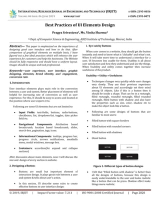
  • 1. INTERNATIONAL RESEARCH JOURNAL OF ENGINEERING AND TECHNOLOGY (IRJET) E-ISSN: 2395-0056 VOLUME: 06 ISSUE: 06 | JUNE 2019 WWW.IRJET.NET P-ISSN: 2395-0072 © 2019, IRJET | Impact Factor value: 7.211 | ISO 9001:2008 Certified Journal | Page 2820 Best Practices of UI Elements Design Pragya Srivastava1, Ms. Vinita Sharma2 1,2Dept. of Computer Science & Engineering, ABSS Institute of Technology, Meerut, India ---------------------------------------------------------------------------***--------------------------------------------------------------------------- Abstract— This paper is emphasized on the importance of designing good user interface and how to do that. After comparison of graphical elements on multiple basis, I have figured out a few ideal practices which will enhance the user experience for customers and help the businesses. The Website should be fully responsive and should have a uniform layout. Images should be unique and look professional. Keywords—user experience, user interface, graphic designing, elements, brand identity, user engagement, conversion rate. 1. INTRODUCTION User interface elements plays main role in the conversion between a user and system. Better placement of elements will helpful for increasing rate of conversion as well as user experience. For this, It should be easy to access and located at the position where user expects it to. Following are some UI elements but are not limited to:  Input Fields: text-fields, buttons, radio-buttons, checkboxes, list, dropdown-list, toggles, date picker field etc.  Navigational Components: Attribution based breadcrumb, location based breadcrumb, slider, search-box, pagination, tags, icons.  Informational Components: tooltips, progress bar, progress circle, arrows notifications, meatballs menu, modal windows, message box.  Containers: accordion(for expand and collapse sections) After discussion about main elements, now I will discuss the size and design of every section in website. 2. Designing a Button:  Buttons are small but important element of interaction design. It plays great role between a user and system & tells about user’s action.  In this section, I’ll describe some rules to create effective buttons in user interface design: i. Eye-catchy buttons When user comes to a website, they should get the button instantly and need to know what is ‘clickable’ and what’s not. When It will take more time to understand a interface for a user, UI becomes less usable for them. Usablity is all about user satisfaction and how they understand and use the things. When Usability and utility comes together then increase usefulness of the product. Usability + Utility = Usefulness  Techniques changes very quickly while user changes very slowly. They use their previous experience about UI elements and accordingly set their mind among UI objects. Like if this is a button then it should be inside a shape. That can be in a rectangle, filled rectangle, rounded rectangle, filled rounded rectangle, filled button with shadow and also have the properties such as size, color, shadow etc to make the object look like a button.  Following are some designs of buttons that are familiar to most users:  Filled button with square borders  Filled button with rounded corners  Filled button with shadows  Ghost button Figure 1. Different types of button designs  I felt that “Filled button with shadow” is better than all the designs of buttons, because this design is easily understandable to the user and looks realistic like a button that can be press. Shadow effect make things more realistic.
  • 2. INTERNATIONAL RESEARCH JOURNAL OF ENGINEERING AND TECHNOLOGY (IRJET) E-ISSN: 2395-0056 VOLUME: 06 ISSUE: 06 | JUNE 2019 WWW.IRJET.NET P-ISSN: 2395-0072 © 2019, IRJET | Impact Factor value: 7.211 | ISO 9001:2008 Certified Journal | Page 2821  In some websites, I found the button between the content with no white spacing which looks like a box not more than this. Buttons surrounded by text or visible elements are not very much visible on the web page. In order to get user’s attention buttons should be placed in spacious regions where it could be seem easily. Figure 2. A Button surrounded by messy text As a user, you can’t tell whether it’s a box or a button. ii. Placement of button  Button should be located at the place which can easily get users attention and user expects to see. Button existence is wastes if user cannot find it in first navigate. iii. Work of the Button  Button should be like, that is understood to a user by reading its label. Confusing labels on button can be the cause of major problem. Let me give you a small example. Imagine that you accidentally clicked delete action and a dialogue box opened that shows following message. Figure 3. Buttons with irreversible actions The label ‘OK’ doesn’t describe about action button. It will confuse the user, Most of users will ask themselves “What happens when I click on ‘OK’?” Dialog box design should not consisted these two options ‘OK’ and ‘Cancel’ rather than this the action of the button should be use as its label. This will help users to understand the work of button and for differentiate the buttons red color can take in use for delete button as red states danger. Figure 4. Designing of ‘delete’ button Now ‘Delete’ button clears the meaning of the button itself. iv. Size of a button  Button size tells about the priority of element on the web page or any application. Small button means less important action whether large button means more important action. By making button like this, engagement of users will increase.  Most important button should look like it’s the most important. The designing of this should different (size, color) so that it captures user’s attention. Figure 5. Example of good CTA design Example:  I have seen in many mobile apps, buttons are too small. Which may cause of mistyping and it made bad impact on users. So button should also be finger- friendly. Proper spacing between two buttons and properly sized buttons are must for user friendliness. Figure 6. Comparing Size of button
  • 3. INTERNATIONAL RESEARCH JOURNAL OF ENGINEERING AND TECHNOLOGY (IRJET) E-ISSN: 2395-0056 VOLUME: 06 ISSUE: 06 | JUNE 2019 WWW.IRJET.NET P-ISSN: 2395-0072 © 2019, IRJET | Impact Factor value: 7.211 | ISO 9001:2008 Certified Journal | Page 2822 Left: properly-sized button. Right: buttons are too small. Image: Apple[1]  (MIT Touch Lab) study found that finger pads averages are between 10-14mm and fingertips are between 8-10mm. So atleast 10mm*10mm will be good touch target size. v. Fix number of buttons  So many buttons on a single web page or an application can be confusing for audience. Limited number of button can help in better results. 3. Designing a Search Box  Though the simple combination of input box and a submit button made search box. But search box design must be attractive. When a user come to a new website he find for search box first, to get their response quickly.  The design of search box matters a lot for user experience. So in the following section, I’ll describe about improving search box designing. i. Magnifying Glass Icon  In mostly sites, we see the icon use for search is magnifying glass. So most of users have a mindset that search box should look like this. By magnifying glass icon user can know about this even without any text-label. ii. Highlighted Search Bar  If search bar is an important function for a website or application then it should be highlighted prominently. It has to be easy to use as they not need waste their time in searching it. Figure 7. Comparing search bar designs[2] In above pictures, left image shows that without text field a search bar become less noticeable whereas in right side image it become more noticeable because of text-field with magnifying glass. iii. Search bar must contain a search button  A search button helps people understand that there is one more step to do or they can press enter to reach on their destination of search. Whereas When search bar has no search button it gets complicated to understand what to do next.  Following are main points which helps in engaging users and help them to focus on the search button: a. Moderate size of search button will help users to spot search field. b. It should be better if search button has some different color than the search field or if color is same then button should carved-out, so that user will get to know easily. c. ‘Search’ label in the text field is must. Figure 8. Comparing search bar designs iv. Search box on every page  Far from designing, It is also necessary that every page of site contain search button. So that when user needs to find the content that they are looking for, user can use search box from that page where he is on the website. v. Simple Search Box  According to usability study, Simple design is easily understandable by users whereas complex design decreases usability and non-understandable for users. It is more convenient for user having no
  • 4. INTERNATIONAL RESEARCH JOURNAL OF ENGINEERING AND TECHNOLOGY (IRJET) E-ISSN: 2395-0056 VOLUME: 06 ISSUE: 06 | JUNE 2019 WWW.IRJET.NET P-ISSN: 2395-0072 © 2019, IRJET | Impact Factor value: 7.211 | ISO 9001:2008 Certified Journal | Page 2823 advanced features in search box, if site is not complicated.  If a website is complicated then advanced search is must. So it will be good if site contain both search bar simple and advanced. Advanced search bar with filters is good for e-commerce websites such as Amazon, Flipkart etc. Figure 9. Advance Search Design vi. Placement of Search Box  The placement of search box should at the place where user expect to find it. This is better for user experience if there is no need to find search box, is spotted by all easily. The pattern you see below was taken from a study.  I asked people(150 participants) where they expect search bar placed to. The study found mostly people want it on the top-right or top-mid of the website. It is more convenient for them to spot search field. Figure 10. Search box placement survey chart Above chart shows mostly users expected it on top-right side. Then in middle of the web page. In many websites such as Amazon, Flipkart this box is in center and on Apple website it is located in top-right corner. when user comes to their website they do not need to find for search they get it by itself. Whereas in WhatsApp application it’s in top-right corner. Figure 11. Placement of search bar in flipkart Figure 12. Placement of search bar in Amazon Thus, search box should be on place where user expect it to be. If it’s not visible or located at the place where user have to scroll page or behind the navigation then it badly impact on engagement and can be cause of down-fall in conversion rate. vii. Proper Field Size  In some website I found input fields that are too short, which can affect the usability. When a text box is too short user can able to write long queries but only few words are visible at a time that is tough for editing.  While a text-field with limited number of characters helps in usability. As user already knows they have to write limited content, so they will write short and imprecise query. And they are able to read and edit their queries easily. A rule says text-field size should be of 27-characters input. For Example: Search box used by Amazon is proper sized. Figure 13. Counting characters of Amazon search bar  It would be also nice if a search grow with a mouse- click, this will save space and convenient for users. Sometimes complete search box information is not
  • 5. INTERNATIONAL RESEARCH JOURNAL OF ENGINEERING AND TECHNOLOGY (IRJET) E-ISSN: 2395-0056 VOLUME: 06 ISSUE: 06 | JUNE 2019 WWW.IRJET.NET P-ISSN: 2395-0072 © 2019, IRJET | Impact Factor value: 7.211 | ISO 9001:2008 Certified Journal | Page 2824 shown to users whatever they type like done in following image, it becomes hectic for users. So search box information should be visible to users. Figure 14. Properly sized search bar design viii. Auto-Suggestion work well  When user start typing query then auto-suggestion mechanism helps them to find a query quickly. This mechanism not only save time but also guides user to find proper query. Some users are very bad in searching their queries in proper manner and they do not get good answers in first try, they switch to substitutes websites. Which reflects negative impact on the users. While auto suggestion makes positive impact with better search queries.  Tips: Auto-suggestions should be related and useful. When user start writing a query and as after 3rd character entered, suggestion should be display. It will convenient for user if they get quick suggestions. Suggestion-list length should not be so lengthy(less than 10 items without scrollbar) which may overwhelmed the content. Suggested item should be in bold format that shows difference. Figure 15. Designing of Google search box  Google search[3] is a good example of perfect search box. ix. Label in the search box It will be better if what you can search for, is clear to all users. For this, sample or hint can be add as placeholder within input field then user will know about the search field for.[4] Figure 16. Designing of Flipkart search box  Search is a function which is used by overall users for finding their queries, the designing of this box is not simple as minor changes can decrease the usability and by doing such activity as the proper size of input field and set the limit of characters in search field can increase usability with overall user experience. 4. Designing a Form Figure 17. Comparing form designs i. Sections Alignment  Alignment is the process of arranging content in well defined structure. If data on a website organized in a structured way that will be eye-pleasing, effective to their customers. Proper padding, margin, spacing between the text and text field can be proved helpful in making a form proper.  In a research I found that left-hand side alignment has good readability than others and it also takes less completion time.  In above image there are 4 options, with proper alignment and having the label text as close to the text field makes this more relatable. Spacing between all labels should be same, it will help to the user in scanning form in one go. ii. Related fields can be grouped  Grouping related field in a form can be a good way to reduce the space. Like If a form has a field city and second field is country then it can be grouped in same row rather than two different rows. Proper and good amount of spacing between the columns and also between each section is must.
  • 6. INTERNATIONAL RESEARCH JOURNAL OF ENGINEERING AND TECHNOLOGY (IRJET) E-ISSN: 2395-0056 VOLUME: 06 ISSUE: 06 | JUNE 2019 WWW.IRJET.NET P-ISSN: 2395-0072 © 2019, IRJET | Impact Factor value: 7.211 | ISO 9001:2008 Certified Journal | Page 2825 Figure 18. Comparing facebook form designs  Here is a example of facebook sign-up form. in old version first name and last name field was in different rows. For the improvement of user experience in updated version of facebook they launched their new sign-up form which is eye soothing and having a single row of name. The row consist two columns First Name and Surname. And also giving label as a placeholders which saves space and increase readability. iii. Format of Input fields  Every text field should contain different foreground and background color for example input field color can be solid white and placeholders can be grey. Though border with same grey color will look better and people will pay more attention for it. And If hint will placed with tough labels(hardly understandable by users) then chances of error will reduced. iv. Adding visual hints  In the input fields where users have to answer manually is tough for them. Sometimes users become lazy to type it manually so giving them few suggestions upfront and knowing their thoughts from it, can be a better way to get their perceptions. v. Optional vs compulsory  This is the point which defines the quality of a form. Using asterisk at the place of ‘required’ will look quite cool. But if in a form mostly options are mandatory while only one or two are optional then showing optional on that field should be used rather putting asterisk on all the fields. vi. CTA conversion  Though, Interface is pretty but call to actions are not clear enough or too small then conversion rate will be decrease. Call to actions should be visible to all of it’s users. Mostly forms contains two CTA; primary is proceed and secondary is cancel. CTAs can look like a text link or a solid rectangle but prominence should be given to one of them. 5. Designing a Navigation Bar i. Easy to find Menu bar should be visible to all users easily so that they can easily interact with the user interface. When navigation and content of website text contains the same color, size and font which is not prominent and conspicuous for visitors of the site. It should be observable and distinguished. Most important thing is spacing between all the navigation links which has to be same. And Navigation Bar should be placed on the top of web page or at left hand side(commonly used place). ii. Easy to operate Font size of the navigation links should be at least 14 pt or 16 pt so that user can facilitate click on it. Websites or mobile applications having small menu options can become a cause of trouble to its users. Due to bad user experience they might lose their customers. Letting click users in easy way and having clear interface will be great for improvement of user experience. When a user click on dummy menu options then they will not get response which reflects negative impact on the user. So if there is no content in the link, then it should not be shown in the navigation link. Only clickable menu links should be there, that are responsive. Unclikable links can affect site users. iii.Order of Menu Links Menu ordering is the most important principle in navigation bar design. Menu are first interactive element for user, if a user comes on website then for getting knowledge about the company or business opens the links such as Services, About us, Contact us etc. Keeping main menus option characters 7 or less than it is the proof of good navigation design. iv. Clear User Interface The content on the web page must be clear. Messy and lengthy content that is not easily readable become trouble sometimes for its users. Whereas simple, short and straightforward content could be understood.
  • 7. INTERNATIONAL RESEARCH JOURNAL OF ENGINEERING AND TECHNOLOGY (IRJET) E-ISSN: 2395-0056 VOLUME: 06 ISSUE: 06 | JUNE 2019 WWW.IRJET.NET P-ISSN: 2395-0072 © 2019, IRJET | Impact Factor value: 7.211 | ISO 9001:2008 Certified Journal | Page 2826 Figure 19. Simple Navigation bar design v. Simple Design Less items in the main navigation is very attractive. If a site have more data to add then it can be add in vertical menus. Sites having complex and many menus in main navigation distracts the user’s attention that affects user experience. vi. Minimalistic Design Now a days minimalistic and simple web designs are in trend. Descent colors of the menu made user interface cool. If entire site follows some specific color then navigation bar should be picked up from any of these color, which suites with the web page better. Figure 20. Minimalistic Navigation bar design vii. Important should on top A website quality measurement is all depends on the usability. Site will become user friendly if user get all expected options without finding. All the options which could have chances to get clicked by users such as services, should be on top. It will increase usability as well as conversion rate. viii. Solve the navigation problem, provide a good user experience Having good and useful content is worthless if user can not properly access that website. Sometimes, in a complex interface users may find the elements for what they searching for but if they can not find it easily, this may become frustrated and reason to leave the site. There are some points for making a better navigation bar so that more users can share the content of web page and content become more readable for them. a. Navigation menu should be easy to find on the web page. b. User could operate navigation links only by the mouse hover or mouse click over it. c. Each item should redirect to some link. None of these should empty. d. Navigation text should be précised and clear for all. e. Styling of every menu should be in same pattern. f. When someone moved their mouse over menus then it’s appearance should change. g. A navigation bar should consist maximum 8 menus, not more than this. h. Ordering of menu bar should according to the importance and in standard pattern. i. Navigation bar should be sticky which can resizes itself on scroll and not disappear when user scroll down website. j. It should also be universal(on every page). k. When there are mega menus to show on the landing page then it will be nice to use hamburger menu. 6. Fonts & Typography[5] i. Minimum Fonts Having more than 2 fonts on a single page distracts reader while reading content available on the website. Different size fonts using in single web page are also disgusting and put bad impact on users. Pairing of fonts are also a typical task. If a text have its sub text, that is written in different font then it should be harmonious with that text. In following image if we compare the combination of Raleway and Open Sans(Left) & Raleway and Broadway(Right) then we found left fonts combination creates a harmonious pairing whereas in right, due to heavy weight of broadway font combination is looking unprofessional.
  • 8. INTERNATIONAL RESEARCH JOURNAL OF ENGINEERING AND TECHNOLOGY (IRJET) E-ISSN: 2395-0056 VOLUME: 06 ISSUE: 06 | JUNE 2019 WWW.IRJET.NET P-ISSN: 2395-0072 © 2019, IRJET | Impact Factor value: 7.211 | ISO 9001:2008 Certified Journal | Page 2827 Figure 21. Comparing combination of Fonts ii. Length of Line  A line with heavy content looks messy, having a correct amount of words or characters in each line can be more readable for the users. It should be nice if each paragraph contain limited content which will be easy to maintain sites user experience. “For a good user experience a line should have around 60-70 characters, whereas for mobile devices it will be 30-40 characters. Having right amount in each line might increase readability of site content.” Line should be like this, if a reader starts reading content there should not be breakage of rhythm. The content of each line should not be too short or too long. Only main terms can be focused so that user read it once and fit in their mind forever. iii. Typeface  User can work on web, mobile and multiple of devices so there is a typeface required that works well on all the devices. A typeface which is legible for all the screens might prove better for user experience. Figure 22. Different typefaces in typography iv. Use of standard Fonts  The use of cursive fonts such as Rouge Script, Vivaldi, Lovely Home can make content difficult to read. Although the font can be beautiful but it may tough while read by users. So font that has good readability like Roboto, Helvetica, Lato can be take in use. User Experience is not all about interface it also depends on the typography, good typography make good impression on the users.  In many of typefaces some letters looks same specifically with “L”s and “I”s & spacing is also not proper. So This can make whole content confusing and messy which distracts users. v. All Caps Text  Content becomes difficult to read if written in all caps text. It may also a cause of poor user experience. Generally, to highlight something important in the web page or section, it is capitalized. But if text is capitalized in abundance, its readability decreases. User finds it rude. vi. Don’t Minimize Spacing Between Lines  User faces many difficulty while reading complex content on web page. Due to this, many times they switch for the substitute web page. Nobody want to invest their time in understanding content which is not clear, so conversion will decreases.  To minimize complexity of text spacing between two lines- leading can be set accordingly. As a rule says, it should be around 30% of characters height for better readability. vii. Proper Color Contrast When background color and text written over it, are same then it may not be visible clearly. Color contrast should be proper when a user came to site then able to read content faster. In a study, I found the contrast ratio of small text(i.e. at 12pt regular and less) should be 4:5:1 against its background whereas the contrast ratio of large text((i.e. at 14pt bold/18 pt regular and up) should be 3:1 against its background. viii. Poor color combination/Use of bright colors  Eye-pleasing is also a main factor in user interface. If users don’t find good color combination or find bright colors like red, green, yellow then they can not tolerate it as it will distract their mind and also force
  • 9. INTERNATIONAL RESEARCH JOURNAL OF ENGINEERING AND TECHNOLOGY (IRJET) E-ISSN: 2395-0056 VOLUME: 06 ISSUE: 06 | JUNE 2019 WWW.IRJET.NET P-ISSN: 2395-0072 © 2019, IRJET | Impact Factor value: 7.211 | ISO 9001:2008 Certified Journal | Page 2828 to read content. Mostly users get headache by reading such colorful or bright content. It decreases user experience.  So use of good colors is also required with the legibility in typography. If background is dark then text over it should be light and when background is light then text should be dark. In a study, it is found color blindness is a common in mostly men, so it will be nice if important information have distinguished property such as bold or underlined. ix. Blinking Text  Blinking text grab attention easily but due to this sometimes most important content are missed by users. Also it doesn’t look professional, do distract users mind and is annoying also.  Readability can be increased by avoiding blinking text. In some sites this is used when any update available for the users. For example when result declares then the link which takes user to result page is also blink. But it doesn’t create problem or distract mind. Blinking text should be used only for temporary or in important information which user should know definitely.  There are two types of typography every web page contains: i. Micro Typography ii. Macro Typography  Micro typography deals with readability, spacing, white-spacing, glyph-width while Macro typography deals with the grid, format and hierarchy.  Typography plays an important role in making site more understandable and readable. If it is perfect then website looks polished and grab users attention easily which is essential for better user experience. 6. Colors & Gradient Color should according to brand like if there is a brand of any service like cosmetics. Then the brand should have a color which relates from its service somewhere. So it should be any shade of pink or purple or something like this. On other side, if it is a brand for example- app development. Then serious colors will suits and fit with it rather than funky colors. Every brand should have their brand color which dictate as their identity. They can promote their brand with that color for getting better user experience. It can make impact on users mind as user will know the brand with their color also. Most of brands used shades of blue and black colors. Brand should use one or maximum two color in their brand identity despite using multiple of colors. It makes design childish. Brand Color States shows the colors mostly used in web design.[6] Figure 23. Brand Color Stats  I usually see combination of colors which do not fit together. A design with strange gradients looks fake whether good gradients makes design more real. There are lot of gradients which looks good together. For example: Sky; red-purple, blue-purple, red- orange gradients are good gradients while there should not combination of red-green, purple-yellow.  I often see many websites using gradient with no match which look like colors are going to fight together for showing their presence. Here are few color combinations, shows good and bad combination gradients: Figure 24. Comparing gradients[7]
  • 10. INTERNATIONAL RESEARCH JOURNAL OF ENGINEERING AND TECHNOLOGY (IRJET) E-ISSN: 2395-0056 VOLUME: 06 ISSUE: 06 | JUNE 2019 WWW.IRJET.NET P-ISSN: 2395-0072 © 2019, IRJET | Impact Factor value: 7.211 | ISO 9001:2008 Certified Journal | Page 2829 Note: RGB color format is used for digital and web media whereas CMYK color format is used for print media. REFERENCES [1]Retrieved from uxmag.com, retrieved on 25 april 2019. [2]Retrieved from thinkwithgoogle.com, retrieved on 18 march 2019. [3]Google, “Google Search Page” retrieved from google.com, retrieved on 12 march 2019. [4]Flipkart, “Flipkart Search Bar” retrieved from flipkart.com, retrieved on 14 march 2019. [5]Nick Babich, “10 tips on typography in web design”, Font and Typography, retrieved from uxplanet.org, retrieved on 23 june 2017. [6]Matt Solar, “What brand colors reveal about your business”, retrieved from blog.marketo.com, retrieved on 20 April 2019. [7]Anna Grenn, “The Secret of great gradient”, retrieved from uxplanet.org, retrieved on 15 dec 2017.