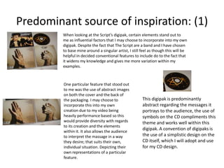
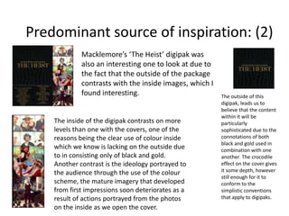
Ancillary Text Inspiration:
[Digipak]

The reason I chose these
particular digipak’s to analyse
is due to the fact that they are
somewhat related to the Pop
Rock genre that my
promotional package will be
concerned with. The variety of
digipaks enables me to identify
conventions and apply these to
my own creations whilst being
individual at the same time.
Predominant source of inspiration: (1)
When looking at the Script’s digipak, certain elements stand out to
me as influential factors that I may choose to incorporate into my own
digipak. Despite the fact that The Script are a band and I have chosen
to base mine around a singular artist, I still feel as though this will be
helpful in decided conventional features to include do to the fact that
it widens my knowledge and gives me more variation within my
examples.

One particular feature that stood out
to me was the use of abstract images
on both the cover and the back of
the packaging. I may choose to
incorporate this into my own
creation due to my video being
heavily performance based so this
would provide diversity with regards
to its creation and the elements
within it. It also allows the audience
to interpret the massage in a way
they desire; that suits their own,
individual situation. Depicting their
own representations of a particular
feature.

This digipak is predominantly
abstract regarding the messages it
portrays to the audience, the use of
symbols on the CD compliments this
theme and works well within this
digipak. A convention of digipaks is
the use of a simplistic design on the
CD itself, which I will adopt and use
for my CD design.
Predominant source of inspiration: (2)
Macklemore’s ‘The Heist’ digipak was
also an interesting one to look at due to
the fact that the outside of the package
contrasts with the inside images, which I
found interesting.

The inside of the digipak contrasts on more
levels than one with the covers, one of the
reasons being the clear use of colour inside
which we know is lacking on the outside due
to in consisting only of black and gold.
Another contrast is the ideology portrayed to
the audience through the use of the colour
scheme, the mature imagery that developed
from first impressions soon deteriorates as a
result of actions portrayed from the photos
on the inside as we open the cover.

The outside of this
digipak, leads us to
believe that the content
within it will be
particularly
sophisticated due to the
connotations of both
black and gold used in
combination with one
another. The crocodile
effect on the cover gives
it some depth, however
still enough for it to
conform to the
simplistic conventions
that apply to digipaks.
Influential factors & why I have chosen to use them:

The reason an abstract CD design is so
important is due to the fact that it must
give the audience the opportunity to
interpret not only the image, but the
songs on the cd, in their own way.

With regards to the inside panels of my Digipak, I aim
to make the images simplistic and abstract, so this
doesn’t overwhelm the sentimental value within
both the song and the promotional video it entails.
Also, the song isn’t massively ‘controversial’
therefore it doesn’t require justifications within the
digipak through the images used.

Inspiration also came from Macklemore’s
digipak due to the fact that my song revolves
around the Pop Rock genre, I hope to portray
this within the digipak through the use of
‘grungy’ colours such as grey, black, white and
potential accents of red.
I want the back panel of my digipak to conform
to the simplistic theme I intend to create for it,
therefore the colour scheme will be basic and
the track list is likely to include only a
background and an effective font that contrasts
with this but remains simple. Such as the one
featured above in Macklemore’s digipak: The
Heist.

Digipak Inspiration

  • 1.
    Ancillary Text Inspiration: [Digipak] Thereason I chose these particular digipak’s to analyse is due to the fact that they are somewhat related to the Pop Rock genre that my promotional package will be concerned with. The variety of digipaks enables me to identify conventions and apply these to my own creations whilst being individual at the same time.
  • 2.
    Predominant source ofinspiration: (1) When looking at the Script’s digipak, certain elements stand out to me as influential factors that I may choose to incorporate into my own digipak. Despite the fact that The Script are a band and I have chosen to base mine around a singular artist, I still feel as though this will be helpful in decided conventional features to include do to the fact that it widens my knowledge and gives me more variation within my examples. One particular feature that stood out to me was the use of abstract images on both the cover and the back of the packaging. I may choose to incorporate this into my own creation due to my video being heavily performance based so this would provide diversity with regards to its creation and the elements within it. It also allows the audience to interpret the massage in a way they desire; that suits their own, individual situation. Depicting their own representations of a particular feature. This digipak is predominantly abstract regarding the messages it portrays to the audience, the use of symbols on the CD compliments this theme and works well within this digipak. A convention of digipaks is the use of a simplistic design on the CD itself, which I will adopt and use for my CD design.
  • 3.
    Predominant source ofinspiration: (2) Macklemore’s ‘The Heist’ digipak was also an interesting one to look at due to the fact that the outside of the package contrasts with the inside images, which I found interesting. The inside of the digipak contrasts on more levels than one with the covers, one of the reasons being the clear use of colour inside which we know is lacking on the outside due to in consisting only of black and gold. Another contrast is the ideology portrayed to the audience through the use of the colour scheme, the mature imagery that developed from first impressions soon deteriorates as a result of actions portrayed from the photos on the inside as we open the cover. The outside of this digipak, leads us to believe that the content within it will be particularly sophisticated due to the connotations of both black and gold used in combination with one another. The crocodile effect on the cover gives it some depth, however still enough for it to conform to the simplistic conventions that apply to digipaks.
  • 4.
    Influential factors &why I have chosen to use them: The reason an abstract CD design is so important is due to the fact that it must give the audience the opportunity to interpret not only the image, but the songs on the cd, in their own way. With regards to the inside panels of my Digipak, I aim to make the images simplistic and abstract, so this doesn’t overwhelm the sentimental value within both the song and the promotional video it entails. Also, the song isn’t massively ‘controversial’ therefore it doesn’t require justifications within the digipak through the images used. Inspiration also came from Macklemore’s digipak due to the fact that my song revolves around the Pop Rock genre, I hope to portray this within the digipak through the use of ‘grungy’ colours such as grey, black, white and potential accents of red. I want the back panel of my digipak to conform to the simplistic theme I intend to create for it, therefore the colour scheme will be basic and the track list is likely to include only a background and an effective font that contrasts with this but remains simple. Such as the one featured above in Macklemore’s digipak: The Heist.