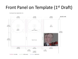
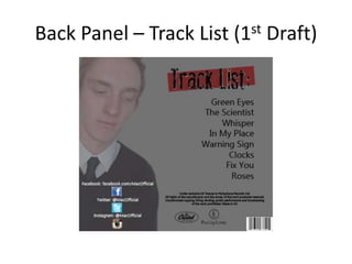
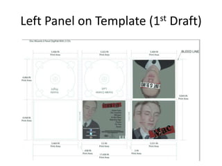
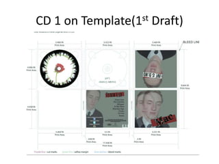
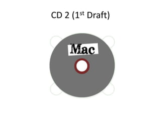
I created a SlideShare to show the first draft of each element of the ancillary text both within the digipak and as separate elements. The promotional poster is also included.
The document discusses the skills the author has learned including Photoshop, Premiere Pro, and audio software. These skills will help with their FMP project as they will edit the main part in Premiere Pro. The author's mood board inspired them by showing different horror styles and how colors and fonts are important. The mood board will influence their final product by helping them tailor it to appeal to their intended audience. A key influence is the 2017 film "It" which was tense and entertaining, and the author will try to include these elements in their trailer, such as using impactful music.
During the construction, research, planning, and evaluation stages of their project, the document's author used various media technologies. They researched film genres on websites like IMDB to identify conventions. They used InDesign, Photoshop, and Paint Shop Pro to design their film poster and magazine cover, editing images and fonts. Finally, they edited their film using Serif MoviePlus 5 to add effects and dub sounds, tailoring it to their chosen genre.
1. The document outlines an evaluation of creating promotional materials for a fictional folk pop artist named Mathew English.
2. The initial plan was to find countryside locations associated with folk music to shoot photos for an advertisement and album packaging. However, poor weather conditions impacted the shoot and some locations had to be changed.
3. While the shoot was overall successful, issues with low light led to some blurry photos. The editing process went well though more time was spent on the cover than other elements. Valuable lessons were learned about planning shoots around weather and using Photoshop editing tools.
This document provides guidance for students on analyzing film posters and creating their own mock film poster. It discusses key elements to identify when analyzing posters such as the title, stars, images, and release date. Students are instructed to analyze an example poster by annotating these elements. They will then analyze the meaning conveyed through the poster's visual style, colors, and tagline. The document outlines requirements for students to plan their own poster, including images, layout, and fonts. It notes they will complete a photo shoot and design mock-ups of their poster.
The document describes the process of creating a double page spread from first draft to final version. It involves image manipulation using selection and smudge tools to clean up jagged edges. The spread includes an artist name and title, a quote, introductory text, bylines, the article text, social media links, and feedback. The creator was advised to add page numbers for convention and decrease the prominence of social media plugs compared to the article text. Issues with wrapping text around an image leg will also be addressed when making future changes.
I took a variety of images from google of different digipak and analysed particular elements of each, stating how these would link to my product and influence its production.
The document discusses changes made to a magazine's contents page based on feedback. It was advised to change the font to conform to the house style used throughout the magazine. The original color scheme made the font hard to read against the dark background. The font was changed to 'Mistral' for continuity with a double page spread, and the maroon tone was lightened to improve readability against the dark background.
This document discusses sources of inspiration for an album cover from various existing album covers. The writer intends to take elements from the covers of Tom Odell and Justin Timberlake. For Tom Odell's cover, the writer likes the simplicity and the road in the background to represent the character's journey. For Justin Timberlake's cover, a blindfold is noted as unusual but could represent love blinding the character. Elements like suits, blindfolds, and close-up shots may be incorporated to represent themes of formality, love, and empathy in the character's situation.
The document discusses various techniques used in magazine contents pages to attract potential buyers. It notes that including a band index allows readers to see if there are artists they like featured. Subscriptions are promoted to save money while enjoying recurring issues. Images of upcoming content and arrows directing readers further entice people to purchase the magazine by implying more interesting articles are inside.
The document discusses problems with photographs taken for a magazine. It notes poor lighting, unwanted objects in shots, and large shadows around the model. This made editing difficult and brought down the overall quality and professionalism of the images. To address these issues, the photographer plans to reshoot the images with better lighting in the studio, clear backgrounds, and attention to framing shots without unnecessary inclusions.
This document outlines the production process for a magazine cover from initial photo shoots through revisions and feedback. It includes taking photos, selecting and editing images, adding design elements like mastheads and barcodes. The first draft received feedback suggesting alternating fonts for cover lines to appear more professional, adjusting the barcode size, and potentially filling blank space. Revisions were made to fonts, dates, and other elements before a final cover was completed.
The document discusses how the media product both uses conventions of real music magazines as well as challenges some conventions. It follows conventions such as using consistent colors and fonts for continuity, including photos and captions, and blocking articles into categories on the contents page. However, it challenges conventions by placing the masthead on the right instead of left and using a long shot for the cover photo instead of a medium close-up. The document provides examples from researched magazines to support how it both conforms to and adapts real music magazine conventions for its target genre and ideas.
This is a SlidShare created to show the conventions of a typical Pop Rock digipak. Despite the fact that this pack is based on a band as opposed to an individual artist, I still chose to analyse it due to the fact that it makes me more aware of conventions within this genre and i am able to adapt a particular element to suit my situation if something was to appeal to me.
Images were taken of an unknown subject, with 4 total photos being captured to document an event or object. Brief imagery was recorded without providing context on the purpose, content, or nature of the pictures in a concise photographic documentation.
The document outlines plans for creating 3 ident packages for a fictional TV channel called "The Grid" aimed at a punk demographic aged 16-34, including concept, logo designs, storyboards, and motion graphics and compositing techniques using software like Photoshop and After Effects. The ident packages are designed to have a consistent visual style while representing the channel's concept of being nuanced and open to exploring different genres. The document also includes production logs detailing the software and file management used in creating the ident packages.
The document outlines plans for creating 3 ident packages for a fictional TV channel called "The Grid" aimed at a punk demographic aged 16-34, including concept, logo designs, storyboards, and motion graphics and compositing techniques using software like Photoshop and After Effects. The ident packages are designed to have a consistent style while representing the channel's concept of being nuanced and open to exploring different genres. The document also includes production logs detailing the software and file management used in creating the ident packages.
1) The document outlines the style, colors, fonts, and layouts for a band poster that the creator is working on.
2) Chestnut, Space Cadet, and Salmon were chosen as the main colors for different elements of the band and their branding.
3) Two experimental layouts on Photoshop included sketches of instruments, logos, and text styles to get ideas for the final poster design.
The document describes the design process for a CD cover and packaging. Various design ideas were tried out, including cropping a band photo and adding color and text, or changing the colors and fonts. Feedback was gathered from others and the first idea was preferred. The final inside cover used a green background to reference military fatigues. The CD design featured a creepy Tony Blair mask and linked to the cover design through consistent fonts and colors.
The document describes the design process for a CD cover and packaging. Various design ideas were tried out, including cropping a band photo and adding color and text, or changing the photo crop and colors. Feedback was gathered from others and the first idea was preferred. The final inside cover used a green background to reference military fatigues. The CD design featured a creepy Tony Blair mask and continued the font and color scheme continuity.
The document describes the design process for a CD cover and packaging. Several ideas were tried for the inside cover, including cropping the photo in different ways and experimenting with color schemes. User feedback was gathered and the first idea was chosen but with an adjusted green background color. The CD design featured a creepy Tony Blair mask on a black background with the band name font to match the continuity of the overall design. Minor adjustments were made to size and logo to complete the final CD design.
The document summarizes the process of creating a first draft magazine advertisement for a new album. Photoshop was used to cut and paste words from light painting into a background and adjust opacity and feathering to blend elements together. Additional details like the album name, label, QR code, date, and website were added. While the first draft was completed, further improvements were planned to make a more attractive advert.
The combination of the student's main music video product and ancillary texts like a CD digipack and poster are effective.
All the products aim to portray the same narrative and genre. Black and white is used consistently to represent the indie genre. Imagery and camera shots are also reused across products.
The digipack hints at the music video's narrative by showing bruises. The poster continues the black and white theme but adds blurred color to the background, hinting that not all is as it seems and referencing the abusive relationship theme.
Technical elements like shots are also mirrored between the products, with close-ups used prominently. There is a clear synergy and relationship between the products that
2. production techniques evaluation pro forma(1)DominikBalint
This document summarizes and evaluates different graphic design, radio, video game, and comparison projects. For graphic design, it discusses advantages and disadvantages of working in Photoshop and compares an original poster to a World Cup poster. For radio, it discusses using Adobe Premier Pro to edit audio and compares an original Coke advert to a student version. For video games, it evaluates pixel art and discusses ease of different styles. It also compares two obstacle course games. Overall, the document reflects on strengths and weaknesses of each project and which advertises a product most effectively.
Evidence for the creation of my digipakFreya Wadeley
The document provides step-by-step instructions for creating a digipak using Adobe Photoshop. It describes 15 steps for editing images, adding text, and designing elements like the spine, tracklisting, and disc. Key steps include editing images onto panels while maintaining brand identity elements like colors from the music video, precisely placing text and adjusting fonts/sizes, and designing cohesive imagery that flows across the product. The level of detail ensures the digipak conveys the artist's vision and themes while following conventions to appeal to audiences.
This document provides a summary and evaluation of Jake's FMP project. It discusses the research, planning, time management, technical qualities, aesthetic qualities, audience appeal, and peer feedback aspects of the project. For the research section, Jake discusses how the research helped inform the look and feel of the final products. In planning, Jake decided on the content and layout for the two final products. For time management, Jake believes spending more time on parts would have improved the work but also allowed enough time to complete both products. The technical and aesthetic quality sections evaluate software used and design choices. Audience appeal discusses targeting a wide demographic. Peer feedback agreed effects were good but images could be higher resolution and the poster background plain.
This document provides a summary and evaluation of Jake's FMP project. It discusses the research, planning, time management, technical qualities, aesthetic qualities, audience appeal, and peer feedback aspects of the project. For the research section, Jake discusses how the research helped inform the look and feel of the final products. In planning, Jake decided on the content and layout for the two final products. For time management, Jake believes spending more time on parts would have improved the work but also allowed enough time for production. Across various sections, Jake evaluates the software and effects used, and considers how choices appealed to audiences and could be improved based on peer feedback. Peer feedback noted issues with some image quality and suggested changing the poster background. [
Theorists and how they relate to my material:holbeau
The document summarizes several media theories relating to representation, narrative, audience, and ideology. It discusses key concepts from theorists such as Levi Strauss, Laura Mulvey, John Berger, Tessa Perkins, Richard Dyer, and others. The document also relates each theory to the creator's own music video, explaining how concepts around binary opposites, male gaze, stereotypes, and more are relevant to the themes and story presented in the video.
The document discusses the creation of a music magazine. It explains that the creator researched other magazines for inspiration on conventions and codes. Throughout the magazine, a house style was maintained using the colors grey, black, maroon and white to create continuity and identity. The same fonts were also used throughout for professional layout and format.
The document discusses how the creator of a music magazine researched other magazines to gain inspiration for conventions and codes. They aimed to maintain a consistent house style using the colors grey, black, maroon and white throughout the magazine to create continuity and identity. The same fonts were also used throughout to follow conventions and create a professional layout and format.
The document discusses what the author learned from their preliminary magazine cover task to the final magazine product. They realized conventions like headers, selling lines, and prices are important to include to make the magazine look more professional. Unused conventions on the preliminary cover like headers and prices detracted from its quality. For the final product, the author aimed to conform to conventions like mastheads, dates, and barcodes. They also gained experience with design software and received feedback to improve the final magazine cover.
Q4. How did you use media technologies in the research, planning, constructio...holbeau
This particular SlideShare highlights the key aspects of technology used throughout the process of the creation of my promotional package consisting of a promotional music video, digipak and promotional poster in combination with one another.
The document describes the steps taken to update a music poster based on feedback. It details how the artist copied a panel from their digipak to maintain continuity. It then explains how they blacked out the artist's face, changed the background color to maroon, added text stating the release date as "out now", and included more social media information to promote the artist. The updated poster incorporated this feedback to make the design more appealing and informative for audiences.
This document lists potential images for a front cover, contents page, and departmental profile sheet (DPS) but provides no details on the actual images or their purpose. It appears to be an incomplete draft listing where images could be included but without specifying the images themselves.
The peer feedback provided suggestions to improve the magazine cover drafts:
1. Use a close-up portrait to show emotion and make eye contact with the audience. Include a visible price and use different font styles creatively.
2. Show more work leading up to the cover design. The pictures lack professionalism and the magazine looks empty without a color scheme. Make the masthead bigger and try a different font.
3. The blog research and draft ideas were good but the cover seems bland without more effects on the writing or an enlarged barcode and distinct price and date.
4. The blog research quality was high but the cover is lacking a date, title, price and headline to make it
I have created a PowerPoint presentation highlighting areas where my music product could be promoted, including a promotional package showing different advertising options and their effectiveness. I believe professionally promoting my product in areas like YouTube, VEVO, iTunes, music magazines, and music stores will increase views, popularity, and sales by targeting audiences interested in pop rock music.
This SlideShare includes shots which were not included in the original animatic. This was due to the timings being confused as I realised that I had missed these shots out after continuing with the storyboard so I must take this into consideration when creating my official promotional device.
The author learned that following conventions is important for creating a professional magazine. Their preliminary task lacked some key conventions like headers and selling lines. For their full magazine, they included most conventions but broke from tradition by placing the masthead on the right instead of left. They have also learned they could have been more adventurous with design elements and included more promotional information to attract readers. Completing a preliminary task helped the author gain experience with the design software and feedback to improve their skills for the final magazine.
Chapter wise All Notes of First year Basic Civil Engineering.pptxDenish Jangid
Chapter wise All Notes of First year Basic Civil Engineering
Syllabus
Chapter-1
Introduction to objective, scope and outcome the subject
Chapter 2
Introduction: Scope and Specialization of Civil Engineering, Role of civil Engineer in Society, Impact of infrastructural development on economy of country.
Chapter 3
Surveying: Object Principles & Types of Surveying; Site Plans, Plans & Maps; Scales & Unit of different Measurements.
Linear Measurements: Instruments used. Linear Measurement by Tape, Ranging out Survey Lines and overcoming Obstructions; Measurements on sloping ground; Tape corrections, conventional symbols. Angular Measurements: Instruments used; Introduction to Compass Surveying, Bearings and Longitude & Latitude of a Line, Introduction to total station.
Levelling: Instrument used Object of levelling, Methods of levelling in brief, and Contour maps.
Chapter 4
Buildings: Selection of site for Buildings, Layout of Building Plan, Types of buildings, Plinth area, carpet area, floor space index, Introduction to building byelaws, concept of sun light & ventilation. Components of Buildings & their functions, Basic concept of R.C.C., Introduction to types of foundation
Chapter 5
Transportation: Introduction to Transportation Engineering; Traffic and Road Safety: Types and Characteristics of Various Modes of Transportation; Various Road Traffic Signs, Causes of Accidents and Road Safety Measures.
Chapter 6
Environmental Engineering: Environmental Pollution, Environmental Acts and Regulations, Functional Concepts of Ecology, Basics of Species, Biodiversity, Ecosystem, Hydrological Cycle; Chemical Cycles: Carbon, Nitrogen & Phosphorus; Energy Flow in Ecosystems.
Water Pollution: Water Quality standards, Introduction to Treatment & Disposal of Waste Water. Reuse and Saving of Water, Rain Water Harvesting. Solid Waste Management: Classification of Solid Waste, Collection, Transportation and Disposal of Solid. Recycling of Solid Waste: Energy Recovery, Sanitary Landfill, On-Site Sanitation. Air & Noise Pollution: Primary and Secondary air pollutants, Harmful effects of Air Pollution, Control of Air Pollution. . Noise Pollution Harmful Effects of noise pollution, control of noise pollution, Global warming & Climate Change, Ozone depletion, Greenhouse effect
Text Books:
1. Palancharmy, Basic Civil Engineering, McGraw Hill publishers.
2. Satheesh Gopi, Basic Civil Engineering, Pearson Publishers.
3. Ketki Rangwala Dalal, Essentials of Civil Engineering, Charotar Publishing House.
4. BCP, Surveying volume 1
This presentation was provided by Rebecca Benner, Ph.D., of the American Society of Anesthesiologists, for the second session of NISO's 2024 Training Series "DEIA in the Scholarly Landscape." Session Two: 'Expanding Pathways to Publishing Careers,' was held June 13, 2024.
Walmart Business+ and Spark Good for Nonprofits.pdfTechSoup
"Learn about all the ways Walmart supports nonprofit organizations.
You will hear from Liz Willett, the Head of Nonprofits, and hear about what Walmart is doing to help nonprofits, including Walmart Business and Spark Good. Walmart Business+ is a new offer for nonprofits that offers discounts and also streamlines nonprofits order and expense tracking, saving time and money.
The webinar may also give some examples on how nonprofits can best leverage Walmart Business+.
The event will cover the following::
Walmart Business + (https://business.walmart.com/plus) is a new shopping experience for nonprofits, schools, and local business customers that connects an exclusive online shopping experience to stores. Benefits include free delivery and shipping, a 'Spend Analytics” feature, special discounts, deals and tax-exempt shopping.
Special TechSoup offer for a free 180 days membership, and up to $150 in discounts on eligible orders.
Spark Good (walmart.com/sparkgood) is a charitable platform that enables nonprofits to receive donations directly from customers and associates.
Answers about how you can do more with Walmart!"
ISO/IEC 27001, ISO/IEC 42001, and GDPR: Best Practices for Implementation and...PECB
Denis is a dynamic and results-driven Chief Information Officer (CIO) with a distinguished career spanning information systems analysis and technical project management. With a proven track record of spearheading the design and delivery of cutting-edge Information Management solutions, he has consistently elevated business operations, streamlined reporting functions, and maximized process efficiency.
Certified as an ISO/IEC 27001: Information Security Management Systems (ISMS) Lead Implementer, Data Protection Officer, and Cyber Risks Analyst, Denis brings a heightened focus on data security, privacy, and cyber resilience to every endeavor.
His expertise extends across a diverse spectrum of reporting, database, and web development applications, underpinned by an exceptional grasp of data storage and virtualization technologies. His proficiency in application testing, database administration, and data cleansing ensures seamless execution of complex projects.
What sets Denis apart is his comprehensive understanding of Business and Systems Analysis technologies, honed through involvement in all phases of the Software Development Lifecycle (SDLC). From meticulous requirements gathering to precise analysis, innovative design, rigorous development, thorough testing, and successful implementation, he has consistently delivered exceptional results.
Throughout his career, he has taken on multifaceted roles, from leading technical project management teams to owning solutions that drive operational excellence. His conscientious and proactive approach is unwavering, whether he is working independently or collaboratively within a team. His ability to connect with colleagues on a personal level underscores his commitment to fostering a harmonious and productive workplace environment.
Date: May 29, 2024
Tags: Information Security, ISO/IEC 27001, ISO/IEC 42001, Artificial Intelligence, GDPR
-------------------------------------------------------------------------------
Find out more about ISO training and certification services
Training: ISO/IEC 27001 Information Security Management System - EN | PECB
ISO/IEC 42001 Artificial Intelligence Management System - EN | PECB
General Data Protection Regulation (GDPR) - Training Courses - EN | PECB
Webinars: https://pecb.com/webinars
Article: https://pecb.com/article
-------------------------------------------------------------------------------
For more information about PECB:
Website: https://pecb.com/
LinkedIn: https://www.linkedin.com/company/pecb/
Facebook: https://www.facebook.com/PECBInternational/
Slideshare: http://www.slideshare.net/PECBCERTIFICATION
This document provides an overview of wound healing, its functions, stages, mechanisms, factors affecting it, and complications.
A wound is a break in the integrity of the skin or tissues, which may be associated with disruption of the structure and function.
Healing is the body’s response to injury in an attempt to restore normal structure and functions.
Healing can occur in two ways: Regeneration and Repair
There are 4 phases of wound healing: hemostasis, inflammation, proliferation, and remodeling. This document also describes the mechanism of wound healing. Factors that affect healing include infection, uncontrolled diabetes, poor nutrition, age, anemia, the presence of foreign bodies, etc.
Complications of wound healing like infection, hyperpigmentation of scar, contractures, and keloid formation.
2. Digipak
I created my Digipak using a template found online, I took measurements for
each panel and added these to a new Photoshop page. So I could begin
creating each piece of the promotional package.
Once I had completed each panel, I added it to the template so I could see it
gradually come together piece by piece.
Due to the fact that this is a 1st draft ancillary text, it is not made to the
standard I intend the final piece to look like, however this is work in progress
therefore the standard of each draft will continue to increase.