
Recommended
More Related Content
What's hot
What's hot (18)
Similar to Digipack and advert analysis
Similar to Digipack and advert analysis (20)
More from hoddn
More from hoddn (20)
Recently uploaded
Recently uploaded (20)
Digipack and advert analysis
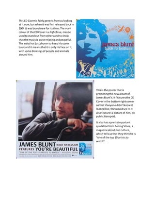
- 1. ThisCD Coveris fairlygenericfromuslooking at it now,butwhenit wasfirstreleasedbackin 2004 it wasbrand newforits time. The main colourof the CD Coverisa lightblue,maybe usedto standout fromothersand to show that the musicis quite relaxingandpeaceful. The artist has justchosento keephiscover basicand it meansthatit isonlyhisface onit, withsome drawingsof people andanimals aroundhim. Thisis the posterthat is promotingthe new albumof JamesBlunt’s.Itfeaturesthe CD Coverinthe bottomrightcorner so that if anyone didn’tknow it lookedlike,theycouldsee it.It alsofeaturesapicture of him, on publictransport. It alsohas a prettyimportant quotationfromRollingStone,a magazine aboutpopculture, whichtellsusthattheythinkhe is “one of the top 10 artiststo watch”.
- 2. ThisCD Coveris differentfromwhatisusuallyproduced nowadaysforalbumcovers.It wasonlyreleasedlastyear but youcan tell fromthe albumcoverthat he istryingto be indie inhismusicandwhat he produces. There isn’t reallyacolour scheme forthiscover,howeveritdoes feature multiple differentpeople doingall their different jobs. The font that hasbeenusedforthe title isquite generic and itis easyto read,as he is meantto be for all ages. There wasn’tactuallya posterthatwas releasedforjustthe album, however there wasone releasedforthe tourthat he had the followingyear,whichis picture left. Thisposterwaslike the JamesBluntpostertooas it had the original CDCoverfeaturedonit.Also,as well as the JamesBluntposter,ithas a type of quotation,sayingthatitwas the “#1 DebutAlbum”.