Nagavara Call Girls: 🍓 7737669865 🍓 High Profile Model Escorts | Bangalore Es...
Cd, advert analysis
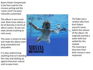
1. The baby was a
random idea from
Kurt Cobain
around 2 years
before the release
of the album. He
originally wanted a
water birth but
settled for this
instead.
The meaning is
that even from
birth money is very
important.
Boons Poster Compressed
Is the font used for the
nirvana writing and the
‘never mind’ has been
manually customized.
This album is very much
rock. Rock music attacts a
lot of divercity in terms of
album covers. As you can
elate almost anything to
rock music.
The cover is meant to look
and make the album seem
drug orientated and
phycadelic.
It is also undermining
anything that isn't bending
the rules and sticking up
against American culture
such as pop music.
2. The fact that they
have had a very messy
looking cake with lots
of things going may
show the lives of the
band members and
how chaotic it all was.
The original was
designed and made by
TV cook Delia Smith.
It was meant to
capture the music but
still remain silly and
fun and as requested
from the band ‘as
tacky as possible’.
This at the time was
very original and still is
the this day. It
captures the working
class background and
also captures the
musical aspect.
This also could show
more in depth things
like the fact there is a
wheel in there, could
show the way they got
around but more lily to
be that there life at the
time was very chaotic
and a lot of hard work.
The fact that it is
very messy and covered
upon with a fancy cake
that has been
decorated well, this
may show behind all
the fame and music
that there lives weren't
as desirable as
everyone thought.
there lives seem to
be onto of a record
player this could show
that music is holding
there lives up.
3. Pink Floyd are very
influential in the music
world. They made a lot of
music that a lot of people
liked but there ‘Dark side
of the moon’ album cover
is one of the most famous
CD cover art pieces every
made. Not only linking to
parts of the album but is
could show that ‘Pink
Floyd’ changed a lot of
things, you could see it as
‘Pink Floyd’ are the prism
and they are changing
things so much they could
change white light to a
rainbow, or they could be
trying to give hope that
anything even boring
white light can be made
into something colorful
and exiting.
The fact that the album is
called ‘Dark side of the
moon’ and the album art
is all to do wit colour and
light is very contradictory.
This could show that
society at the time and still
now is very contradictory
of its self.
4. Who ever has designed this advert for this
magazine has tried to make the colour on
the album cover run through out the
magazine to make the colour flow well and
make it easier for the eye. This colour runs
through well but the designers has got the
exact font font for the writing to promote
the album. As you can see you advert fills a
whole page this makes it very eye catching.
to make the viewer more interested in
the advert they have placed the best
known part of the album ‘sex on fire’ this
makes the viewer 1. know who the band
are 2.like to listen to the album 3.maybe
cut out the page and show more people.
This makes the whole advert very effective.
They have put OUT NOW in red. This
makes it stand out and being in red it
makes it seem like it is much more urgent
than the rest of the advert. This makes the
whole advert seem very important due to
the size and the colors used. Especially the
red.
5. This album has gone for a slightly different
approach. By making the writing see like its been
written in marker pen and the actual album cover
has marker pen on and it doesn't’t all seem
massively urgent or compelling making someone
want to buy it. They are demanding but at the same
time they are asking you politely to buy the album.
By asking ‘please’ but then stating that you can
pre order makes the advert seem, not polite but ot
rude. It is very strange. Kanye has wanted it to seem
like it is just a mix tape and not a big deal for him as
he refers to him self as ‘the king of music’.
The plain black writing and the rest of the
plain album cover and advert make the whole thing
seem very simple and what they are asking is very
simple. ‘go and buy it on the date stated. The whole
thing seems arrogant and sarcastic as if the people
that designed it knew what ever they did it didn't’t
really matter because Kanye is ignorant to think he
will sell the most no matter what it all looks like
that’s why it just looks like a home made mix tape.
6. This album cover ad advert are both very
colorful and do shout out for as may views
as they could possibly get. It almost looks
like a vinyl cover this may be because they
wanted the whole thing to look cool and
retro which it has done very nicely. Every
word is written in a different colour and
the advertisement at the bottom with a
review of how good it is. This shows that
they have obviously done a good job on
the album, on the advertisement and
distribution and now in the magazines.
The picture used is very yellow but it
has hints of the different colour that have
also been used on the fonts and writing.
Repetition has been used also to try and
get the point across to the viewer by
placing the name and album around 5-6
times make the names very memorable
and seem very important and are defiantly
a main focus point.