1. Kings of Leon – Come Around Sundown
ThisalbumadvertisementisfromanIndie rockband named
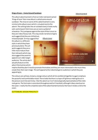
‘Kingsof Leon’theirnewalbumis calledcome around
sundown.The mise enscene of this advertisementisvery
similartothe albumcoverwhichis situatednexttothe
advert.The settinglookslike anisolatedisland,itlooksreally
calm andrelaxed.Palmtreesare aniconicsymbol of
relaxation.Thisjuxtaposesagainstthe style of theirmusicas
theyare indie/heavyrock.Thismaycreate narrative enigma
and suggestthattheyare chilledout,
relaxedpeople.Ormaysuggestthat
thisalbumisa different
style inwhichtheyhave
previouslydone.Thisart
worksuggeststheyare a
little more mature than
theiroldworkwhichmay
alsosuggesttheywant to
appeal toan oldertarget
audience. The artistsdon’t
actuallyfeature onthe
advertthemselveswhich
impliesthattheydon’tneedtopromote themselvesandtheyare more interestedinthe musicthey
create than theirownimage. Thiswill appeal tothe indie/rockgenre audience inwhichtheyare
appealingto.
The coloursare yellows,browns,orange colourswhichall mix andblendtogethertoagainemphasis
the peaceful andcomfortable mood.There lookslikethere isalayerof lightnessmakingthe airin
the picture seemhotand misty.Ilike the advertasit isn’tstereotypicallyrepresentativeof the indie
rock genre.The fontstyle isconsistentthroughoutandisn’ttoobold,althoughitdoesstandouton
the cover.I reallylike the simplisticstyle of the advertisementandalsolike how itrelatesalotto the
cover.
GUTTENBURG DESIGN PRINCIPLE??
Advertisement
Albumcover