1. How does the card appeal to its audience?
The cards are very fun in style and appeal to a family with young children wishing to let their children be
involved with, and learn to cook
What is the best aspect of the fonts used?
They’re easy to read against the background, making each letter easy to read for the audience.
What areas of font use could be improved?
The fonts so far are very good and I cannot suggest a way in which these could be improved.
Is the copy clear and easy to read?
The copy is clear to read, due to the fonts used.
Are there any errors?
The cards are unfinished as of yet but they look good , the second card needs the Vegetarian Society logo
in the top corner to make sure they stay consistent in style. ;
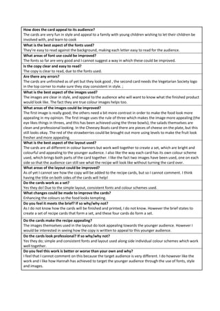
What is the best aspect of the images used?
The images are clear in style, and appeal to the audience who will want to know what the finished product
would look like. The fact they are true colour images helps too.
What areas of the images could be improved?
The first image is really good; the others need a bit more contrast in order to make the food look more
appealing in my opinion. The first image uses the rule of three which makes the image more appealing (the
eye likes things in threes, and this has been achieved using the three bowls); the salads themselves are
clean and professional looking. In the Cheesey Boats card there are pieces of cheese on the plate, but this
still looks okay. The red of the strawberries could be brought out more using levels to make the fruit look
fresher and more appealing.
What is the best aspect of the layout used?
The cards are all different in colour banners but work well together to create a set, which are bright and
colourful and appealing to the younger audience. I also like the way each card has its own colour scheme
used, which brings both parts of the card together. I like the fact two images have been used, one on each
side so that the audience can still see what the recipe will look like without turning the card over.
What areas of the layout could be improved?
As of yet I cannot see how the copy will be added to the recipe cards, but so I cannot comment. I think
having the title on both sides of the cards will help!
Do the cards work as a set?
Yes they do! Due to the simple layout, consistent fonts and colour schemes used.
What changes could be made to improve the cards?
Enhancing the colours so the food looks tempting.
Do you feel it meets the brief? If so why/why not?
As I do not know how the cards will be finished and printed, I do not know. However the brief states to
create a set of recipe cards that form a set, and these four cards do form a set.
Do the cards make the recipe appealing?
The images themselves used in the layout do look appealing towards the younger audience. However I
would be interested in seeing how the copy is written to appeal to this younger audience.
Do the cards look professional? If so why/why not?
Yes they do; simple and consistent fonts and layout used along side individual colour schemes which work
well together.
Do you feel this work is better or worse than your own and why?
I feel that I cannot comment on this because the target audience is very different. I do however like the
work and I like how Hannah has achieved to target the younger audience through the use of fonts, style
and images.