Explore beautiful and ugly buildings. Mathematics helps us create beautiful d...
Evaluation powerpoint
1. Visual language
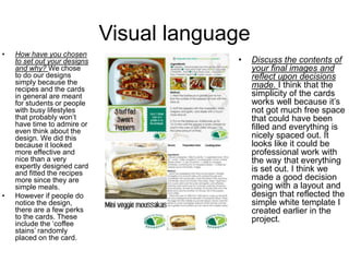
• How have you chosen
to set out your designs
and why? We chose
to do our designs
simply because the
recipes and the cards
in general are meant
for students or people
with busy lifestyles
that probably won’t
have time to admire or
even think about the
design. We did this
because it looked
more effective and
nice than a very
expertly designed card
and fitted the recipes
more since they are
simple meals.
• However if people do
notice the design,
there are a few perks
to the cards. These
include the ‘coffee
stains’ randomly
placed on the card.
• Discuss the contents of
your final images and
reflect upon decisions
made. I think that the
simplicity of the cards
works well because it’s
not got much free space
that could have been
filled and everything is
nicely spaced out. It
looks like it could be
professional work with
the way that everything
is set out. I think we
made a good decision
going with a layout and
design that reflected the
simple white template I
created earlier in the
project.
2. Visual language and audience
• Discuss the semiotics
and connotations created
from the content you
have included. To add a
little more to the design,
we incorporated a little
minimalist clock next to
the timing information
(the things such as
preparation time and
cooking time).
• Some of the recipes
(such as sweet peppers
and the salad) could
induce a summer like
feel to the audience. This
could also be prompted
by the light and simple
colour scheme or in
certain cases the word
barbecue (or some of the
other recipes could be
served at barbecues,
such as the South
Western style salad).
• Audience profile.
The audience could
either be students
or someone with a
busy lifestyle who
needs quick and
simple meals to suit
around them. These
people don’t have to
be vegetarian but
the cards are aimed
at people who like
vegetarian food and
also vegetarians of
course. The age of
this audience can b
anyone from age 16
and over. They can
be of any gender.
They can be from
anywhere and any
social grade (if not a
student). These
meals are cheap
and easy and so are
the recipe cards.
3. Audience and cultural context
• How have you
constructed your
work to appeal to this
audience? We have
made the recipe
cards to be simple,
just like the meals
that will be featured
on the recipe cards.
To represent
students (messy) and
busy people
(careless about
mess) we have
placed random
coffee stains on the
cards. This also
makes it more quirky,
fun looking and less
formal than other
recipe cards.
• What did you use as your
design influences and why
were they chosen? Before
we even made templates
of recipe cards we looked
at existing recipe cards,
some of which were done
by vegetarian society and
published on their
website. From there we
took features that we liked
from existing cards and
slightly changed them to
fit our cards and wanted
we wanted to do on our
cards.
• We chose to look at
existing cards created by
big brands so that we
could see what popular
features of big recipe
cards were and to make
our own a popular choice.
4. Cultural context and finished
product• Do vegetarian products
have a specific design
aesthetic and how does
your project reflect/contrast
this? Why? I think that
vegetarian products are
very stereotyped and are
very associated with the
colour green. This is
because plants are green
and vegetarians are seen
to only eat plants. Also the
white of the card is seen as
pure and vegetarians are
seen to have more pure
diets.
• We have reflected this by
following the whole green
and white colour scheme
as the main colours on the
recipe cards. We did this to
make sure that it was clear
it is a vegetarian meal card
by using the stereotypical
vegetarian colours.
• Does your finished
product reflect your initial
plans? How? If there are
any differences, describe
why changes were made.
Our finished product
does sort of reflect our
initial plans that got
inspired by the template.
We kept the simple,
uniform look but then
added some shapes
(such as the coffee stains
and borders) to add a bit
of quirkiness to the whole
card so it didn’t look as
boring or plain as it might
have done.
• Another change from the
template was that the
ingredients, instead of
being listed, they are all
in one paragraph but
separated by a shade of
green dots. We changed
it to make it look more
fun and add more colour
to the back of the card.
5. Finished products
• Does your finished product match
what you were set in the brief?
How? The brief states that the
design must be ‘Interesting,
creative and have a clear theme
running throughout all of the cards
that can either be based on an
ingredient or country etc’.
• We have complied this need by
creating eight recipe cards all on
the theme of quick and easy
meals. All of the cards look very
neat and clean cut but do contain
an element of fun and
creativeness by the use of
different shapes throughout the
cards.
• Another thing that we have also
done to math the brief is the use
of information such as preparation
time, cook time etc.
• How did the use of peer feedback help you in
your production? Peer feedback came in very
useful and showed us areas in which we could
improve and/or things that other people liked
about our work. This means we could then
improve our work to suit our feedback and
make the cards more appealing to others
rather than to what we want. This would also
help give us other ideas for the cards and then
we could improve them even further.
• Another reason why the peer feedback we
received was useful was because part of our
target audience included students and we are
all students so we could see what hey thought
of them and adjust them to the audiences
wants and needs.
• We also received some feedback from one of
our tutors. This also helped us improve our
work further, getting opinions from someone
possibly outside of the target audience and
seeing if they like it, what they’d improve and
things like that.
6. Finished product
• Strengths and weaknesses of final
product? I think that overall our
product looks professional and neat
with some quirky elements. There
could be a few improvements made
to the card.
• These could include things like better
placed coffee stains that look more
like coffee (darker and maybe less
transparent) and maybe the logo
should be the same size on both
sides of the card so it looks like a
page template that has been set out
before the construction of the actual
cards as if both sides have been
created from the same template.
• The best bit of the cards, in my
opinion, is the fonts and also the
photographs used.
• What skills/knowledge have you
gained/developed in this project? How
could these be applied in future practice?
I believe that I have earned a range of
new skills. These include things such as
using a vast range of shapes to create
borders and more interesting and
creative backgrounds for the card.
• I have also developed further knowledge
and skills on the use of Photoshop,
making my work a better quality.
• These could be applied in future practice
and pieces of work by making better
quality pieces of work and/or improving
my skills further.
• I have also improved my photograph
skills. I learned that to take a good
photograph you have to take your time
and let the camera focus itself.
7. Production process
• Is the work creative and
technically competent? I do
believe that the work we produced
is quite creative because it is not
like any of the others that the rest
of the group made and it is has
been changed numerous times
(meaning that we have tried a
range of ideas, therefore been
creative). Even if the recipe cards
we made are quite simple in
design, they contain everything
that the client stated that they
want in the brief. We spent a lot of
time making sure everything was
rightly positioned and looked
good. The cards didn’t look empty,
which is important since we chose
to do a simple design.
• Effective time management? I
think we managed our time pretty
well. We organised to have one
person at home, creating the
meals and then photographing
them, whilst the other person was
at college working on the designs
and cards in general. This help
gain us a lot of time instead of
both of us being off to create the
food and photograph it.
• We did, however need a bit of
extra time at the end just to finish
the last card off. This is because
some of the files got corrupted so
we had to re-do the cards that
were effected by this.
8. Production process and constraints
• If you could repeat the process
what would you do differently? I
think if we were to do this process
all again we would probably talk
more to get a clear idea of what
we wanted the cards too look like.
• We could have also had less days
off college when we weren’t
planned to so we could actually
get on and do the work.
• Another thing that we could also
have done is that we could have
shared the workload more. By this
I mean we could have made the
initial design together and then
split the cards (four each maybe)
and get on with putting them all
together so we have all the cards
prepared for photos.
• Legal, regulatory and financial
constraints. The only thing that
might be a legal restraint is that all
but one of the recipes that we
used are off of the BBC Good
Food website so we would need
permission to publish their work.
• Regulatory constraint would
include things such as who did
what work and if it actually was
their job. This wasn’t an issue for
use because we all did what we
were meant to do but helped each
other when needed to.
• Financial constraints would
include the money I used to buy
the ingredients used to create the
recipes so we could have original
images instead of sourced recipes
along with sourced images.
9. Management
• How did you work as part of a
group? In the group I think I
worked quite well. I think this
because, at the end of the day, we
got all our work done and to a high
standard. We may have had some
opposing opinions but we worked
around them and finally got a
good end piece. We organised
tasks to each other and did what
we were meant to and in the end
all the work we did paid off as we
had created a quality piece of
work.
• As just one person, however, I feel
I did well working in a group. I got
everything that I needed to done
and kept up with my work and
kept the blog up to date.
• How important is communication
when working in a group?
Communication whilst working in a
group is highly important. This is
so that everyone knows what
they’ll be doing, when it needs
doing by and other things on the
same line.
• Listening is also an important part
so that you know what everyone
else is doing, why they’re doing
what they’re doing, what they
might need you to do and other
things.
• If both factors are achieved then
the project should run smoothly
and you should be finished by
your deadline (or even before).
10. Management
• What have you learnt about
working in a group and how will
you apply this to future practice?
I have learned that working in a
group requires many different
skills and abilities. These include
patients with your other group
members (alongside tolerance
as well). Another thing that you
would need is responsibility and
the ability to be organised. This
will all make the project that you
are working on run smoothly.
• What have you learnt about working in
to a brief and how will you apply this to
future practice? I have learned that to
work to a brief requires a level of
acceptance and creativity.
• Acceptance is needed so that you
agree with the brief and stick to
everything that the client that wants.
This is important so you don’t rip the
client off with giving them a product
that doesn’t fit the brief.
• Creativity so that you can make a
piece of work to a really good quality
and still manage to fit all the brief
features in.
• I could use this in future practice
because I will already know in advance
what to do and what is to be expected.