
Recommended
More Related Content
What's hot
What's hot (20)
Similar to Colour scheme
Similar to Colour scheme (20)
More from hanaa_m
More from hanaa_m (20)
Recently uploaded
Recently uploaded (20)
Colour scheme
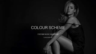
- 1. COLOUR SCHEME FOR R&B MUSIC MAGAZINE CLARA BARROSO
- 2. I decided to do a combination of the colour black, white and dark pink, (one of my favourite combinations) as the first group of three’s because the colours set a classy mood to the three colours together. My magazine is going to be set for mainly female from the age of 17-24. The idea of the dark pink sets a connection with the female target audience as the pink is a different tone of pink. And when it comes to genre, the three colours can be connected with R&B but in a female way, as the dark pink colour takes over the black and white colour together, which may portray how the model is posing in front of the camera. I really like this combination because the black and white can refer to the idea of black and white shots in magazines as it’s the colour scheme that mainly links to R&B and then the pink sets the mood of the model/artist and how she’s portrayed. The use of the colour, dark pink links straight away to the audience especially the ones between the age 17-24 as it would be a colour that is appropriate to the females. COLOUR COMBINATION 1
- 3. I also really like this combination of the colour gold, silver and white. These three colours together connect to the idea that the colours can be for either sex, male or female. These colours set a visual idea that my magazine is trying to portray classic R&B as it would also link by the different outfits that the model would be wearing. Theses colours together, especially the colour gold sets a mood of vintage to the R&B magazine as is trying to keep it natural and simple, not too over complicated. The white colour balances out the idea of the use of metallic colours for my magazine. These three colours together would link to the idea that the primary audience and the secondary audience can link to the magazine, especially as it is the type of music they would listen as it is already set to the type of artist they listen. The colours would link to the artist, as it would be portraying classic side of R&B but also female and currents songs played in the R&B industry. COLOUR COMBINATION 2
- 4. COLOUR COMBINATION 3 I really dislike this combination of the colour silver, light blue and brown. This would set an idea that the magazine is set to male especially by the use of the colour blue and brown colour together, which sets an idea for male. This won’t link to my primary target audience, females, because it’s colours in a combination that wouldn’t get the target audience to read. This colour combination would be set to some of my secondary audience, which are male as long as female (but male with a higher percentage). The blue would link to males straight away, besides of female (as a stereotype, because there are females that like the colour blue) but it still wouldn’t link o the artist in the magazine. However the idea of the silver and the brown colours shows a communication of R&B, as it’s the combination that would portray classy R&B but also old school R&B.
- 5. COLOUR COMBINATION 4 This combination of the colour rose gold, white and black are very similar to the first combination of colours. This set of colours set a mood that would only connect with the female as the colour rose gold and white together, are both light colours so it makes it look like as it takes over the black colour. The black and white colours together links to the idea of the way R&B is portrayed today, especially in the media. These colours together would link to the idea that even though my magazine is about the current R&B music style people listen compared to the old music R&B style, it would link to the idea of how classy the artist is also tying to kook and trying to follow that idea that the artist in R&B magazine are either setting the idea of classy or sexual by the way they’re dressed. The rose god colour would link to the idea that the colour have a connotation to the audience as it’s the colour that is mainly linked to female than men, as the artist listeners/fans are mainly female, around from the age of the target audience of my magazine (age 17-24) than men.
- 6. COLOUR COMBINATION 5 This combination of the colour gold, rose gold and brown, as one of the colour combinations that I like. The brown and the gold colour does reflect back to the idea of being an R&B magazine and the idea of showing vintage colours and old original classic R&B music, as it also portrays the idea of old school R&B, when actually for my magazine I’m actually looking for the current R&B music, that still makes the music genre, R&B, a genre that a specific group of people still listen to. The use of the rose gold colour, sets a connection with my target audience a it’s a trendy colour that mainly all females still use. The colour will have a connection with the artist and the target audience a it would refer to the idea of the artist being portrayed in a way that would link more to women than men, that’s especially why my magazine is mainly set for women than men.
- 7. MY FINAL CHOICE: COLOUR COMBINATION 6 After creating different colour combinations, that we’re separately aimed at my primary audience, females or my secondary audience, males. I wanted to create a colour combination that would be equally aimed at my primary and secondary audience and it would still reflect that my magazine is an classic, hip-hop, old school and modern R&B music magazine. I chose three on my strongest colours from previous colour combination ideas, to a final outcome which would identify my magazine by the use of the final colours on the colour scheme, which is white, gold and black. The use of the colour black and white link to the idea of my idea of using black and white photograph in my magazine, which would link and have connections with the use of the black and white colour on the colour scheme. The use of the colour gold, reflects the codes and conventions of my magazine being recognise of being an R&B magazine and the types of R&B genres it includes within a whole magazine that would be released monthly.